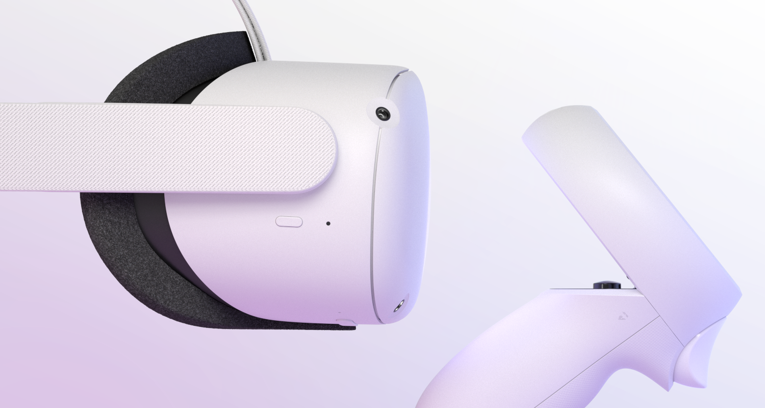
Oculus
VR as a concept dates back to a 1935 short story and a behemoth of a contraption created in the 1960s called The Sword of Damocles. But it was largely written off as an idea ahead of its time until 2012, when the founder of what would become Oculus showed up at a videogame trade show with duct taped goggles that let people experience the game Doom in a whole new way.
Today, Oculus is on a mission to prove the true value of VR is to expand our perspective in the real world. Stepping inside games is cool and will always be cool, but stepping inside someone else's life and seeing the world through their eyes is truly revolutionary.
To do that, however, Oculus has to show the world that gaming is just the beginning of VR and that the technology is ready to affect real change in business and education, medicine and science, parents and children. It has to show the world that VR is really about exploration and discovery and blow the walls off of a 3-dimensional life so we can live more than one life in more than one place.
That's no small challenge.
How do you evolve an identity from a gamers’ playground to an experience for personal and cultural development that can also be used as a gamers’ playground?
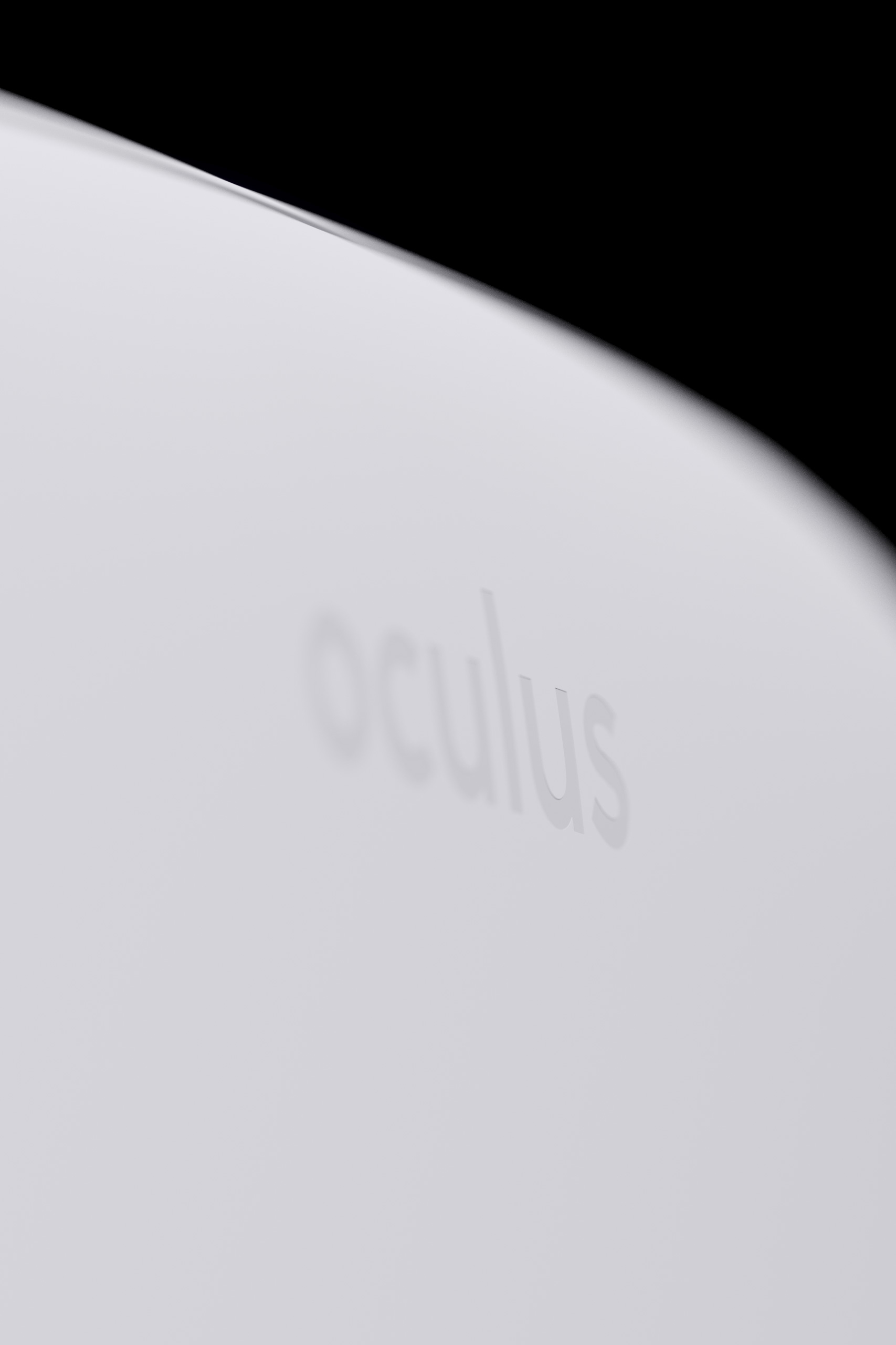
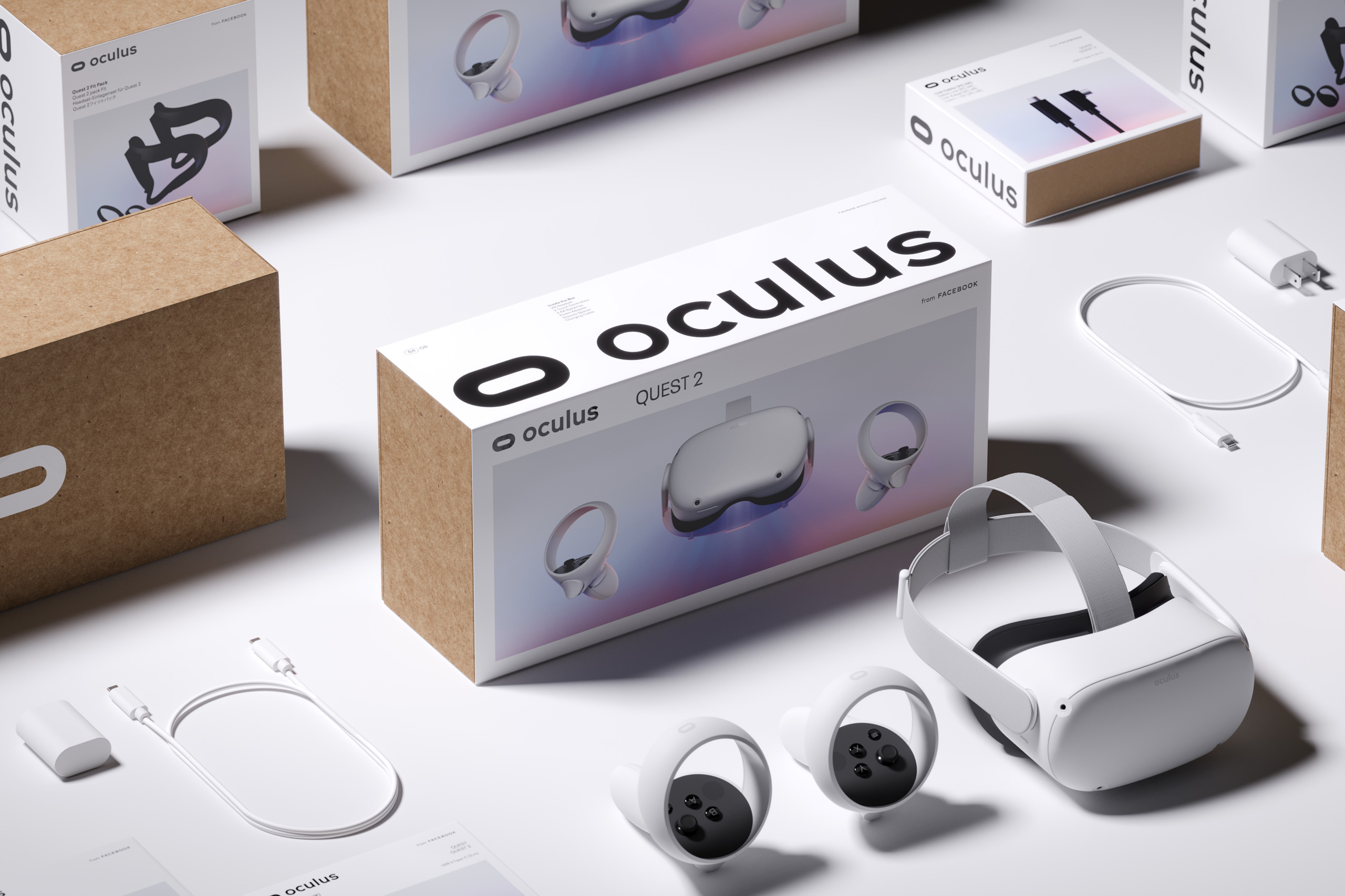
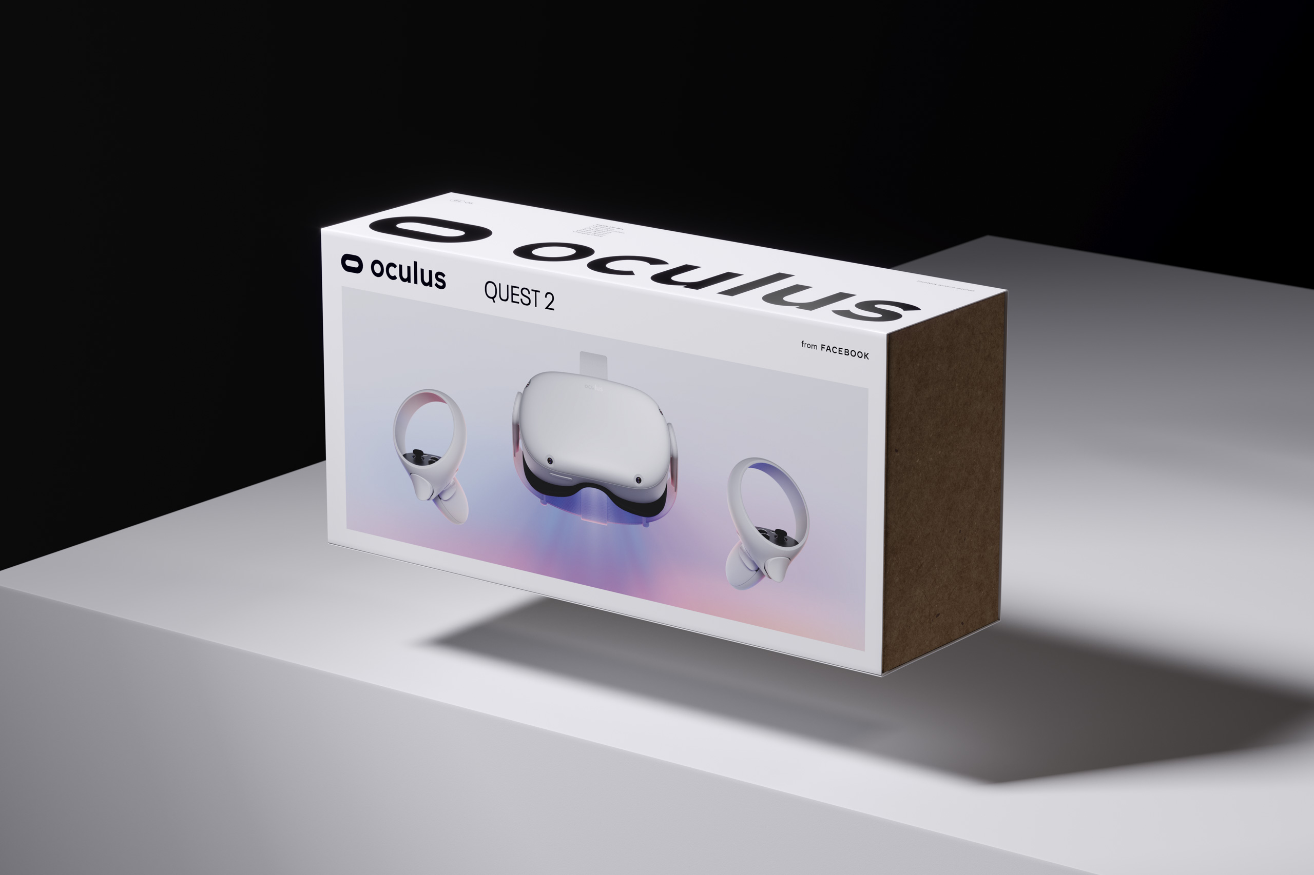
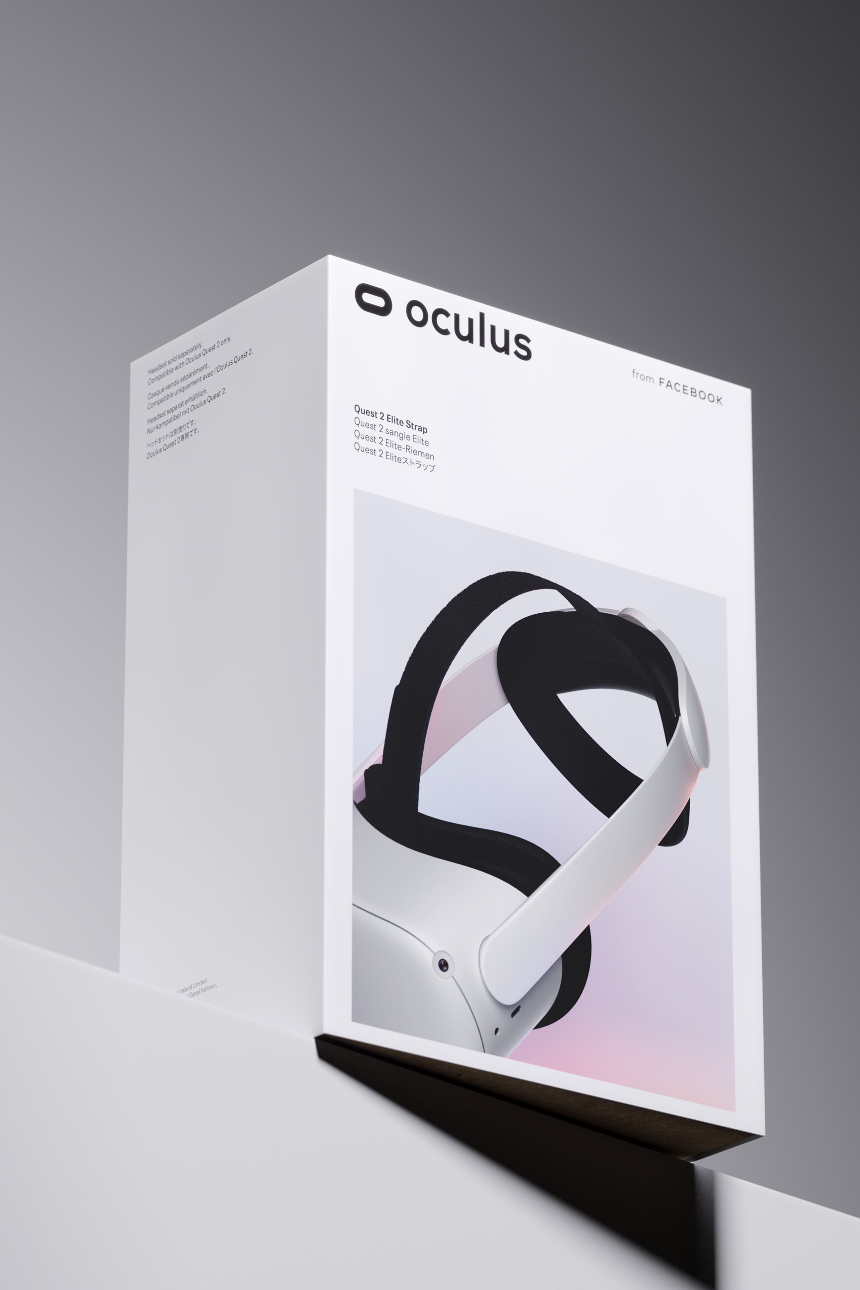
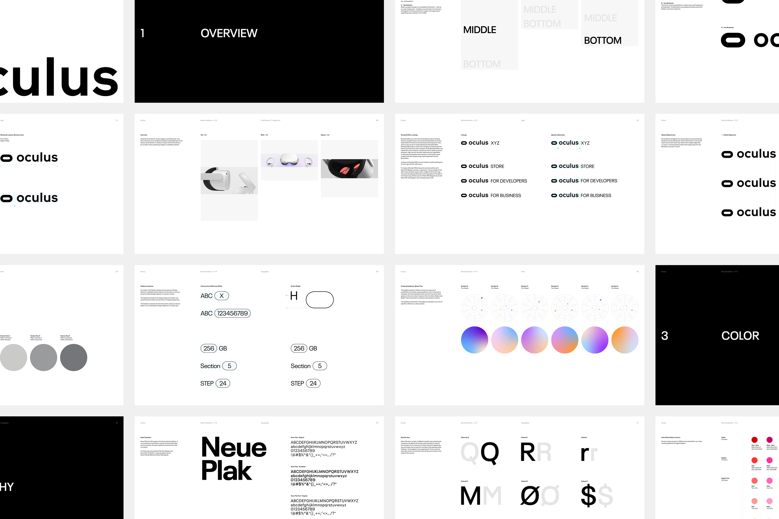
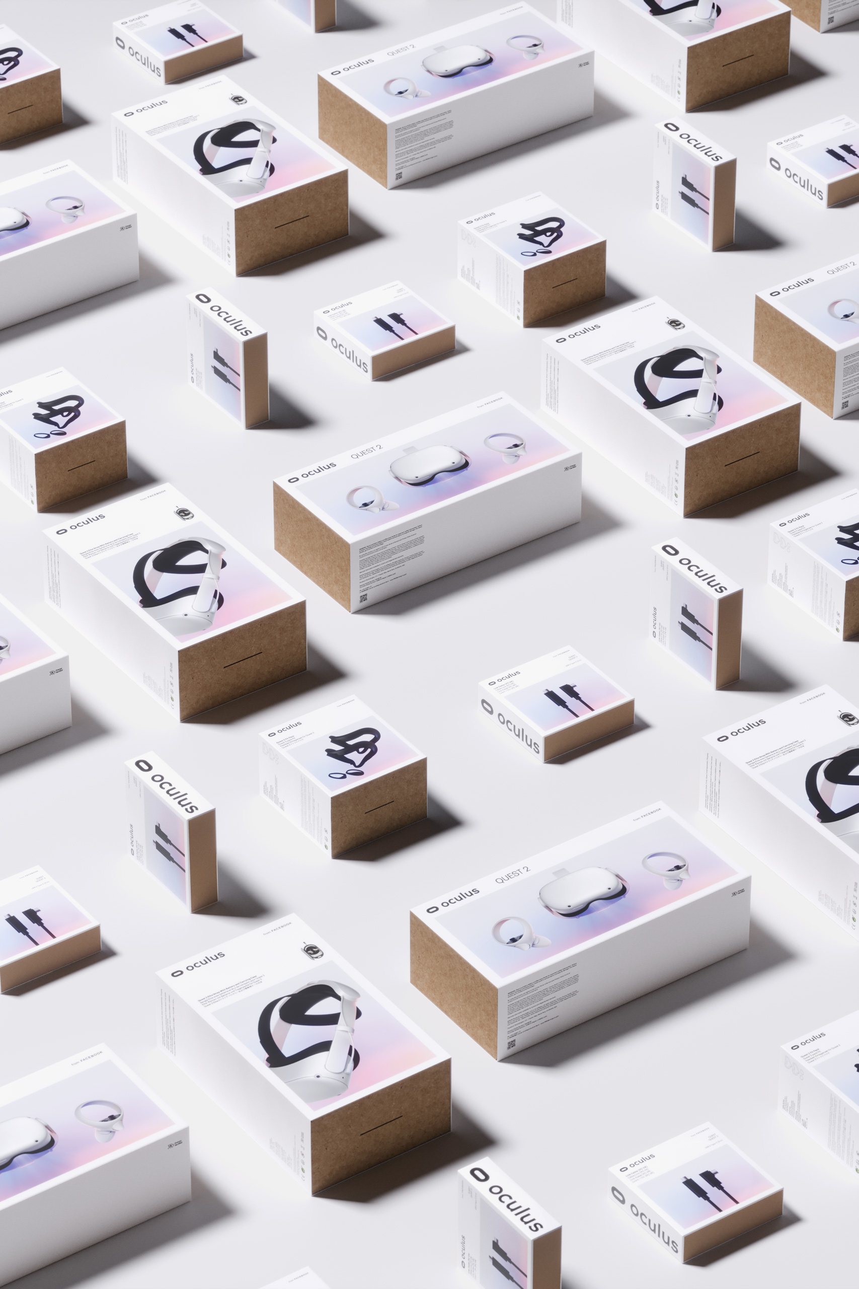
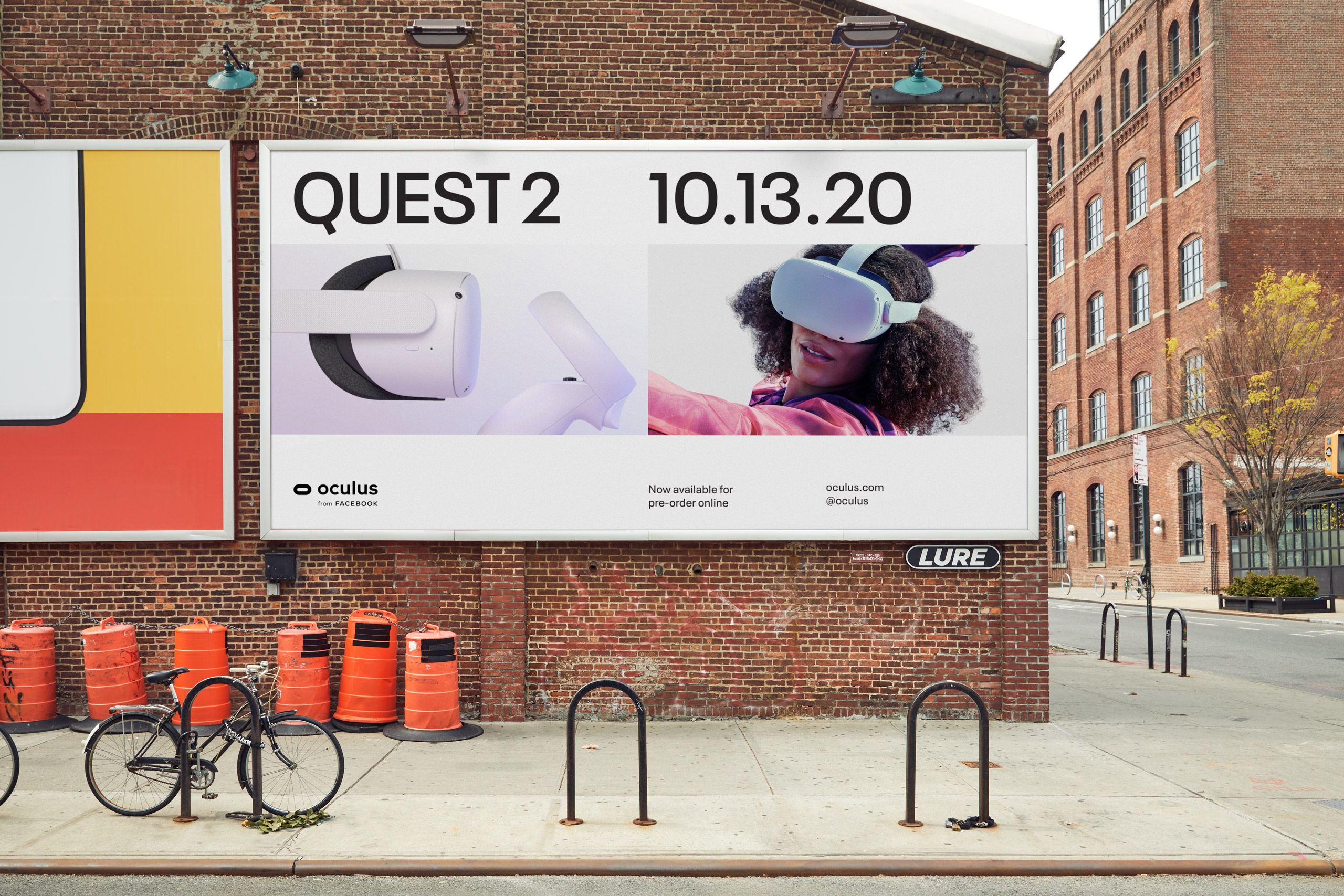
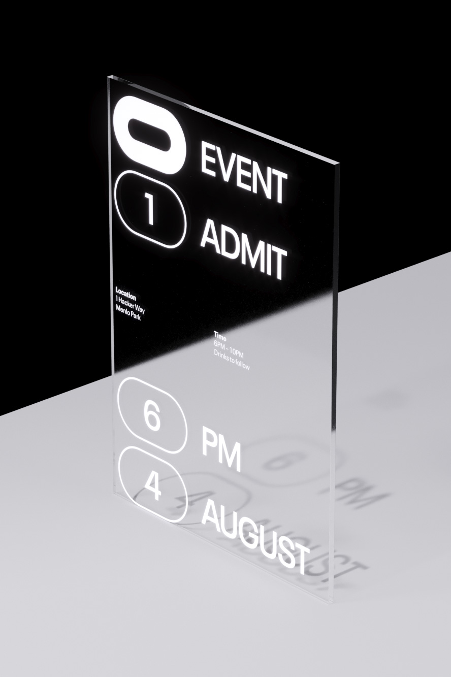
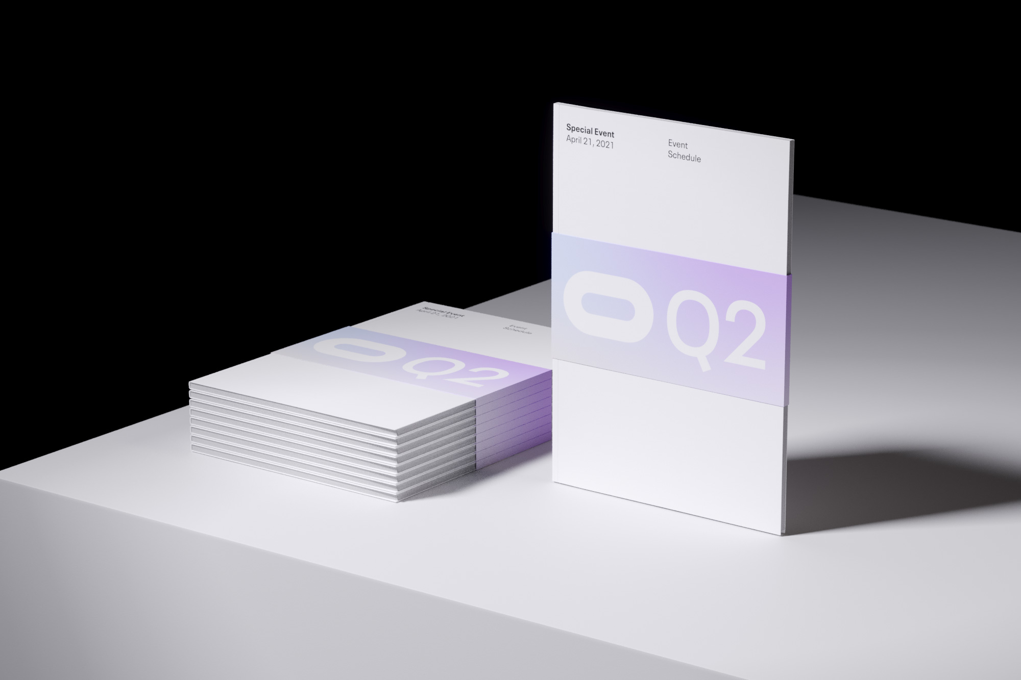
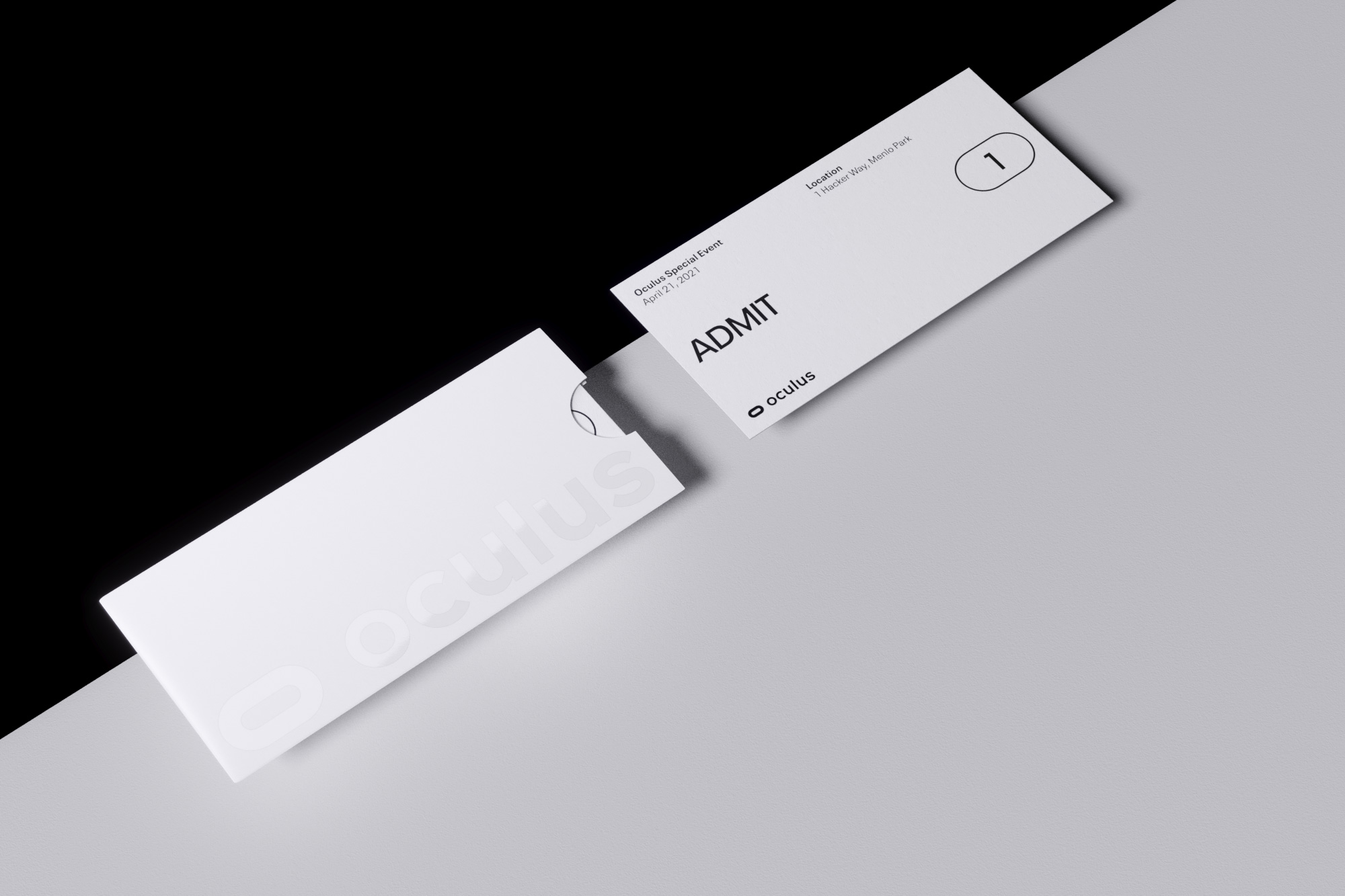
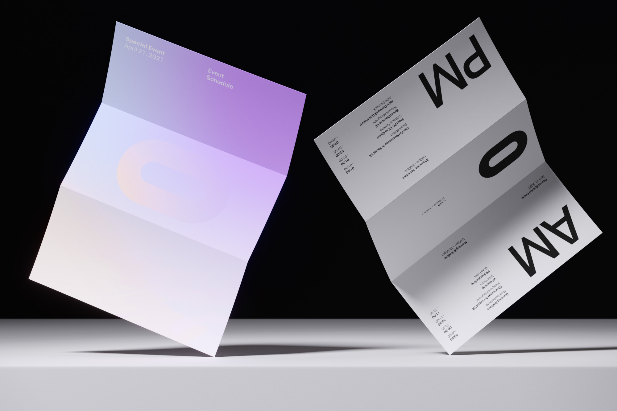
To answer this question, we worked with the visionary Oculus design team over the course of two years to define a new visual identity system covering custom wordmark and logo system, typography, color palette, photography and product visualization, layout system and more.
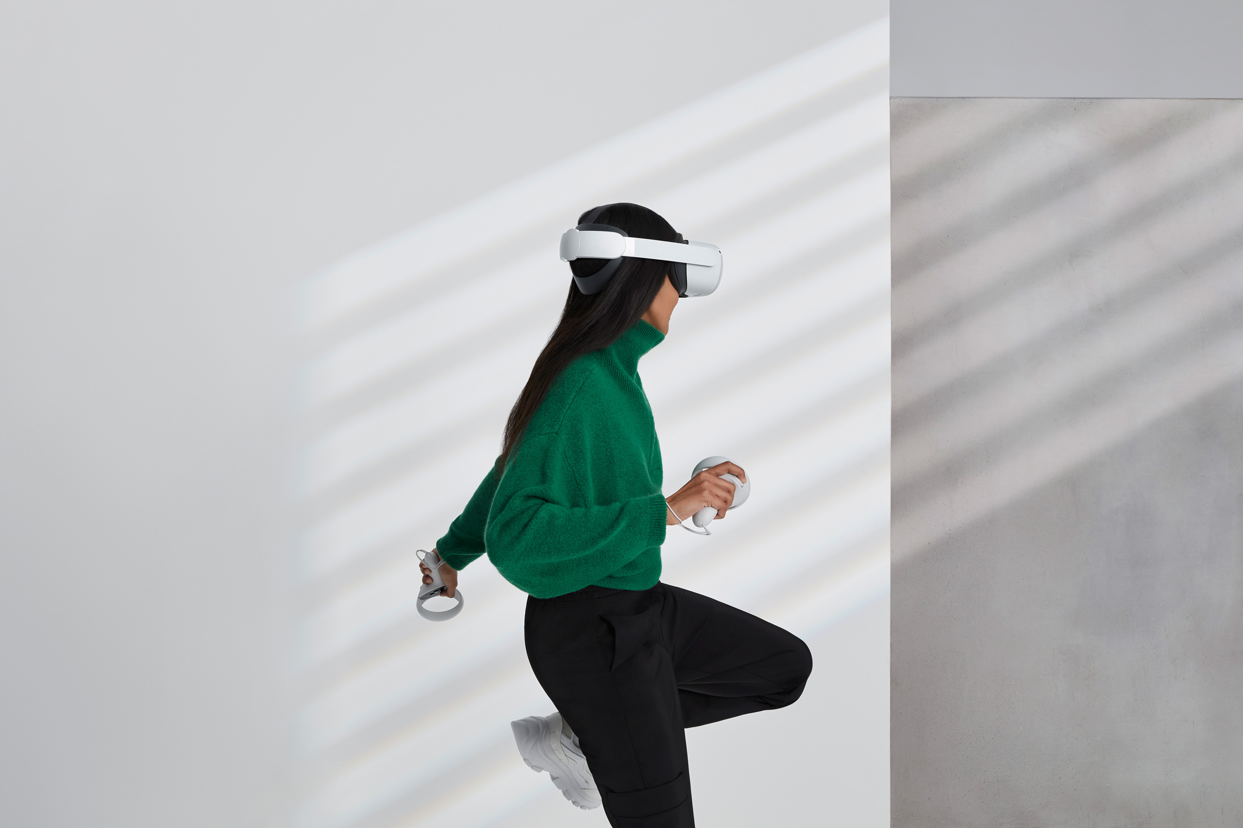
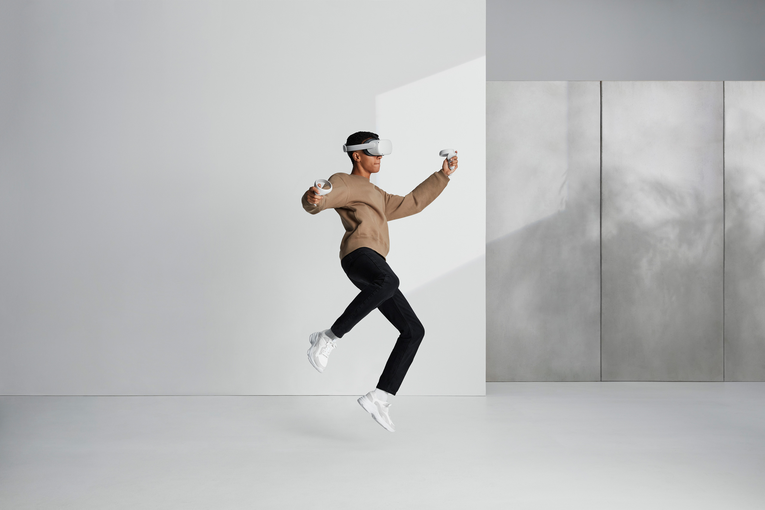
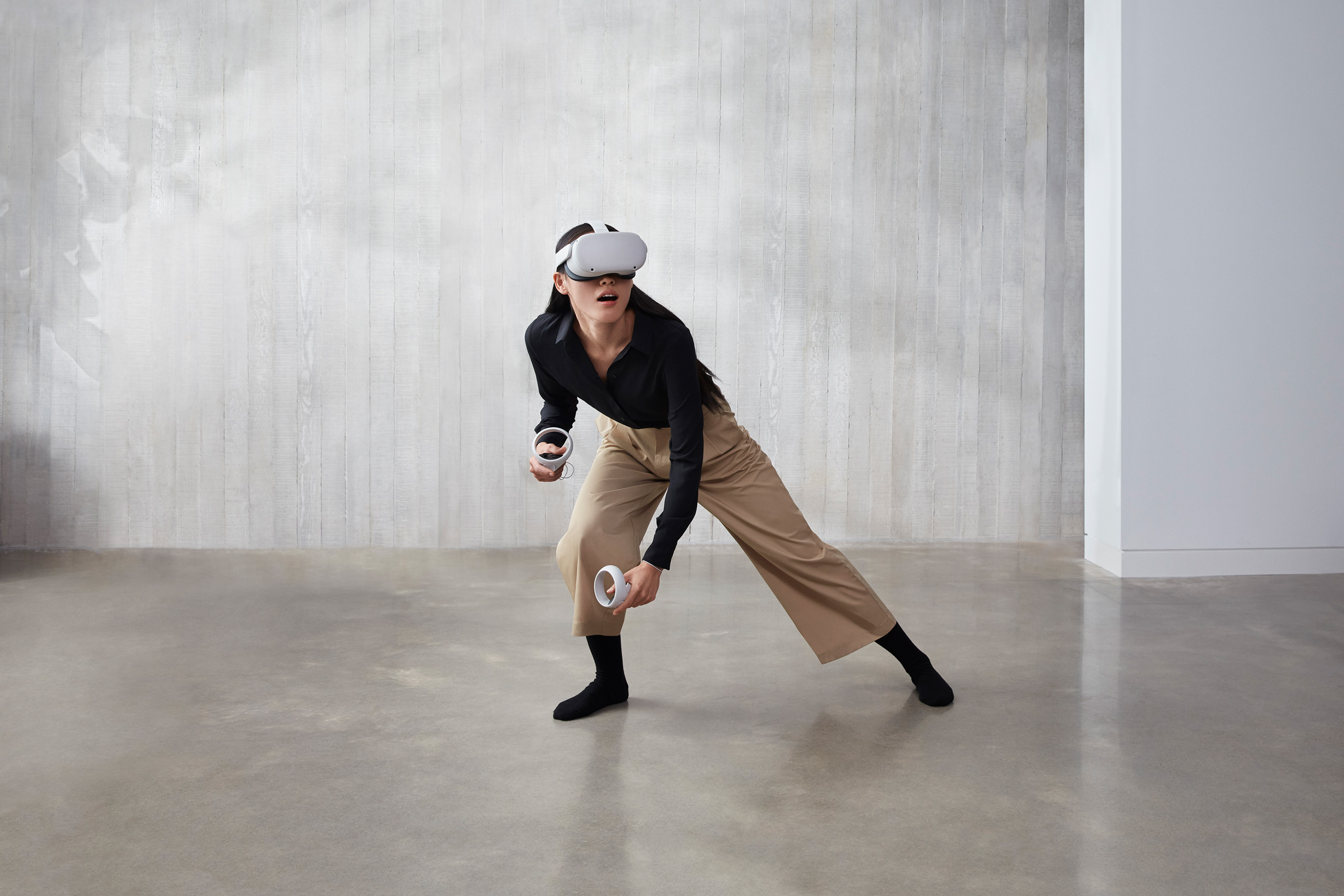
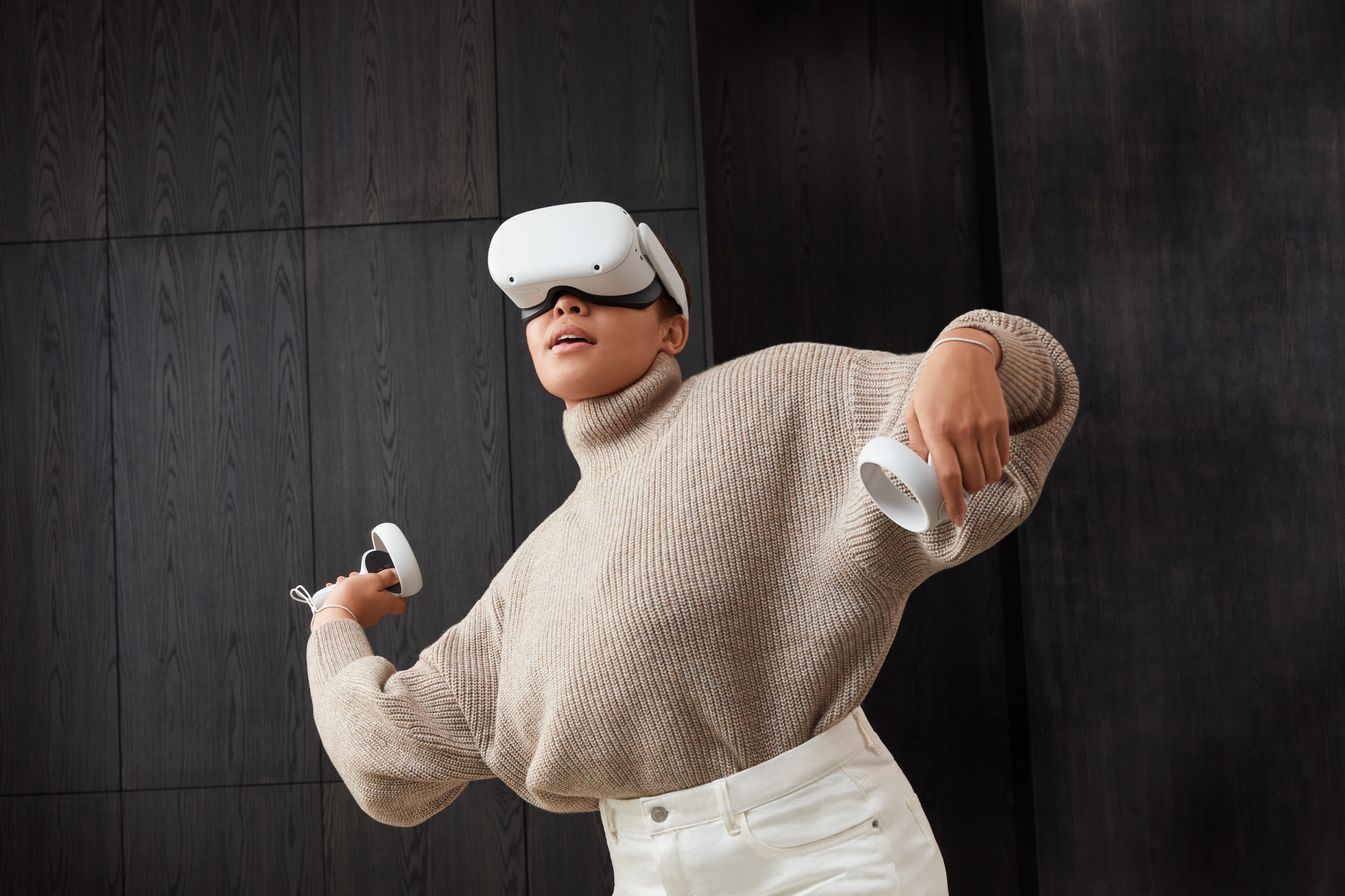
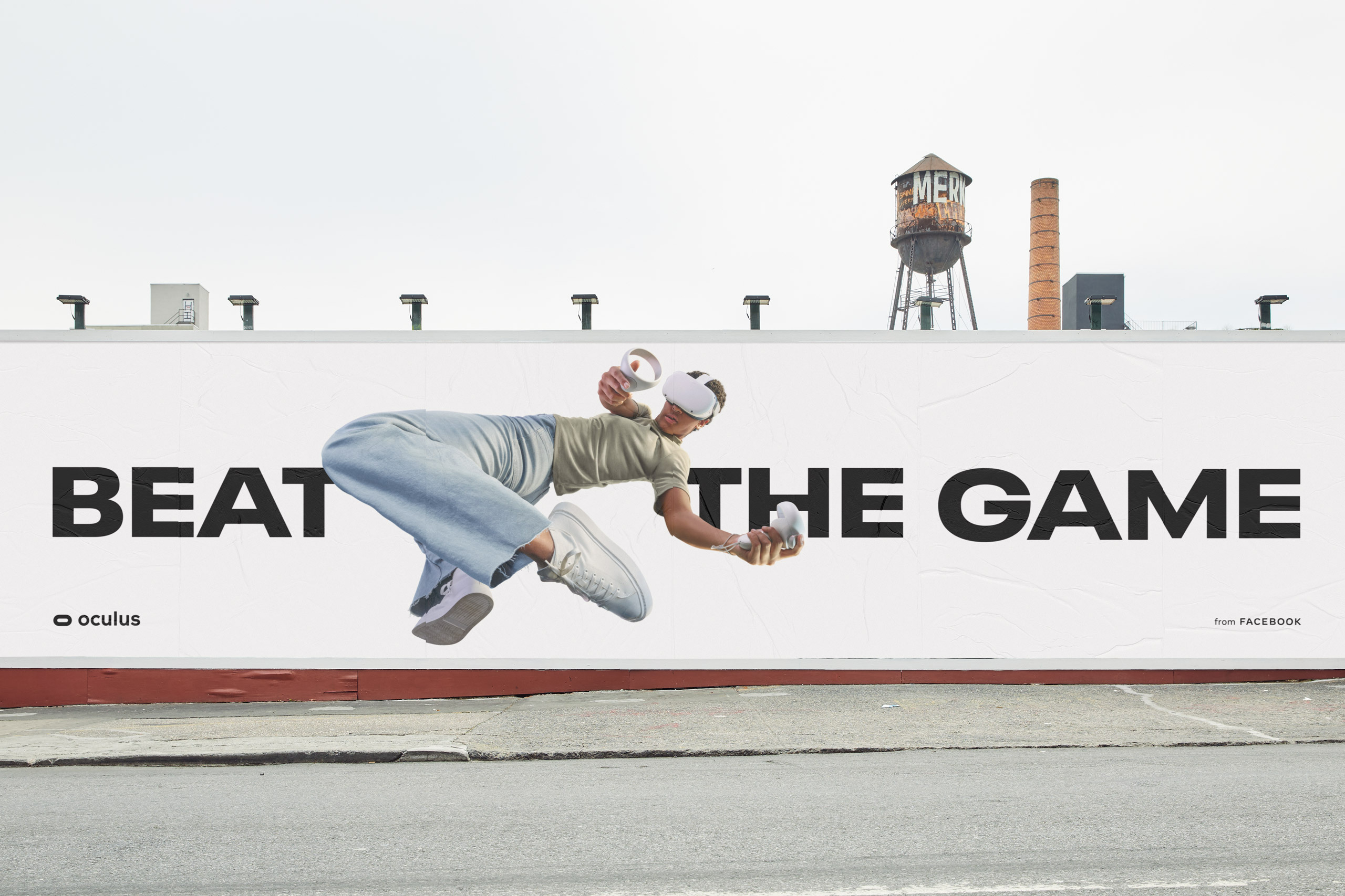
Our design approach centered around a dramatic switch from a black background to white. Much more than a simple change in color, the shift from black to white represented a complete change in mindset. We were moving VR from an unknown futuristic world to a bright, accessible way for people to enhance their everyday life.
Our color system complimented this shift in perspective, allowing Oculus to grow and signal new products while retaining their core identity. We also created a type system to allow the full range of expression this new identity demanded. Instead of the one note, gamer-centric voice, the brand now has to reach the full spectrum of people across the full spectrum of lifestyles.


Credits
Moniker: Visual Identity System, Art Direction, Brand Guidelines
Never Sit Still: Animation
Where Giants Roam: Renders