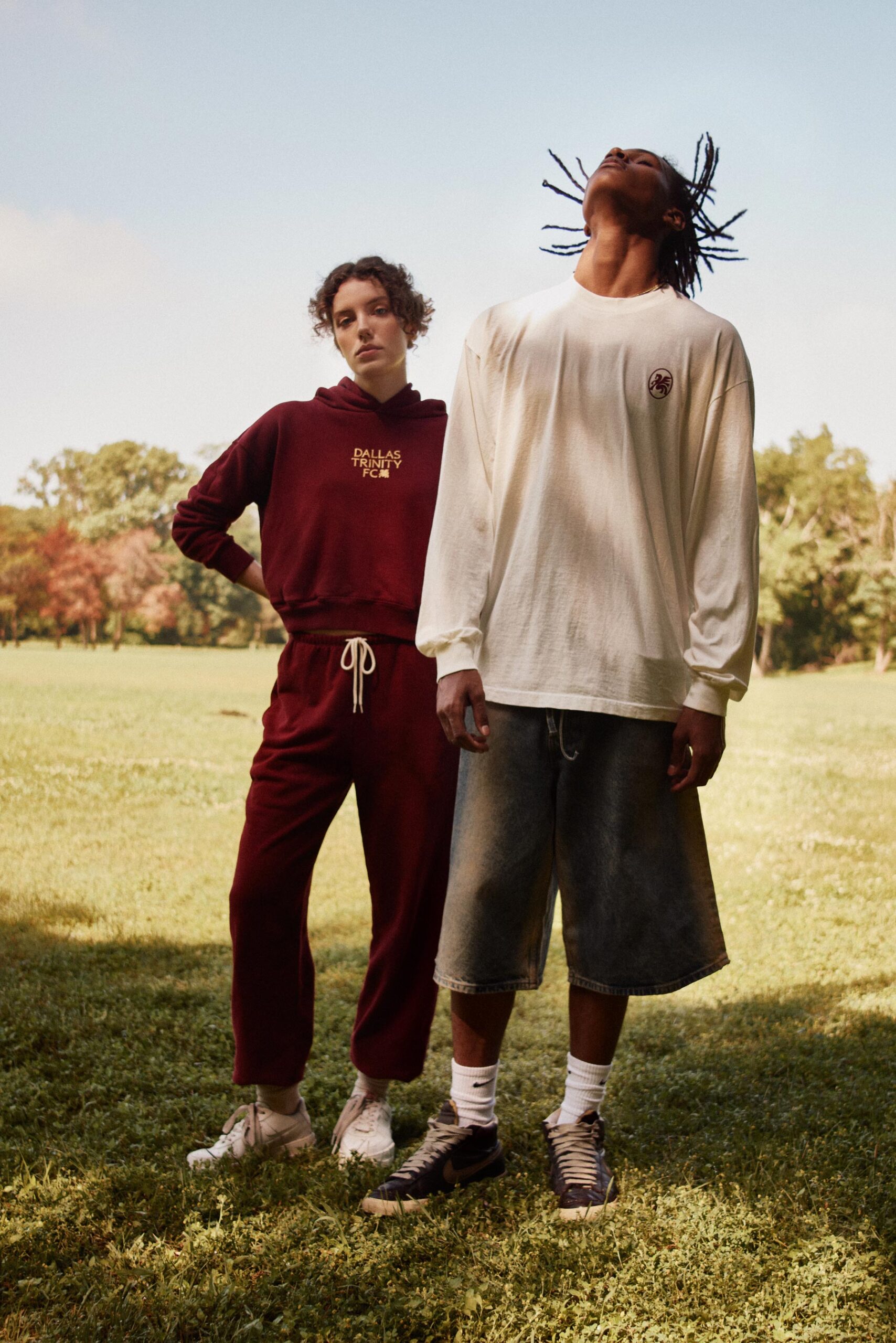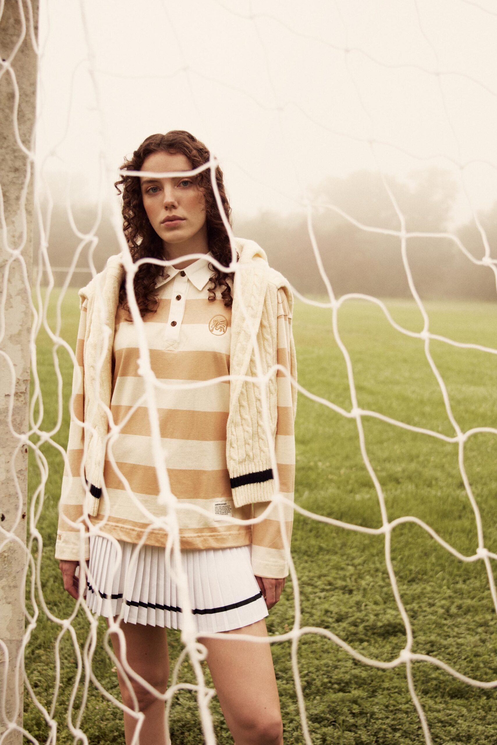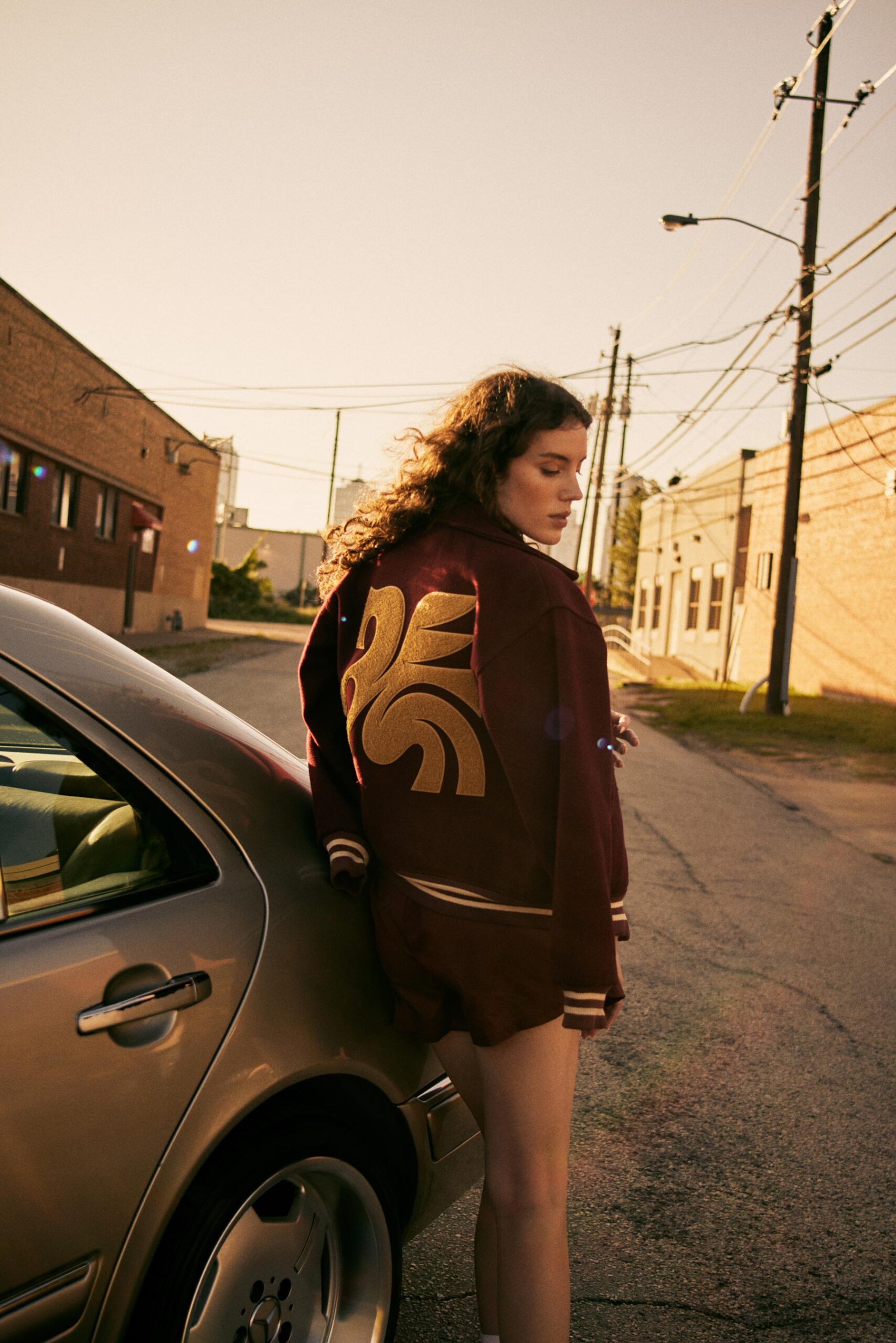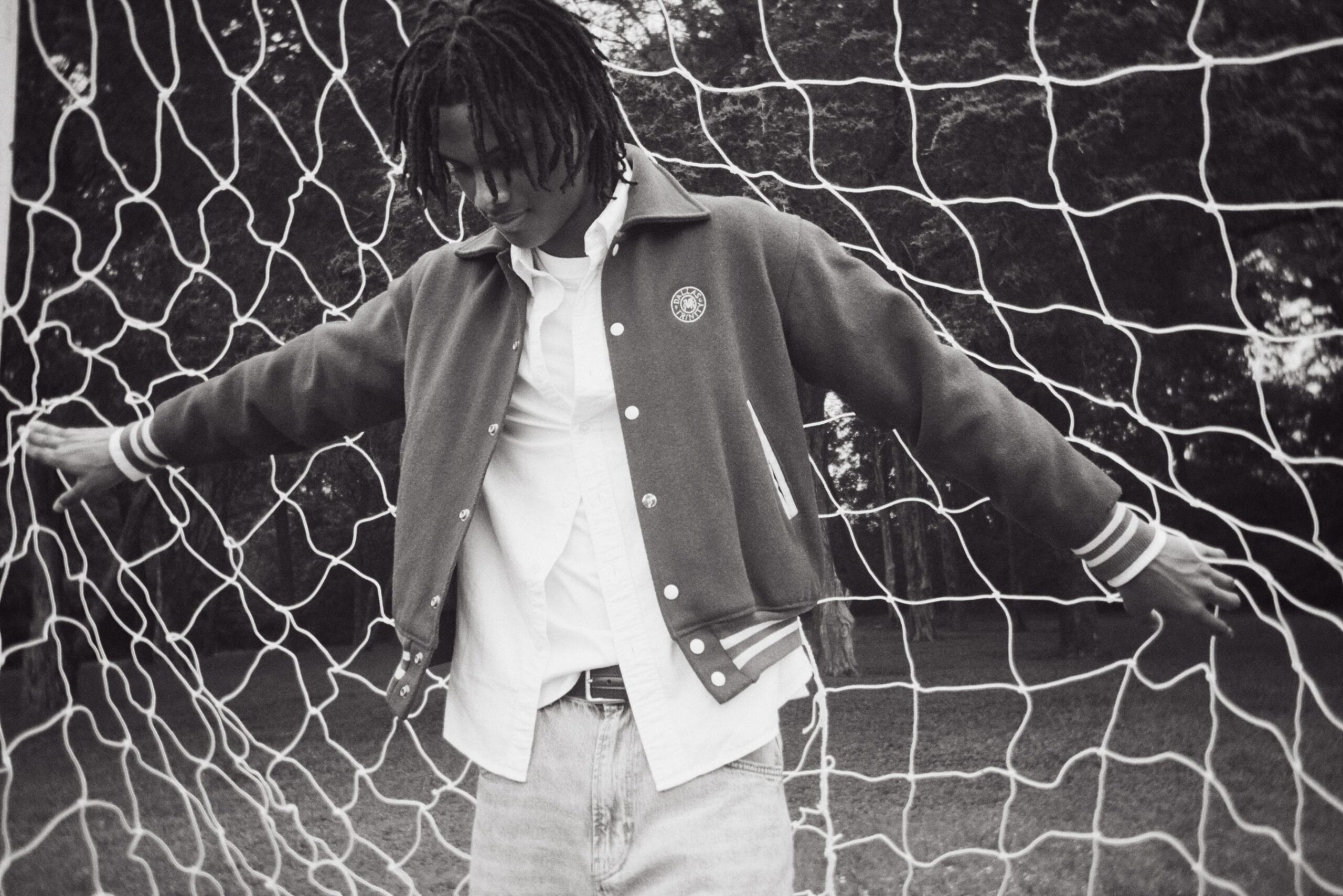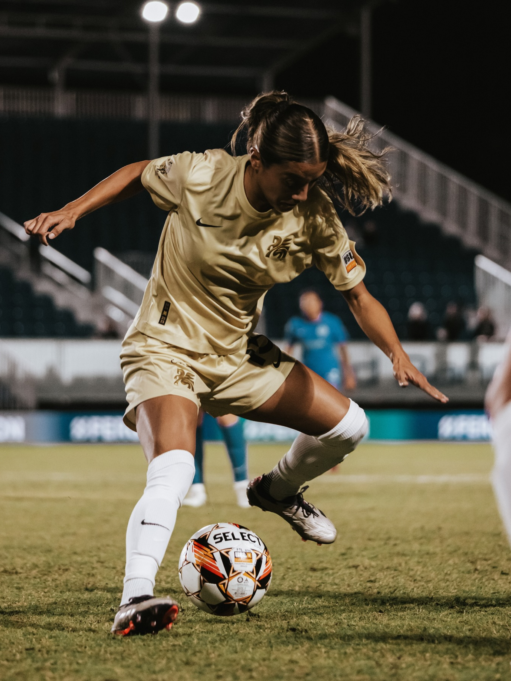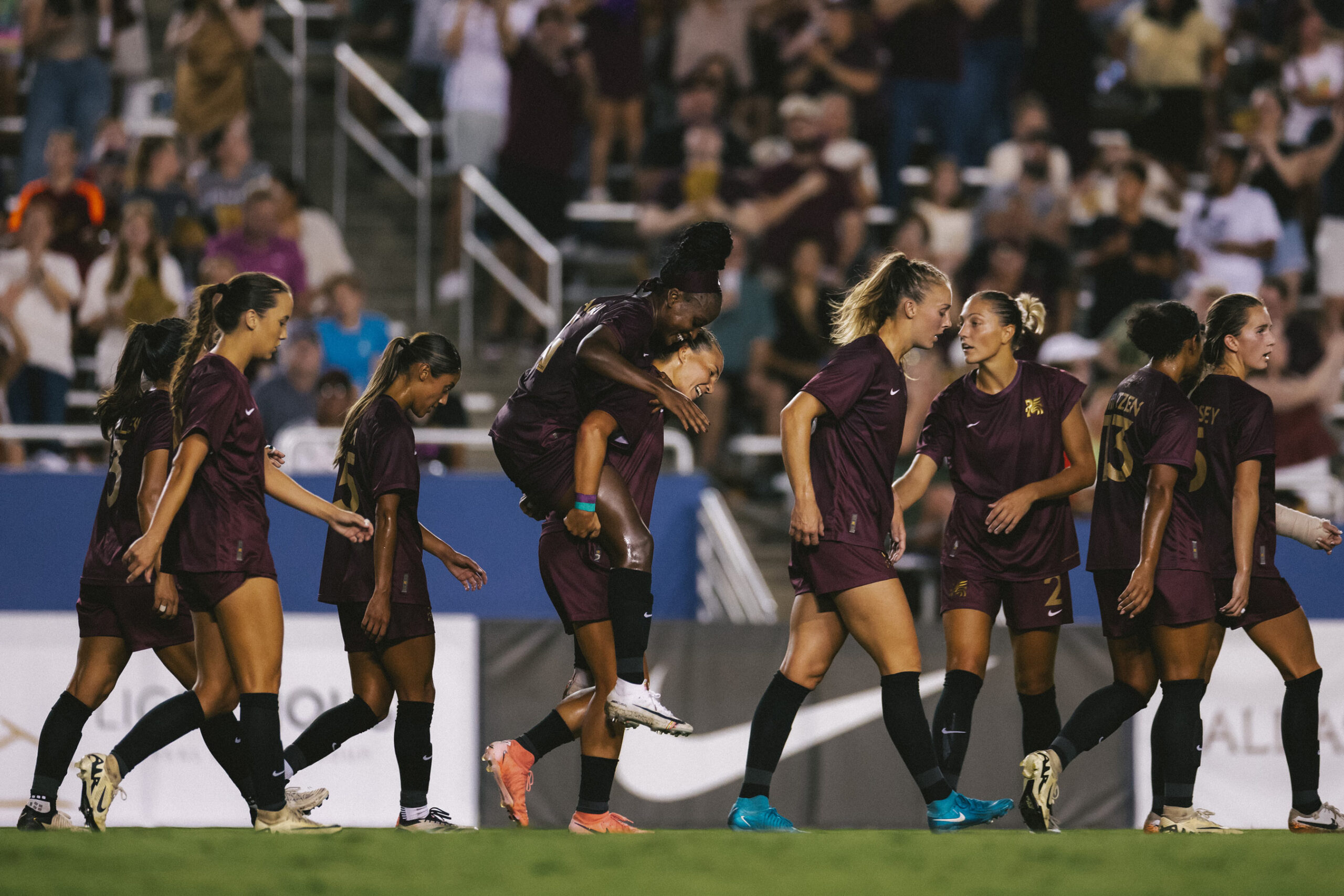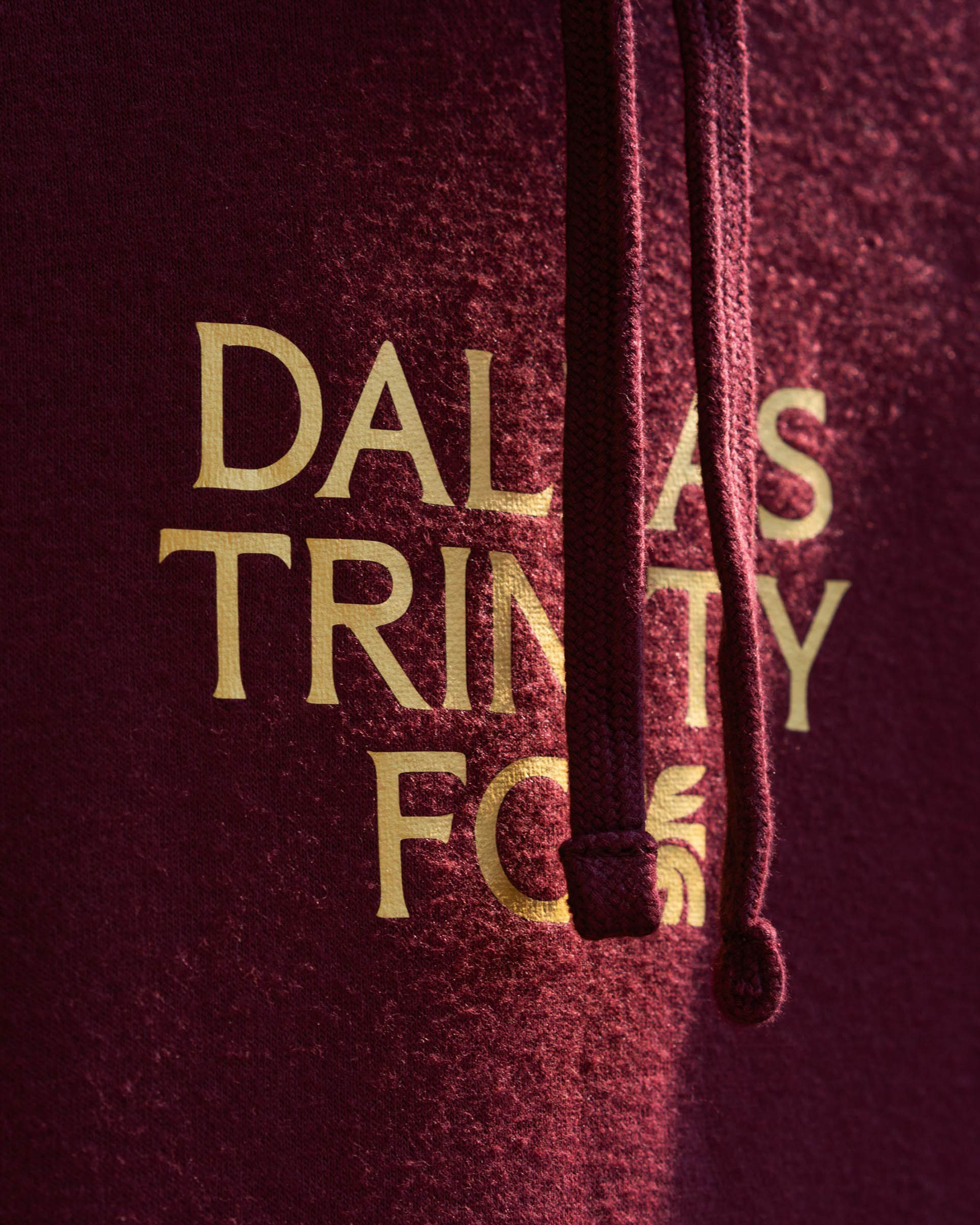
Dallas Trinity FC

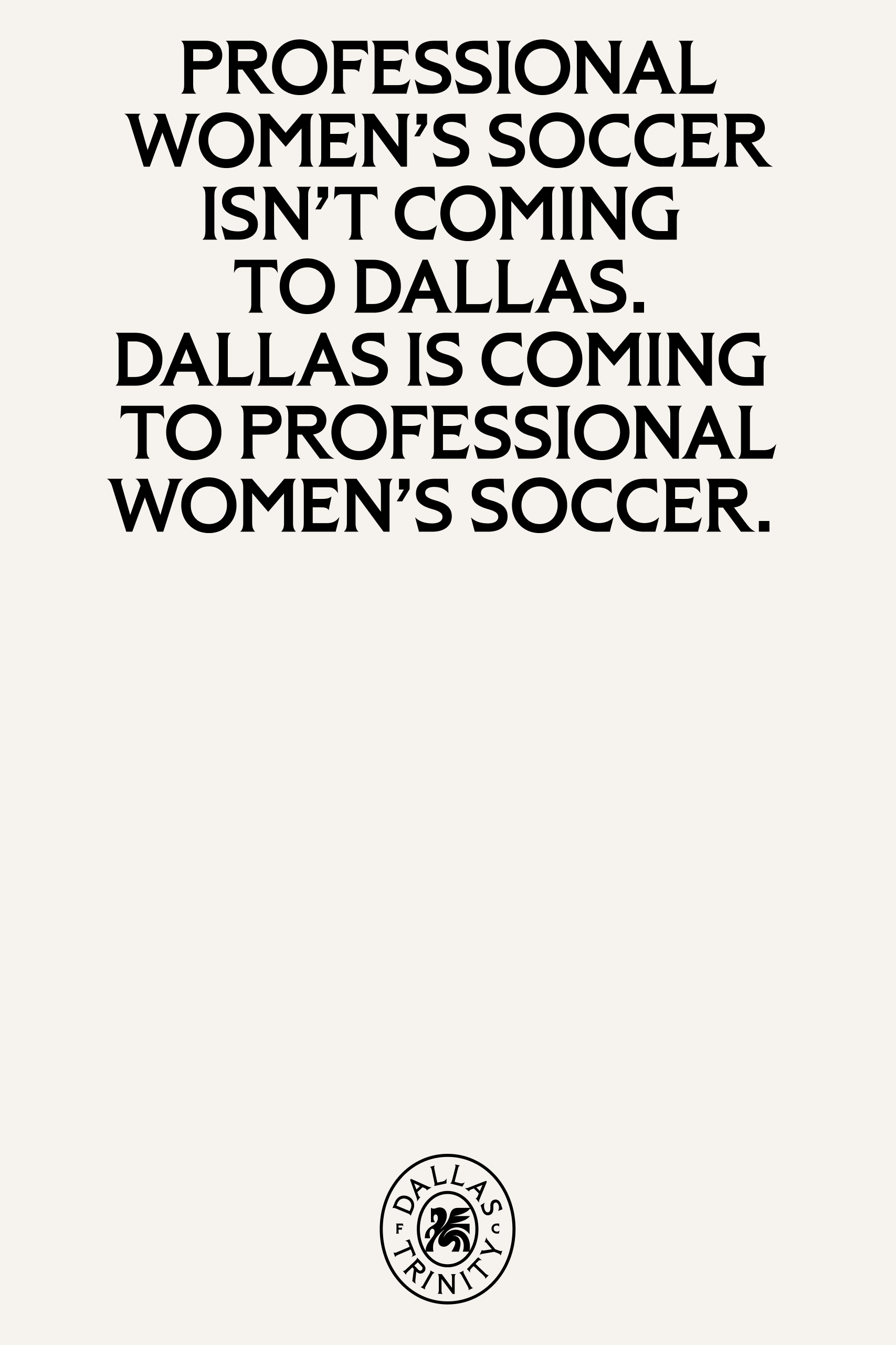
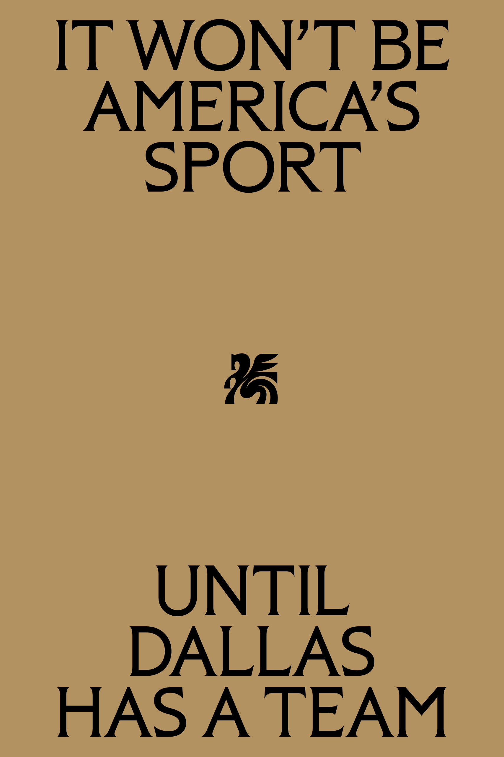
Women’s soccer is on the rise, but it’s not America’s Sport until Dallas has a team.


In a city where a different kind of football takes center stage, we were tasked with crafting the identity for Dallas's first professional women’s soccer team. The team would be part of the groundbreaking USL Super League, embodying the spirit of Dallas—a city defined by its diversity, ambition, and unwavering passion.

Our brand strategy and story drew inspiration from the people, landmarks, and narratives that have shaped Dallas into what it is today.

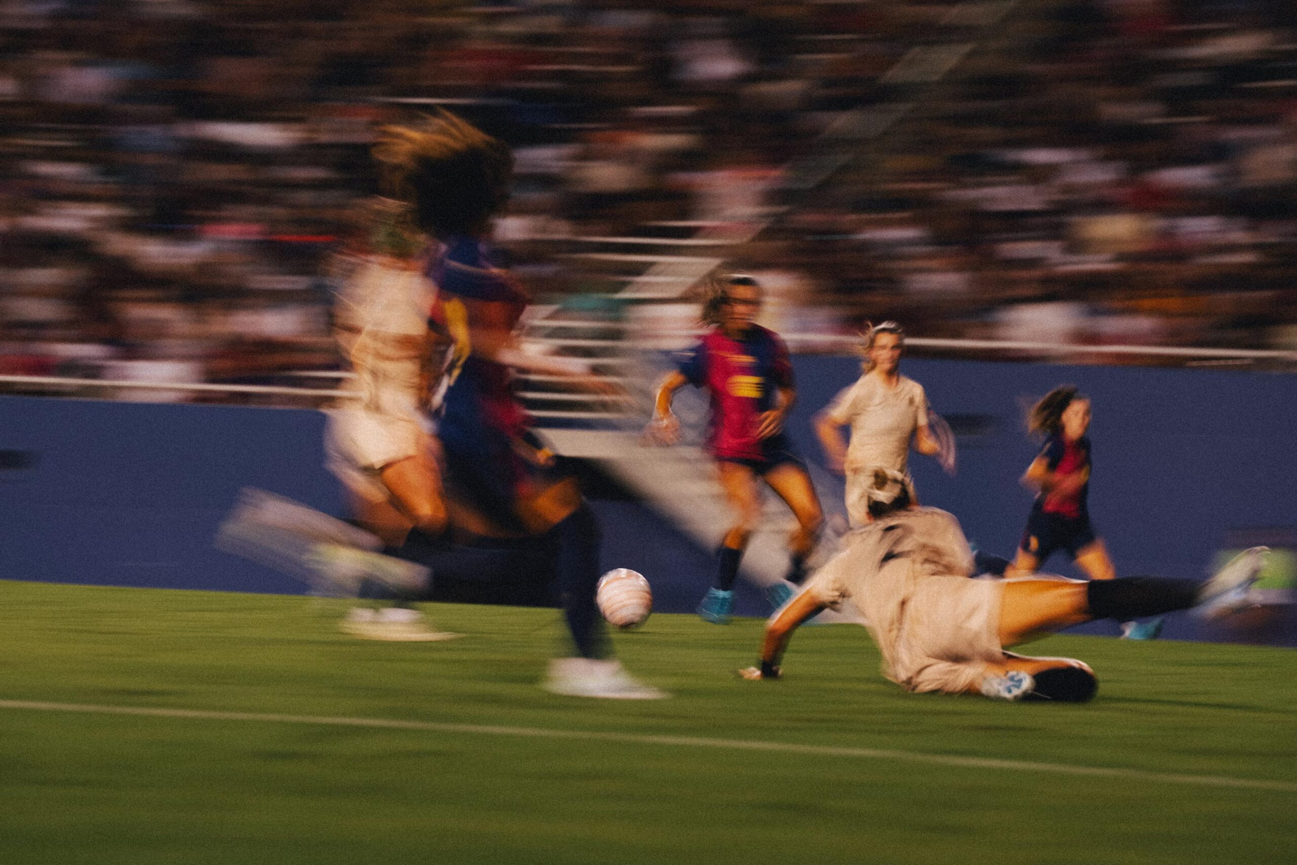
The most defining characteristic of Dallas is its approach to potential. This city doesn’t dwell on limitations or indulge in empty promises—it takes action and delivers results. That same relentless attitude would define the team’s presence on the field and guide our creation of its brand identity.

For the team’s name, we sought something deeply rooted in Dallas’s heritage—something that resonated with the city’s history and the rich interplay of its diverse cultures. We found our answer in the Trinity River that winds from the northwest to the southeast through town, serving as a unifying thread in Dallas’s story since its founding in 1841. While the river might lack the glamour often associated with the city, its quiet resilience reflects the resourceful, can-do spirit of Dallas’s people.

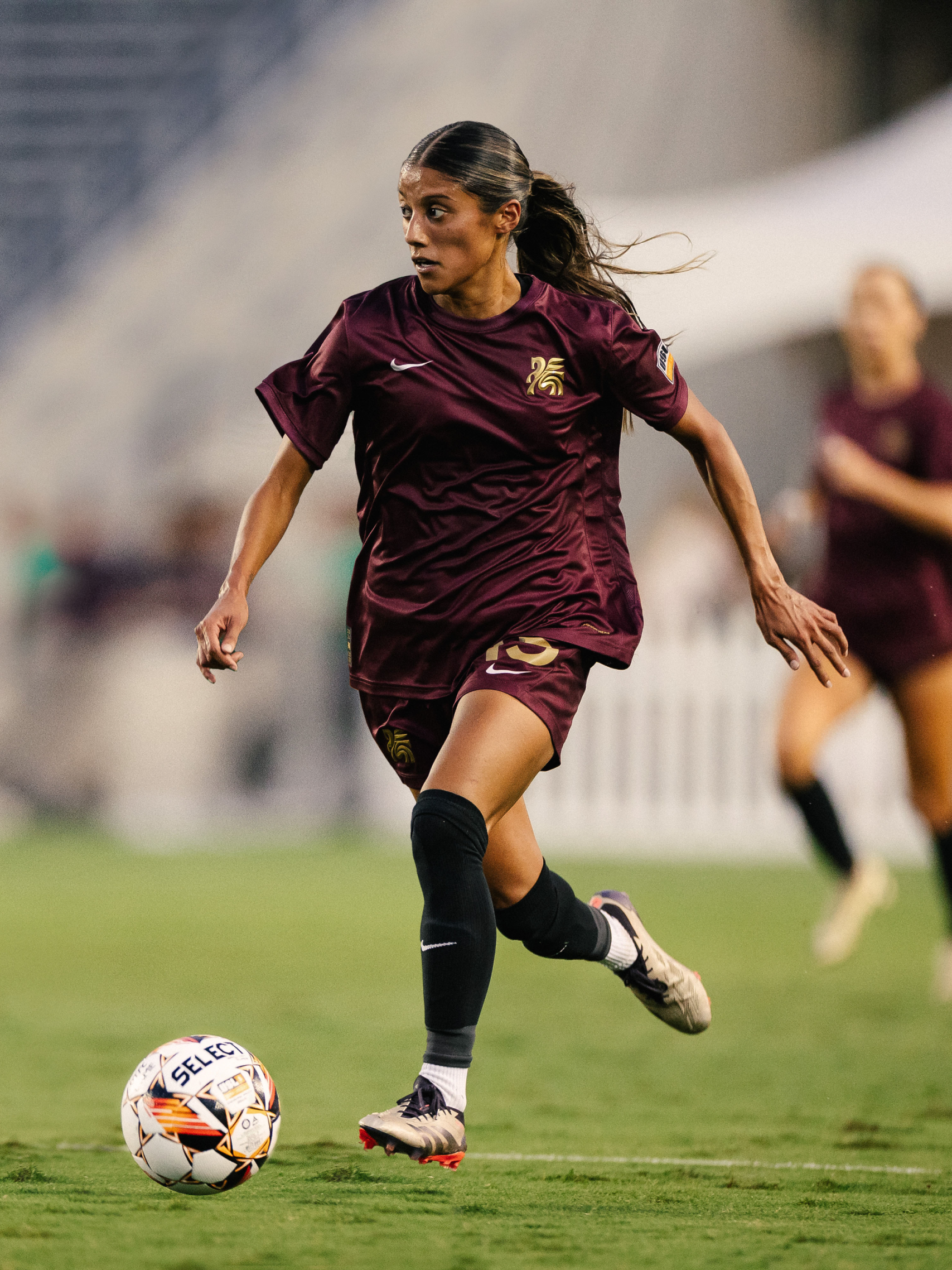
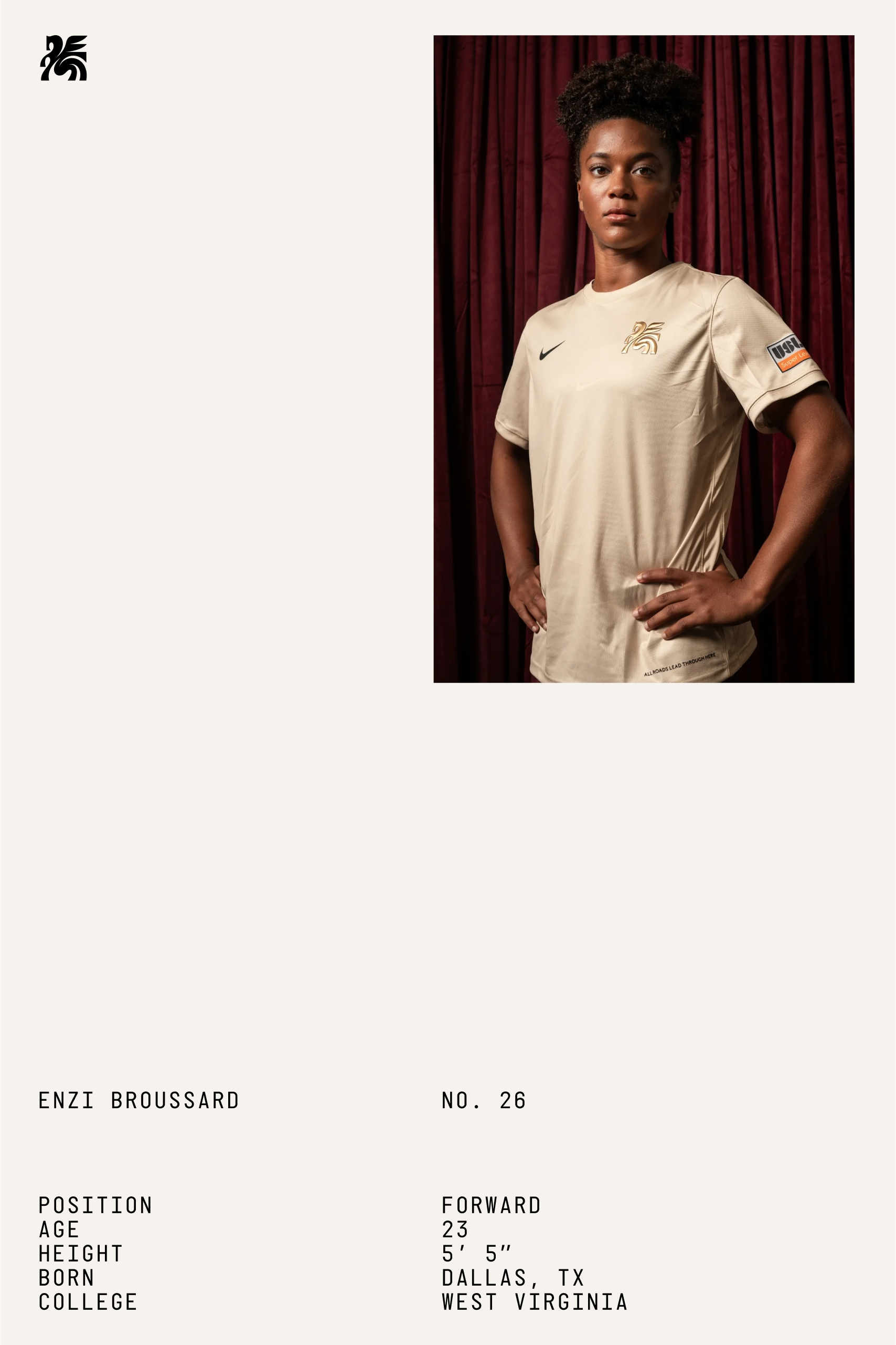
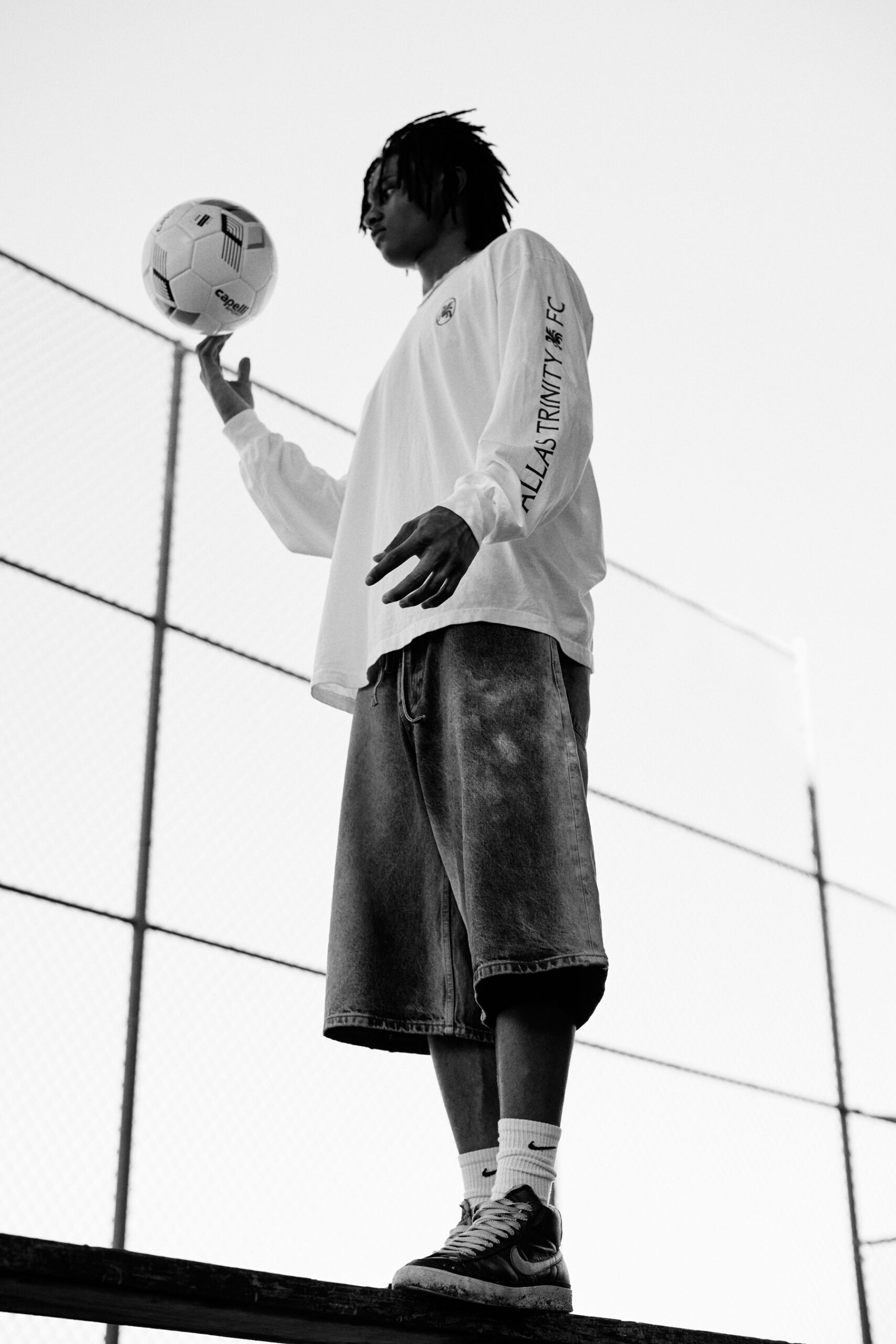
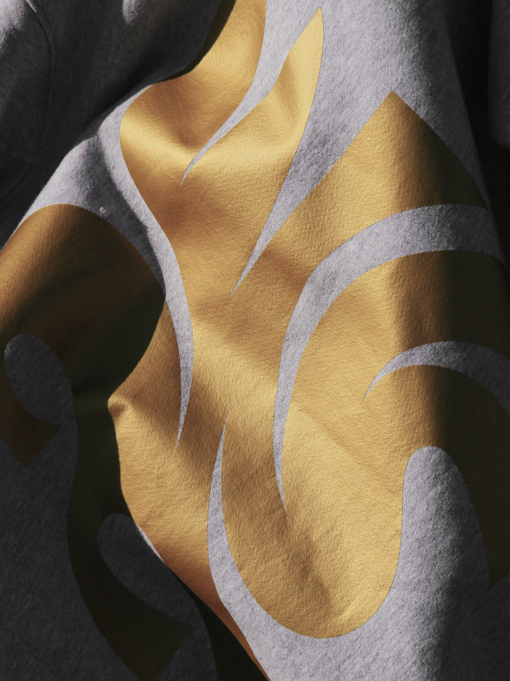
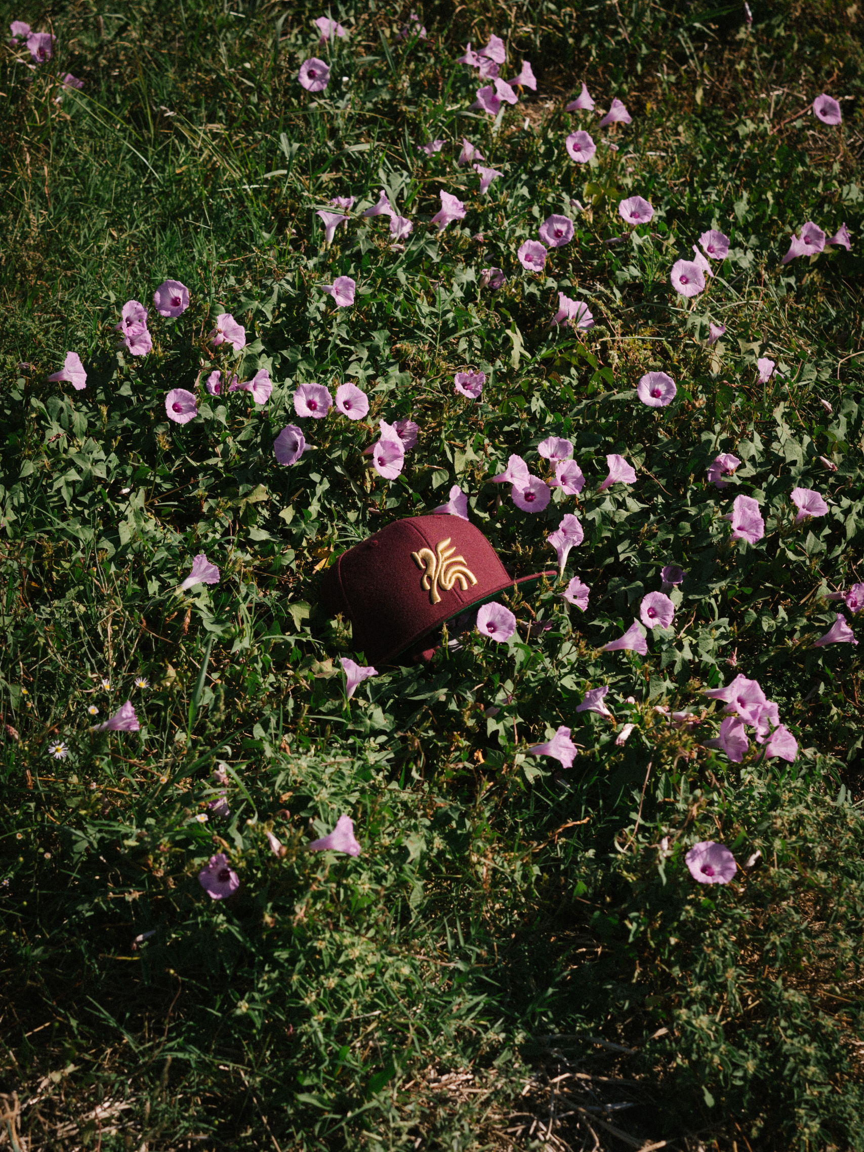
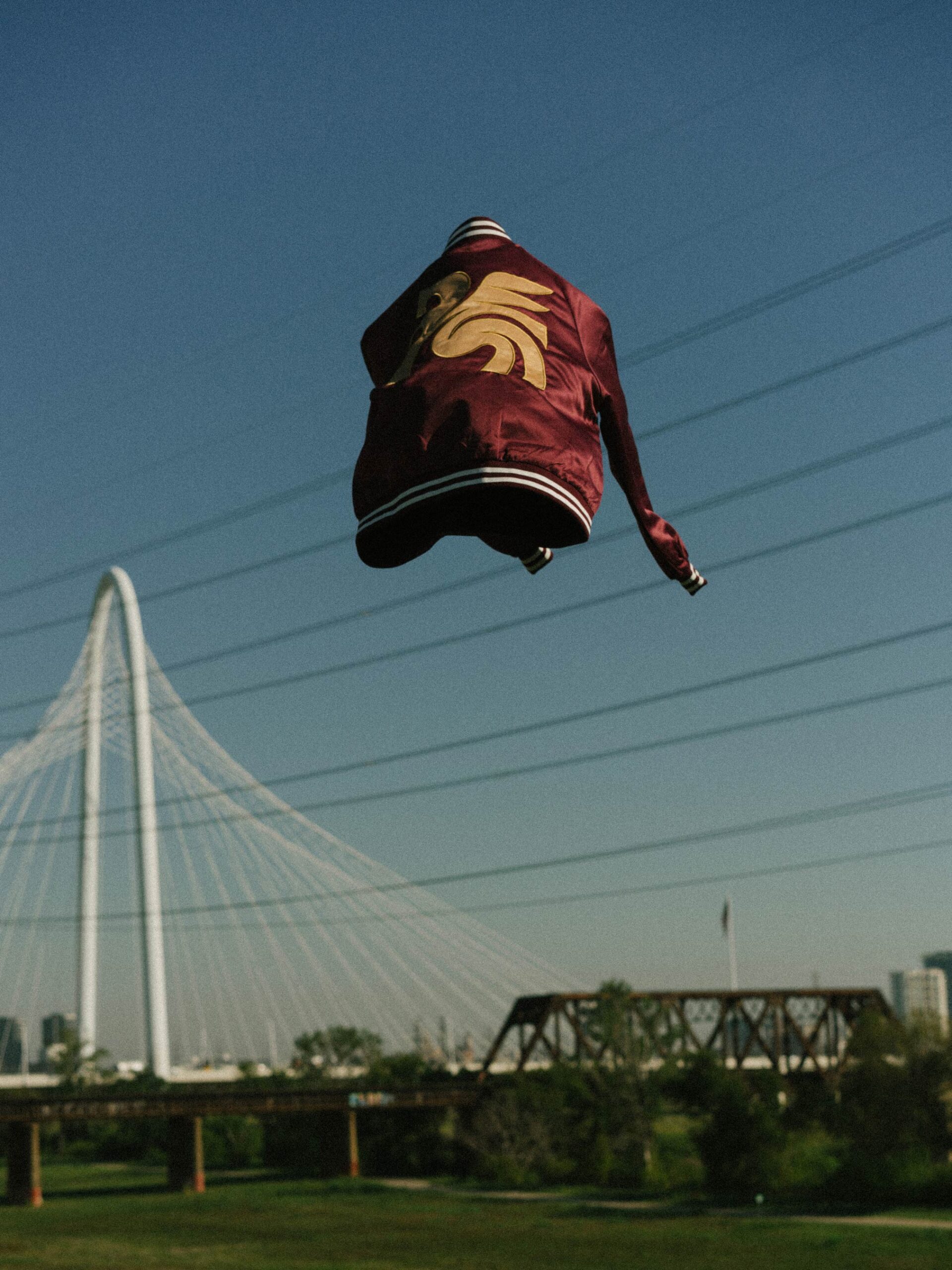
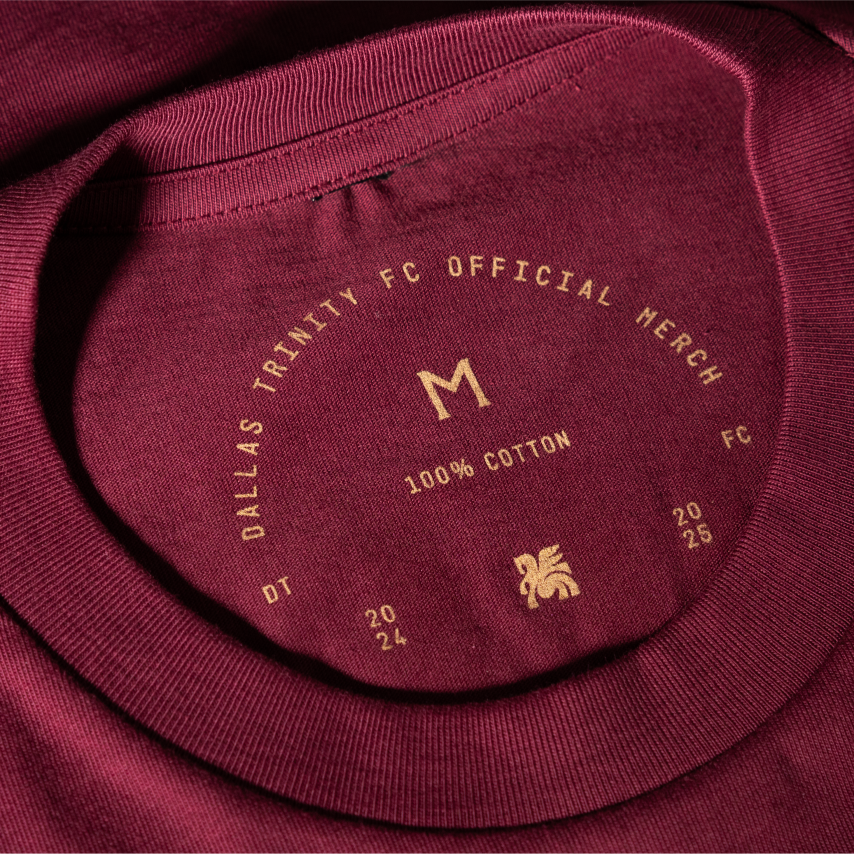
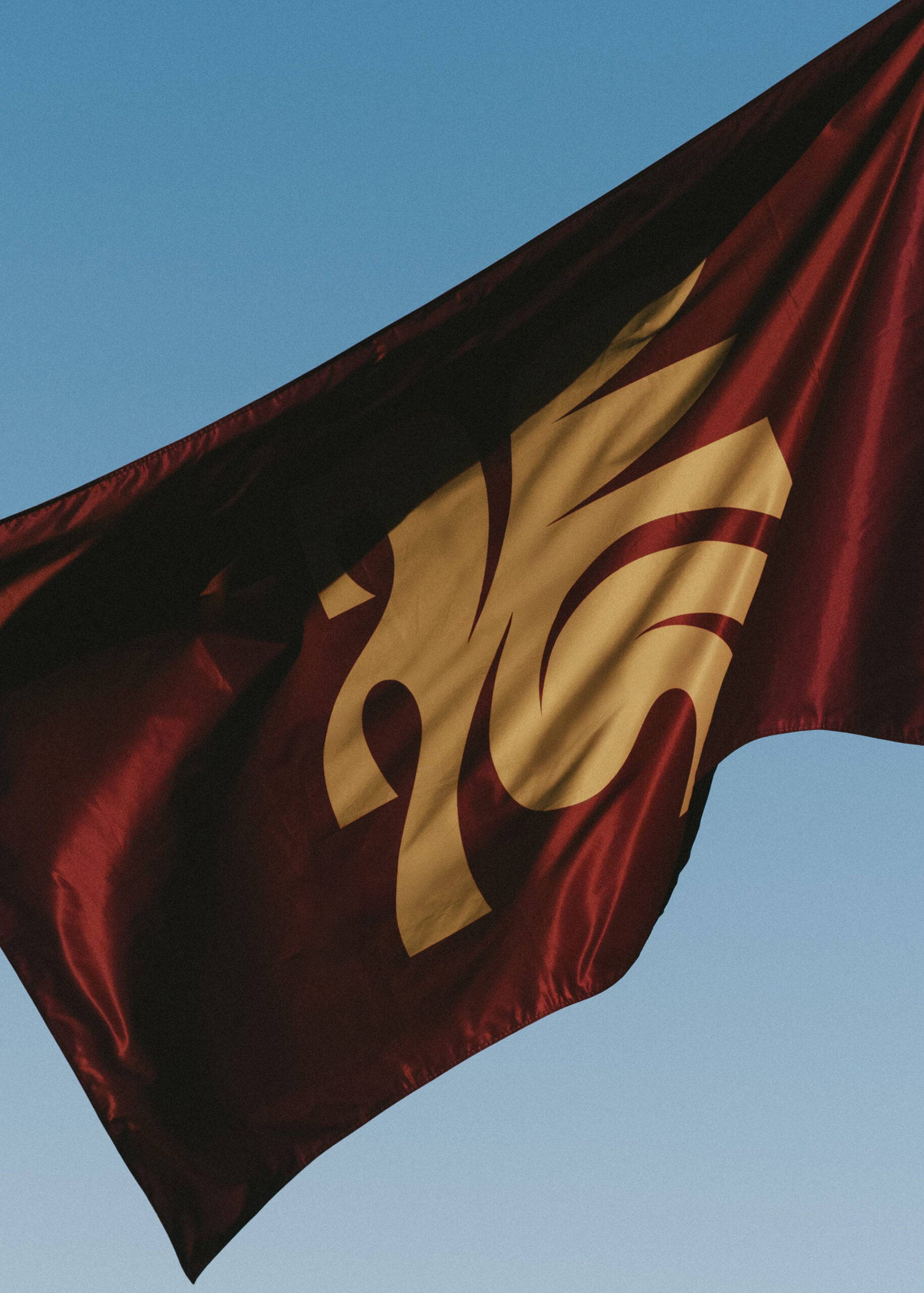
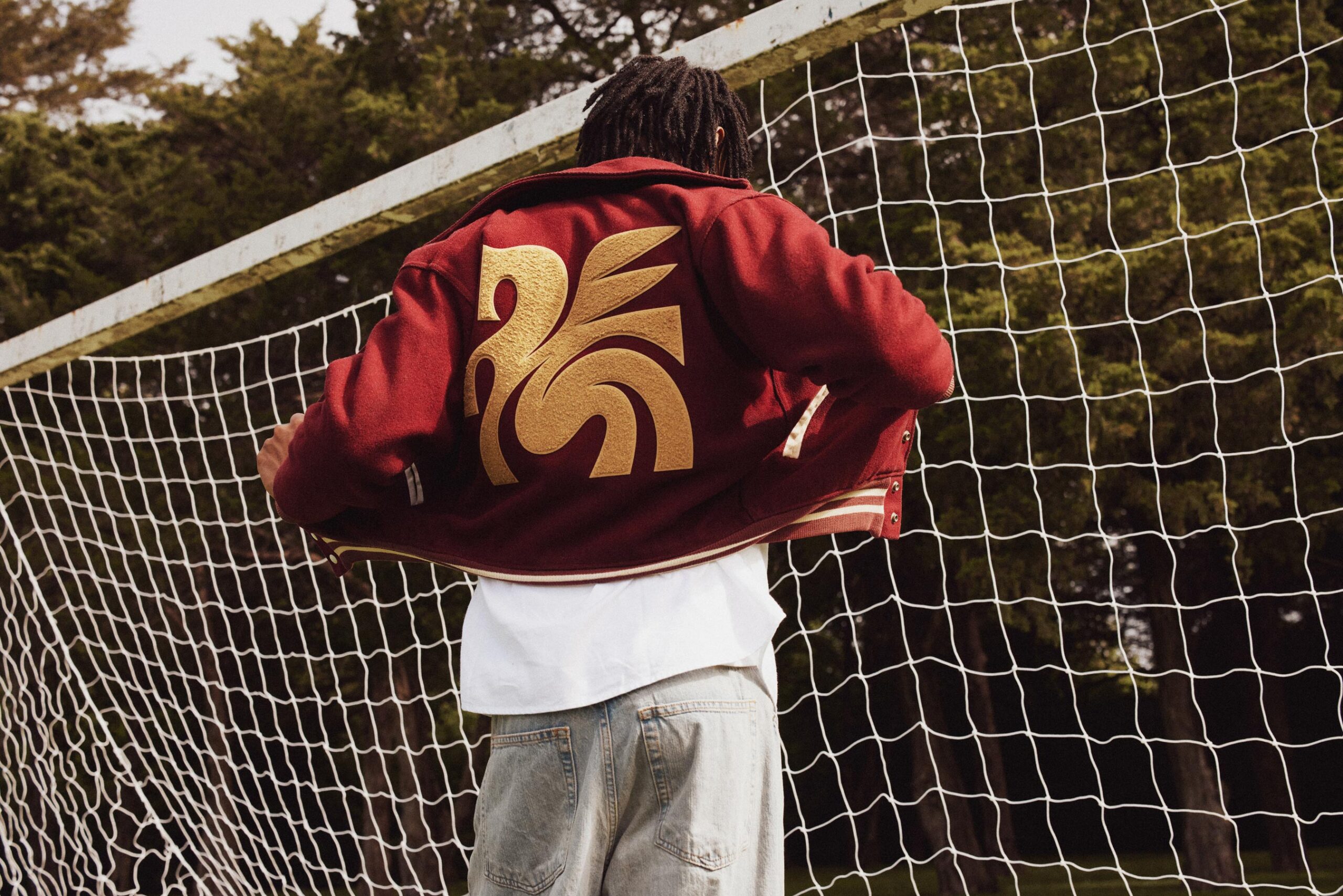
Since the 1930s, a red neon Pegasus has illuminated downtown Dallas from atop the 29-story Magnolia Petroleum Building, standing as a steadfast symbol of the city’s progress, pride, and persistence. We reimagined this iconic figure from Greek mythology in our crest, tying the team’s identity to the rich history of Dallas. This enduring symbol embodies the city’s unyielding spirit—whether you call it grit, entrepreneurial drive, or plain stubbornness, there’s simply no quit in Dallas.

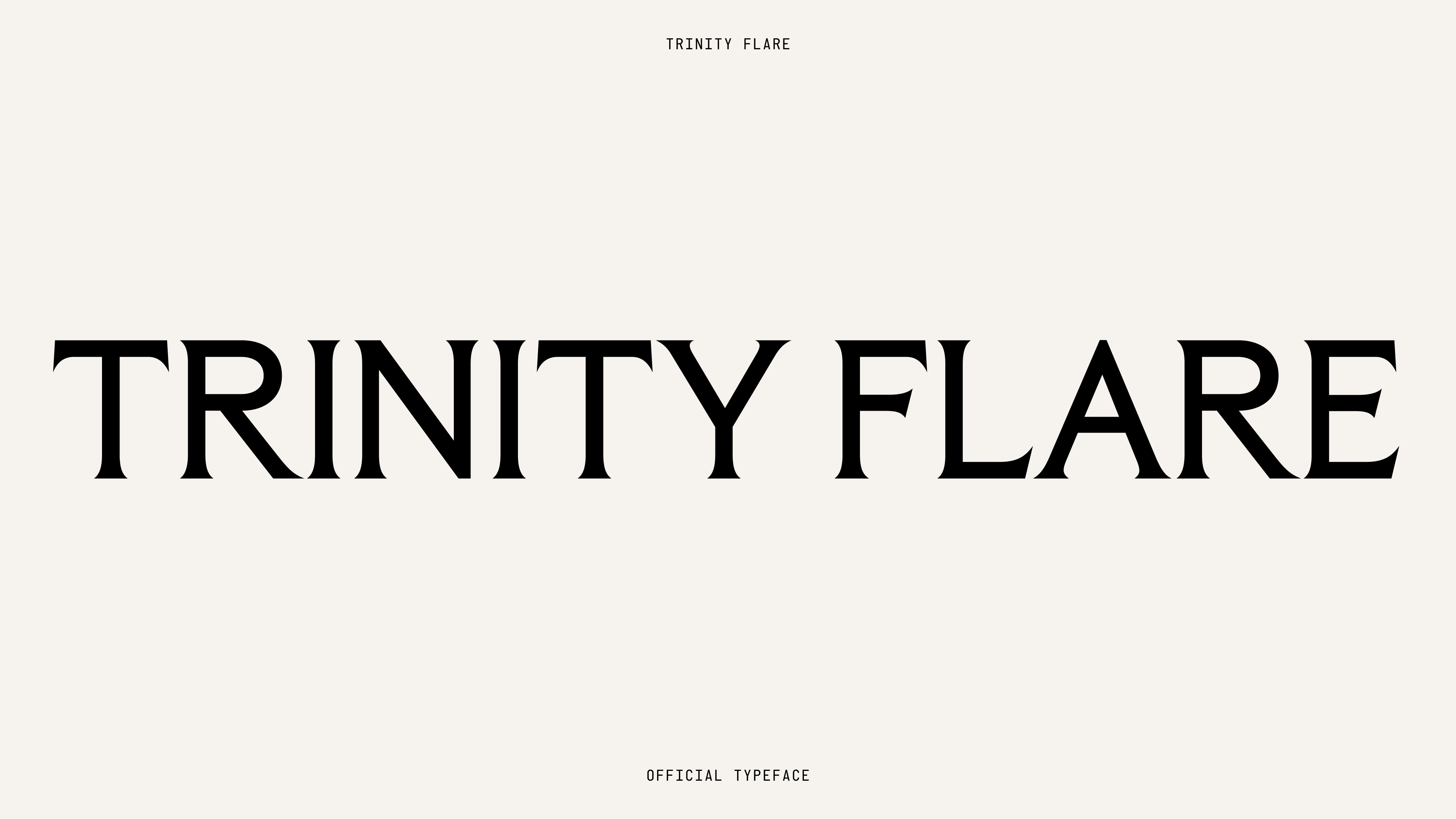
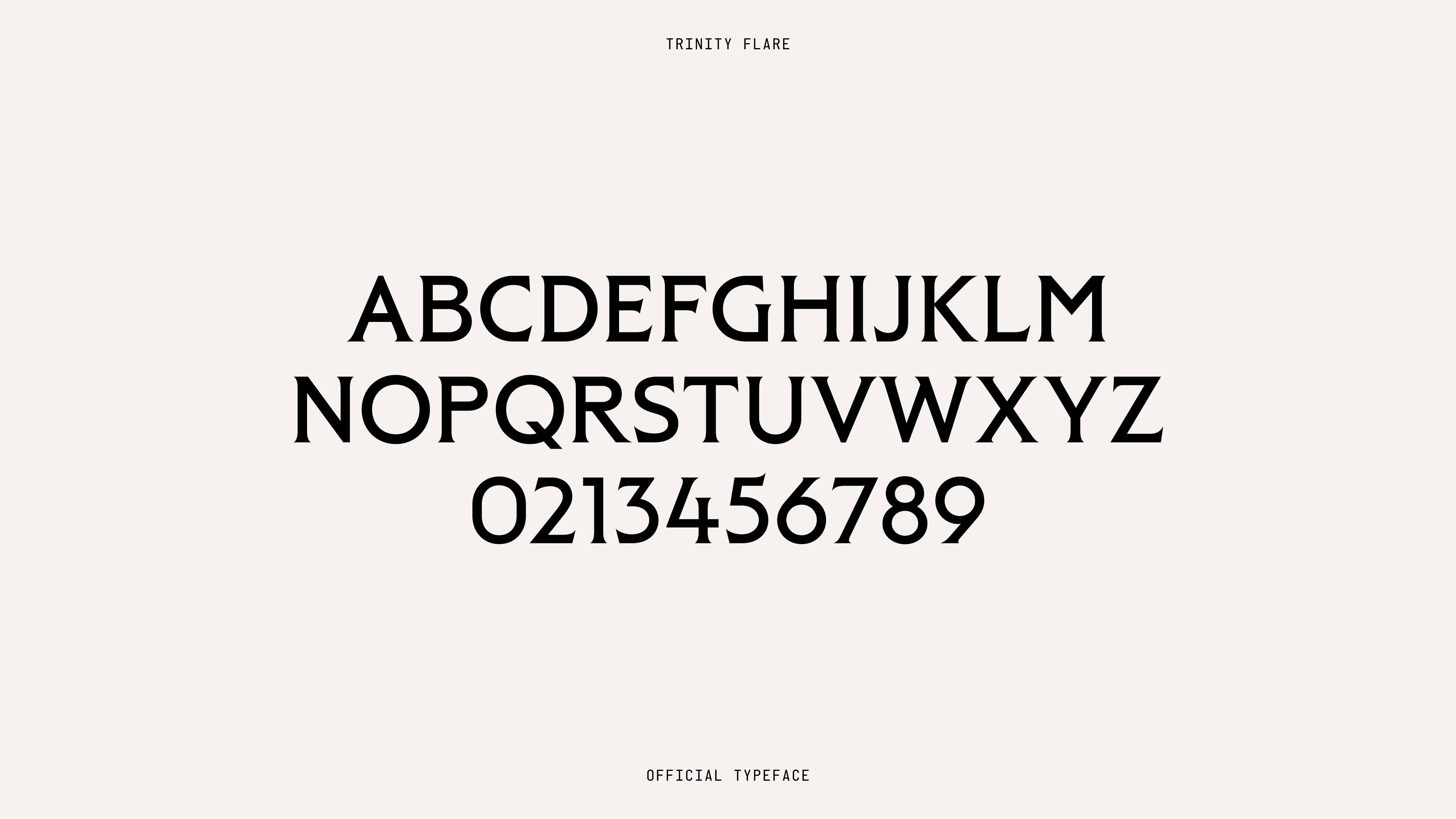
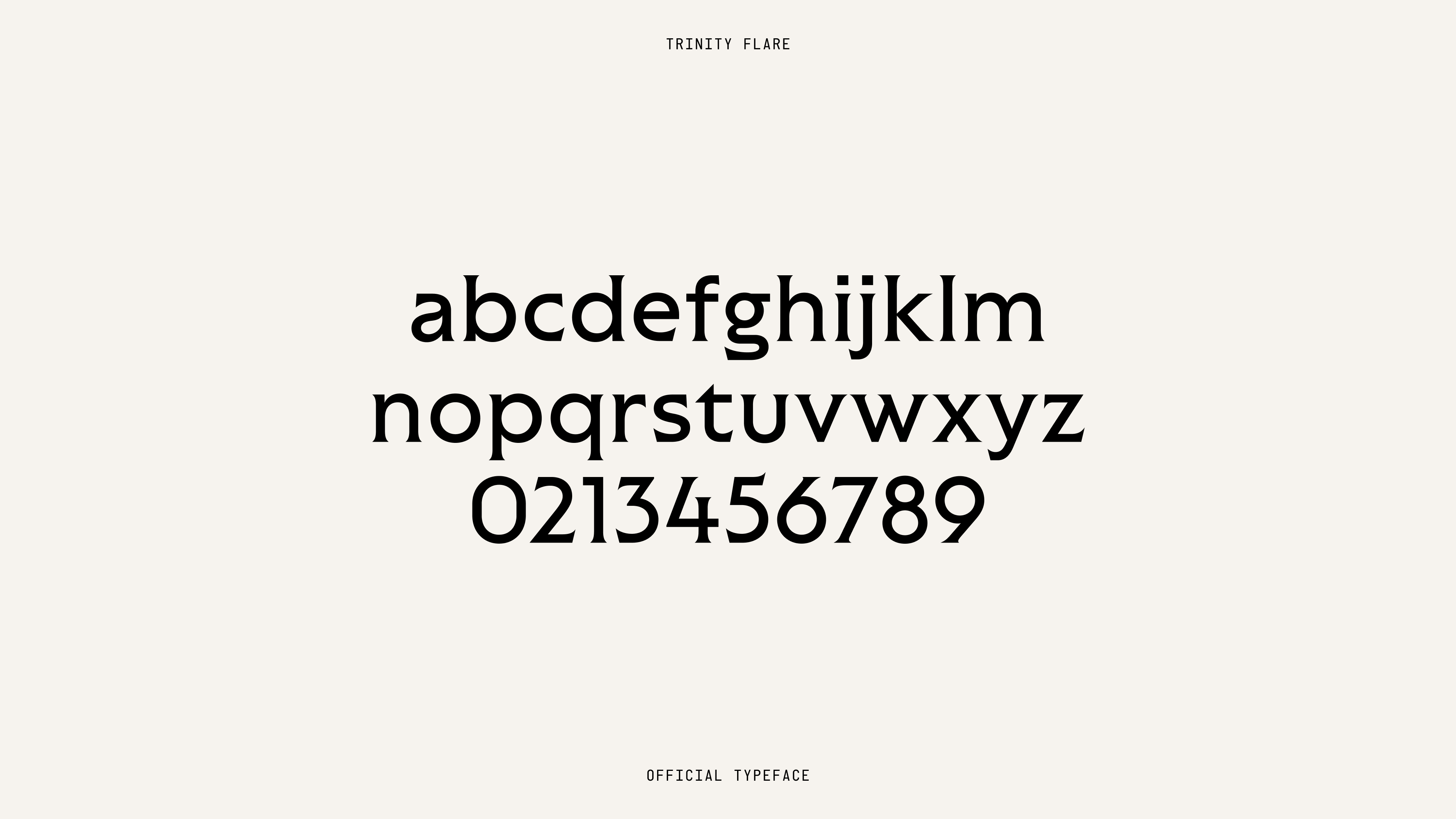
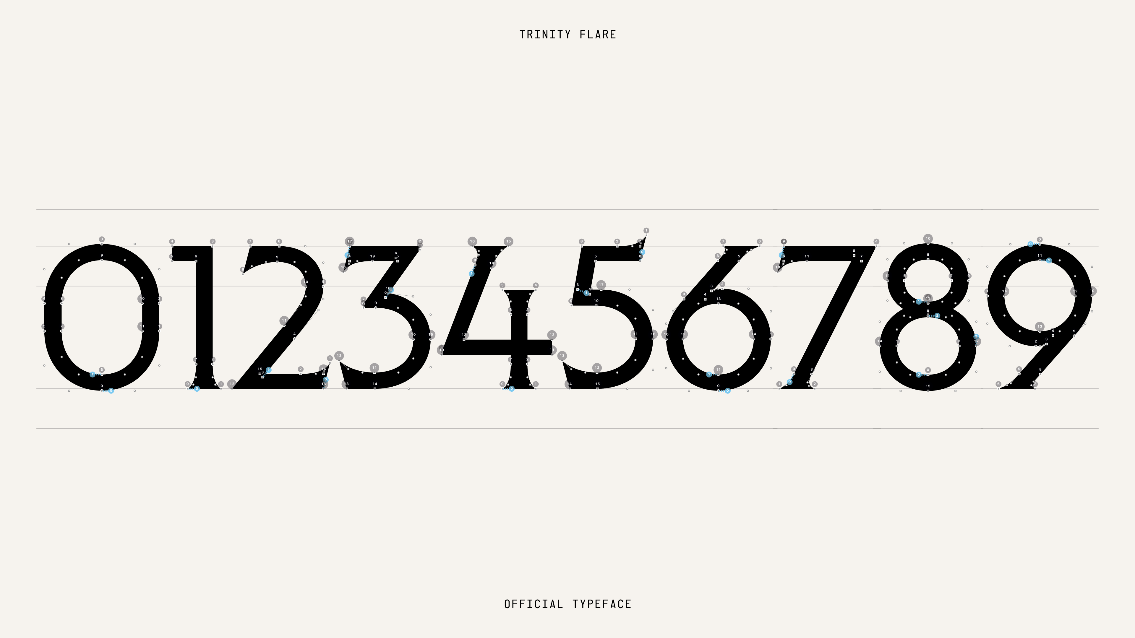
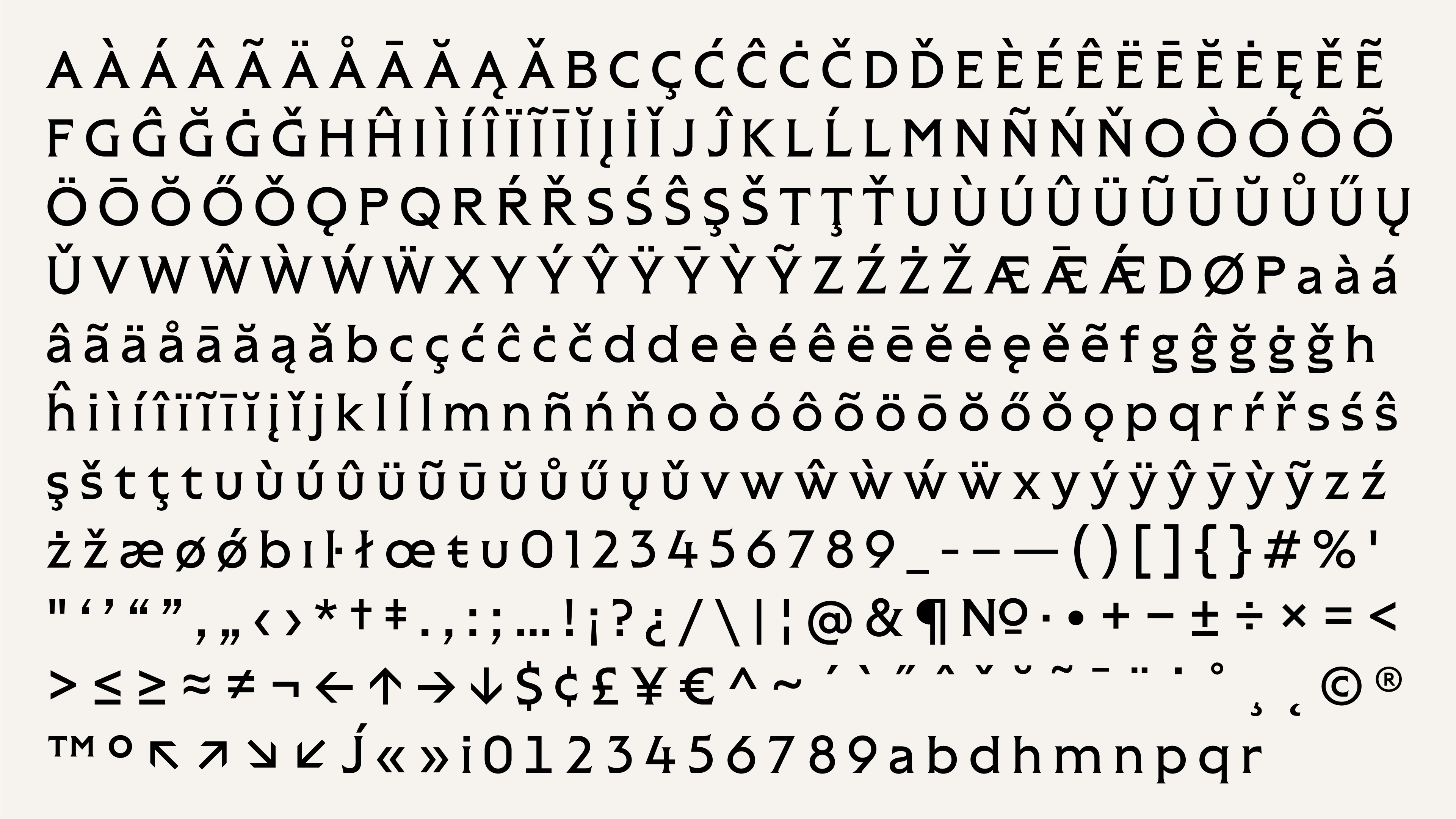
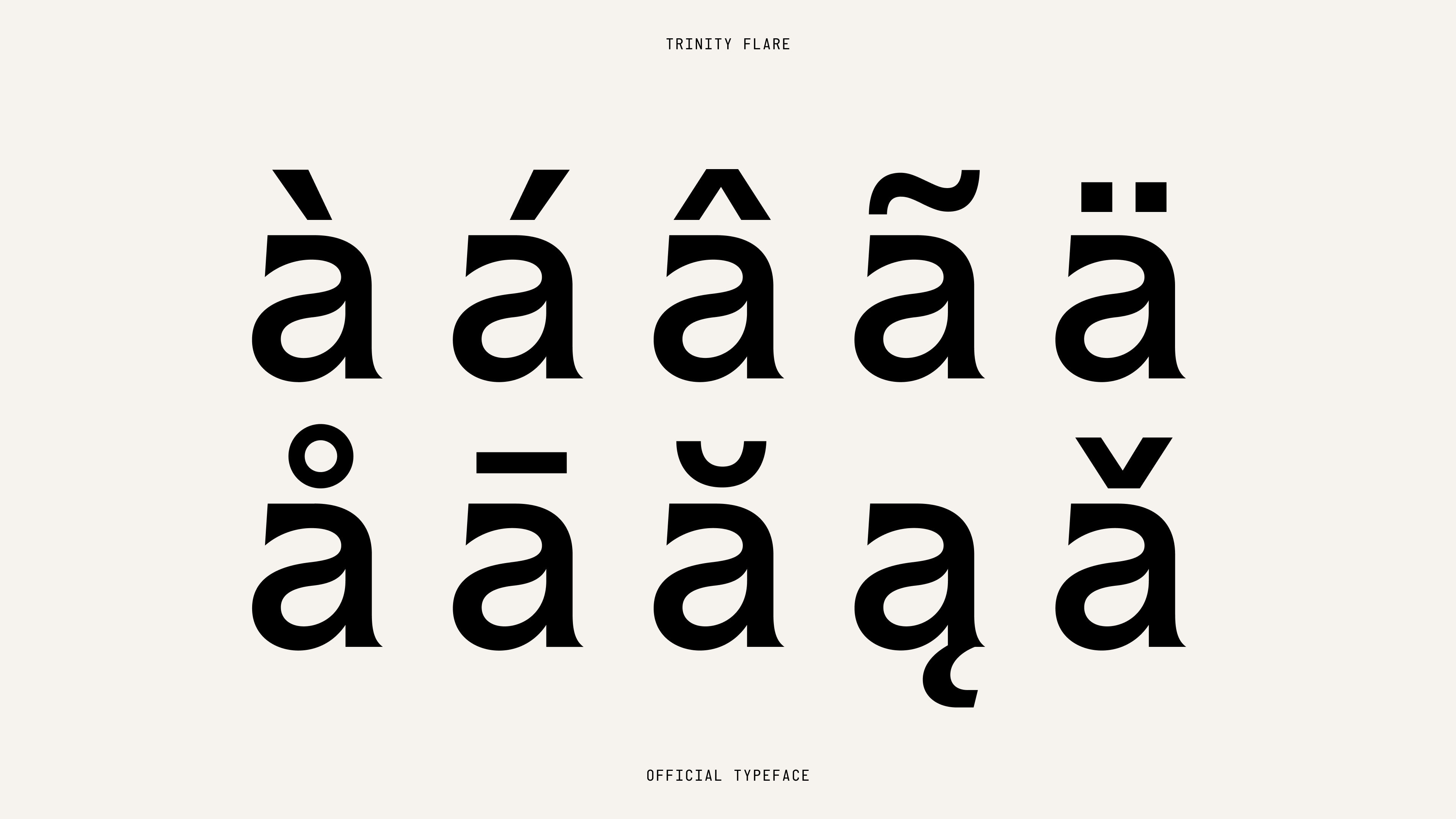
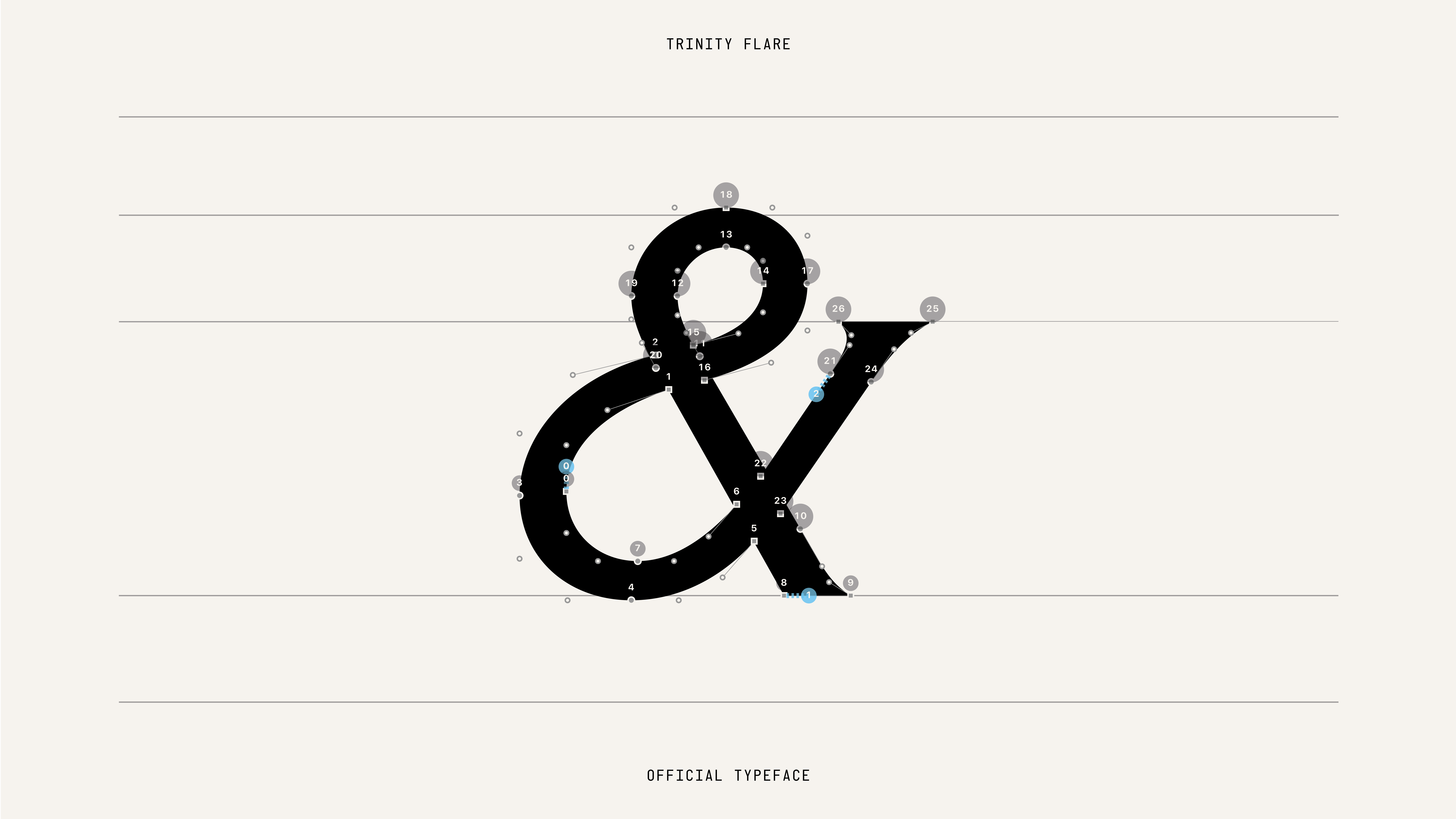
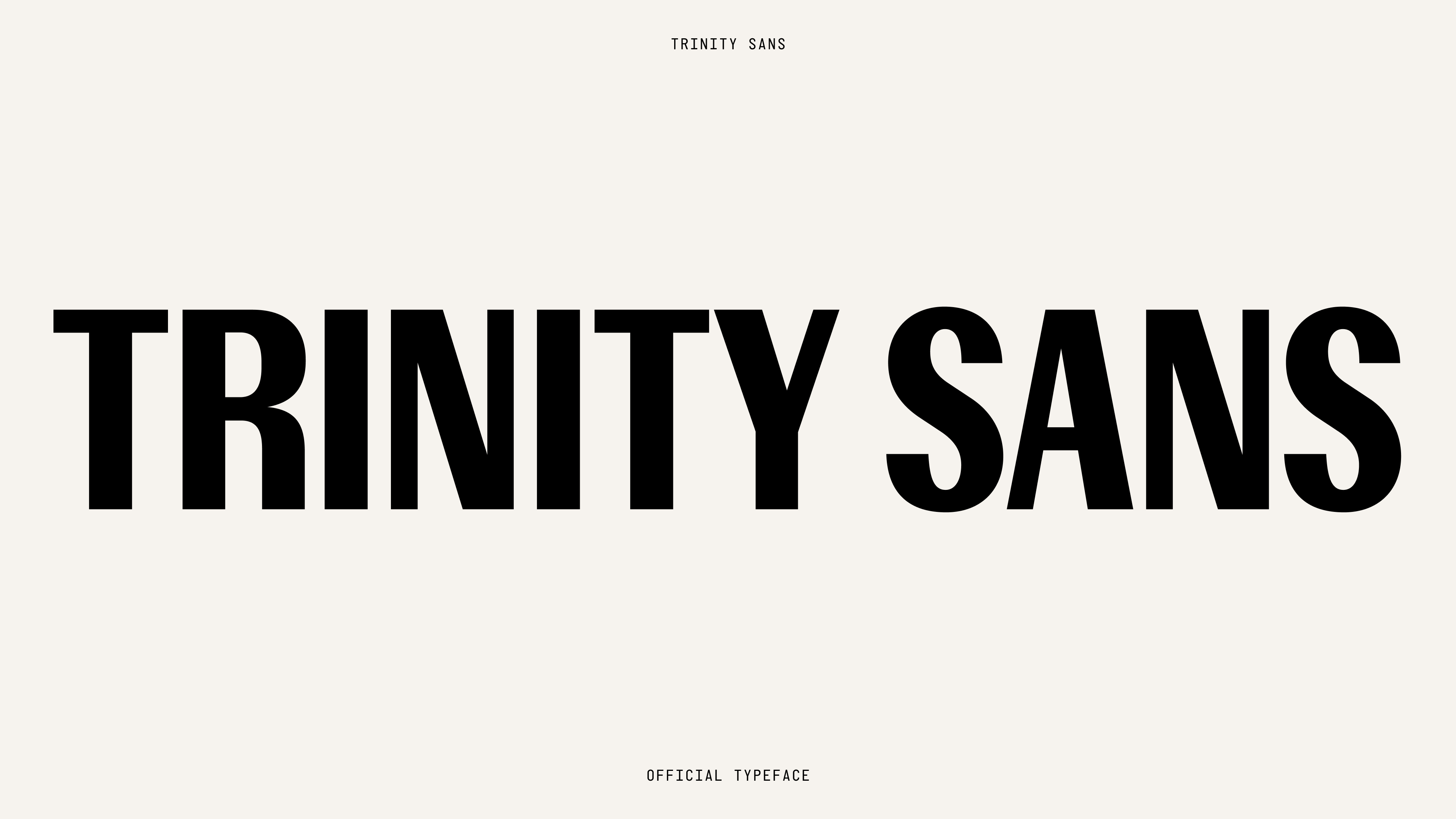
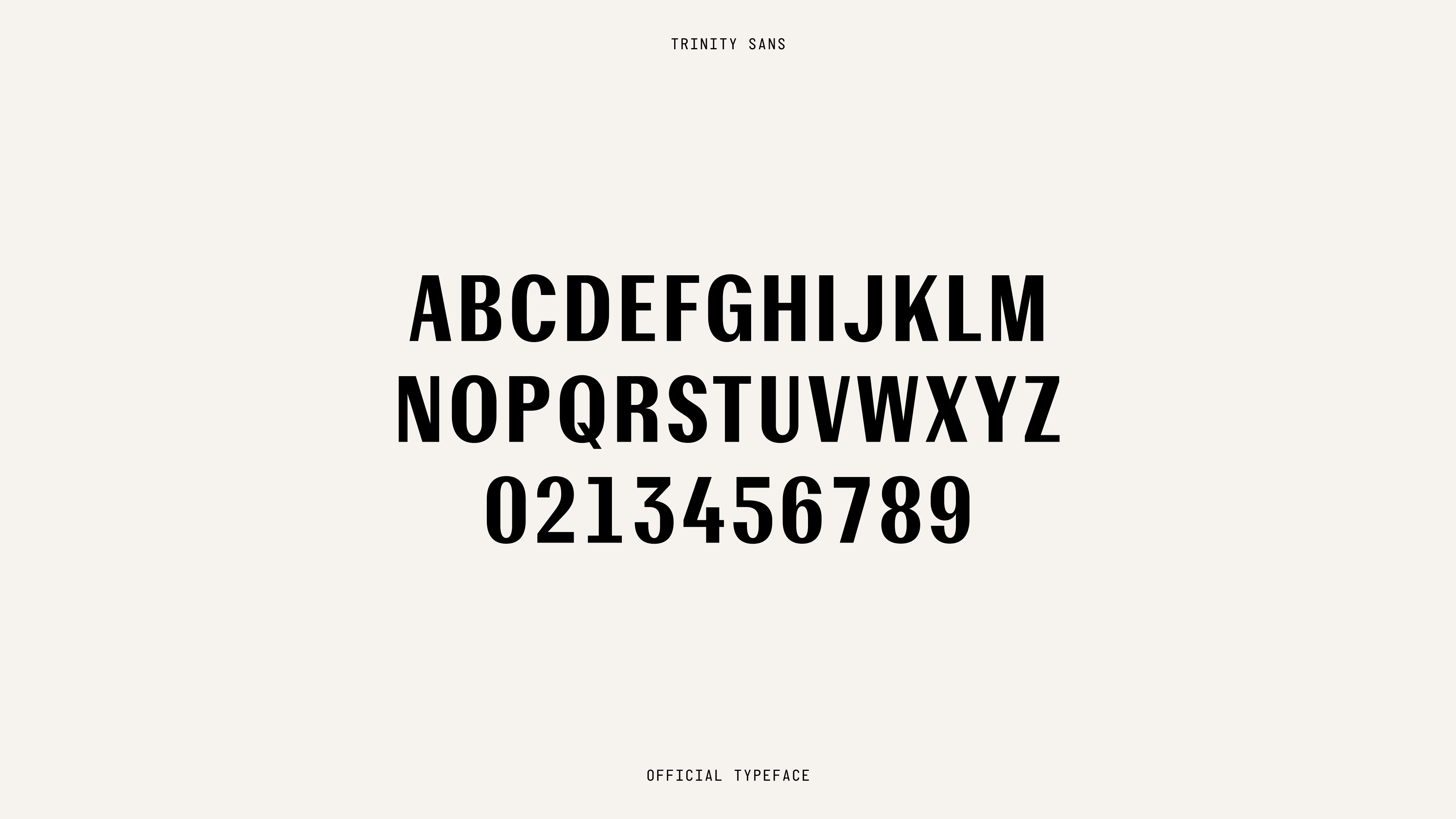
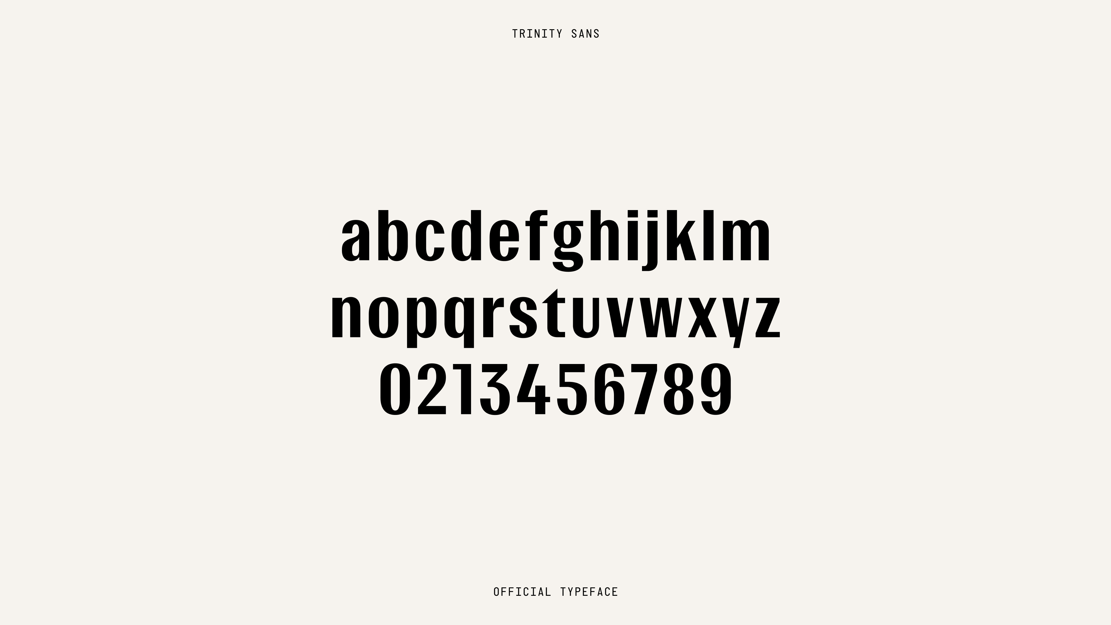
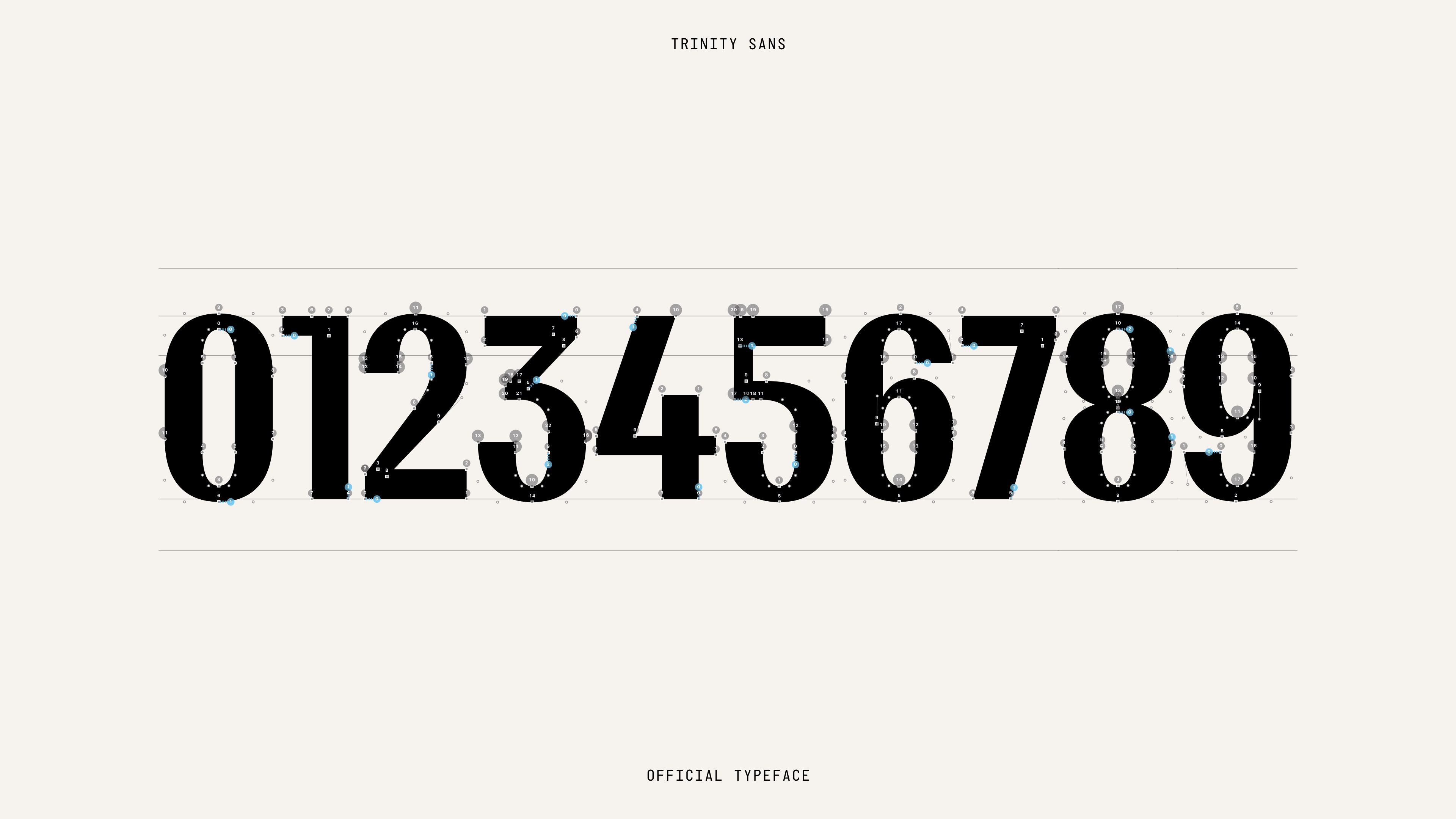
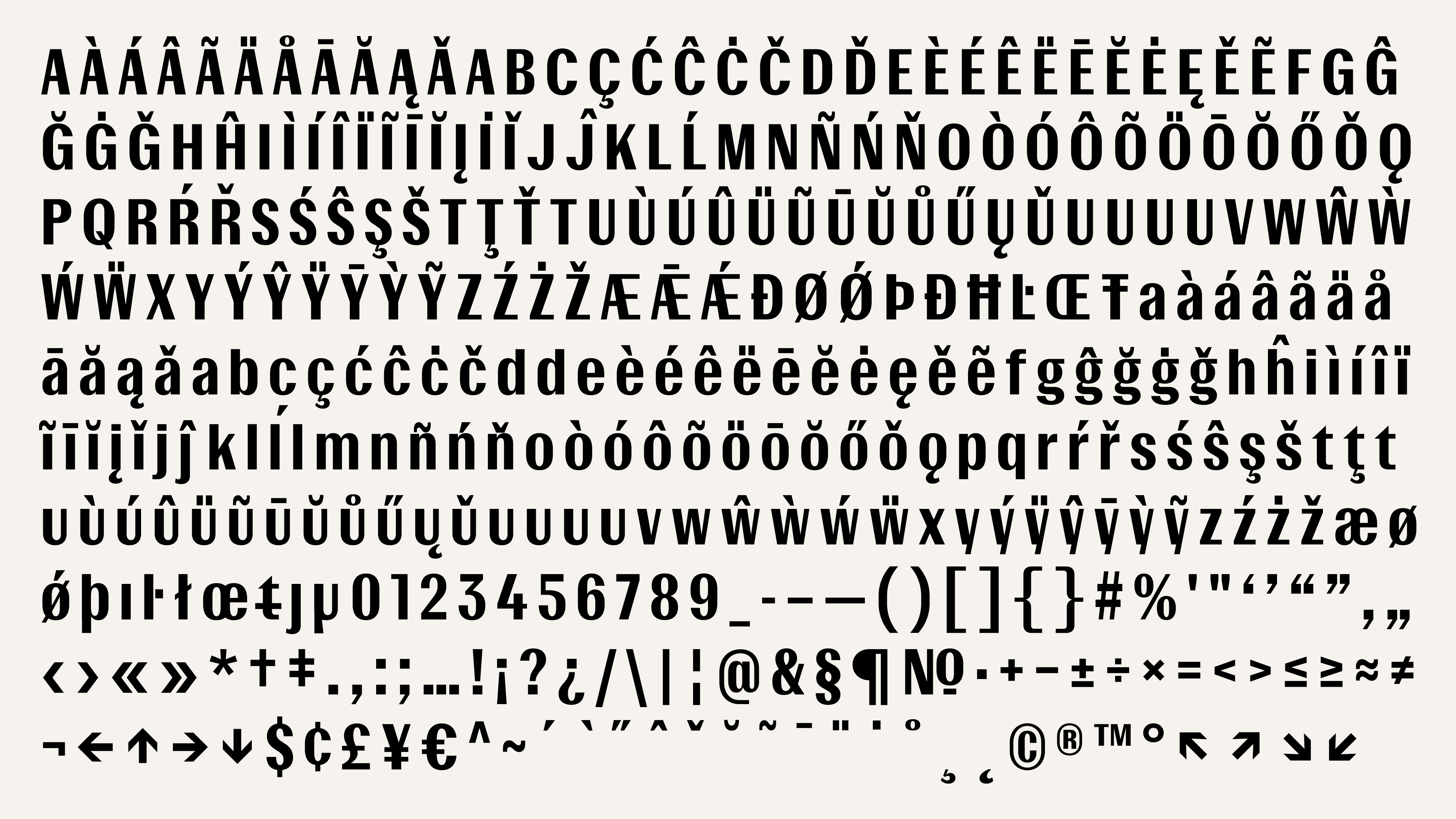
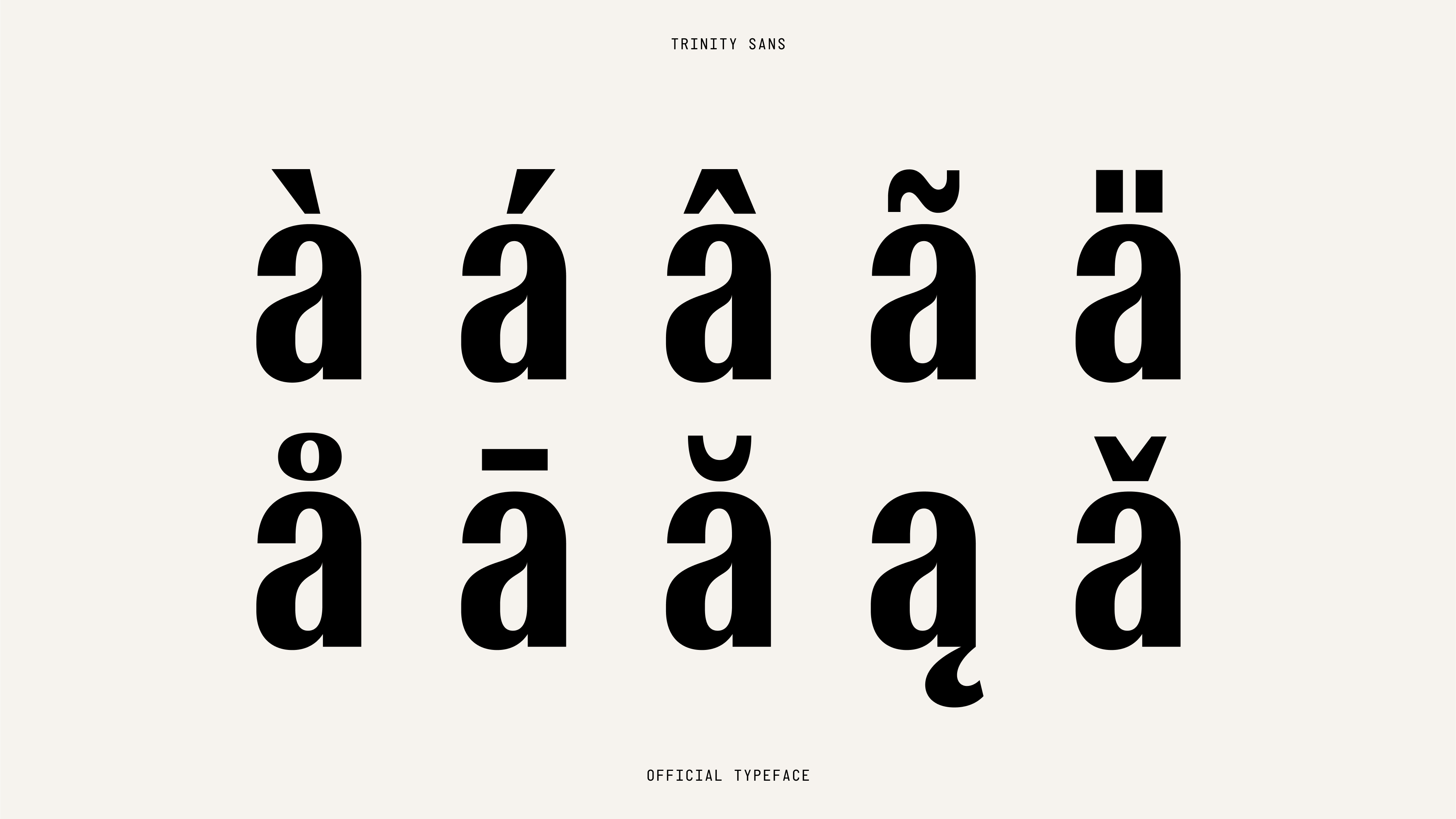
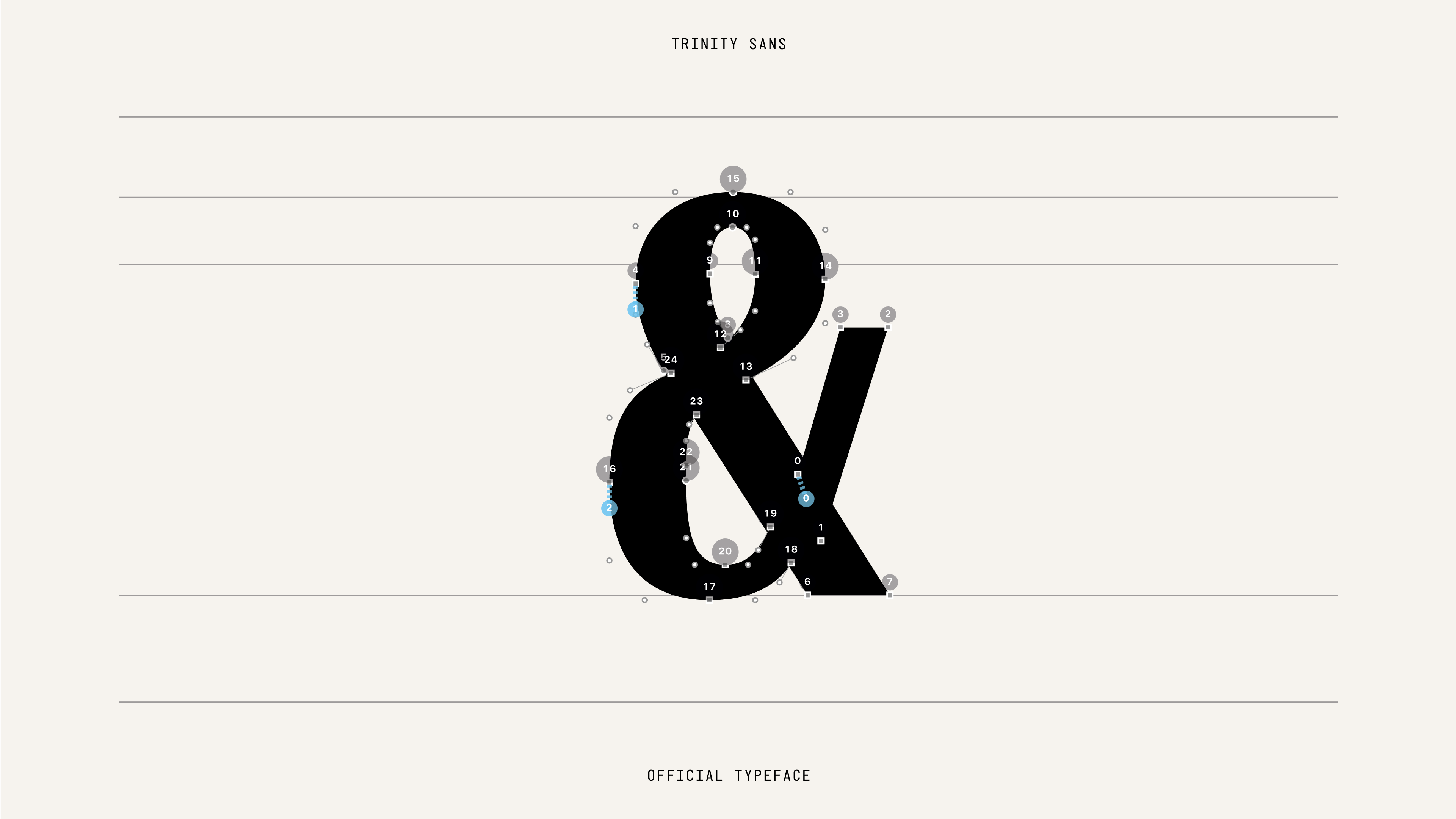
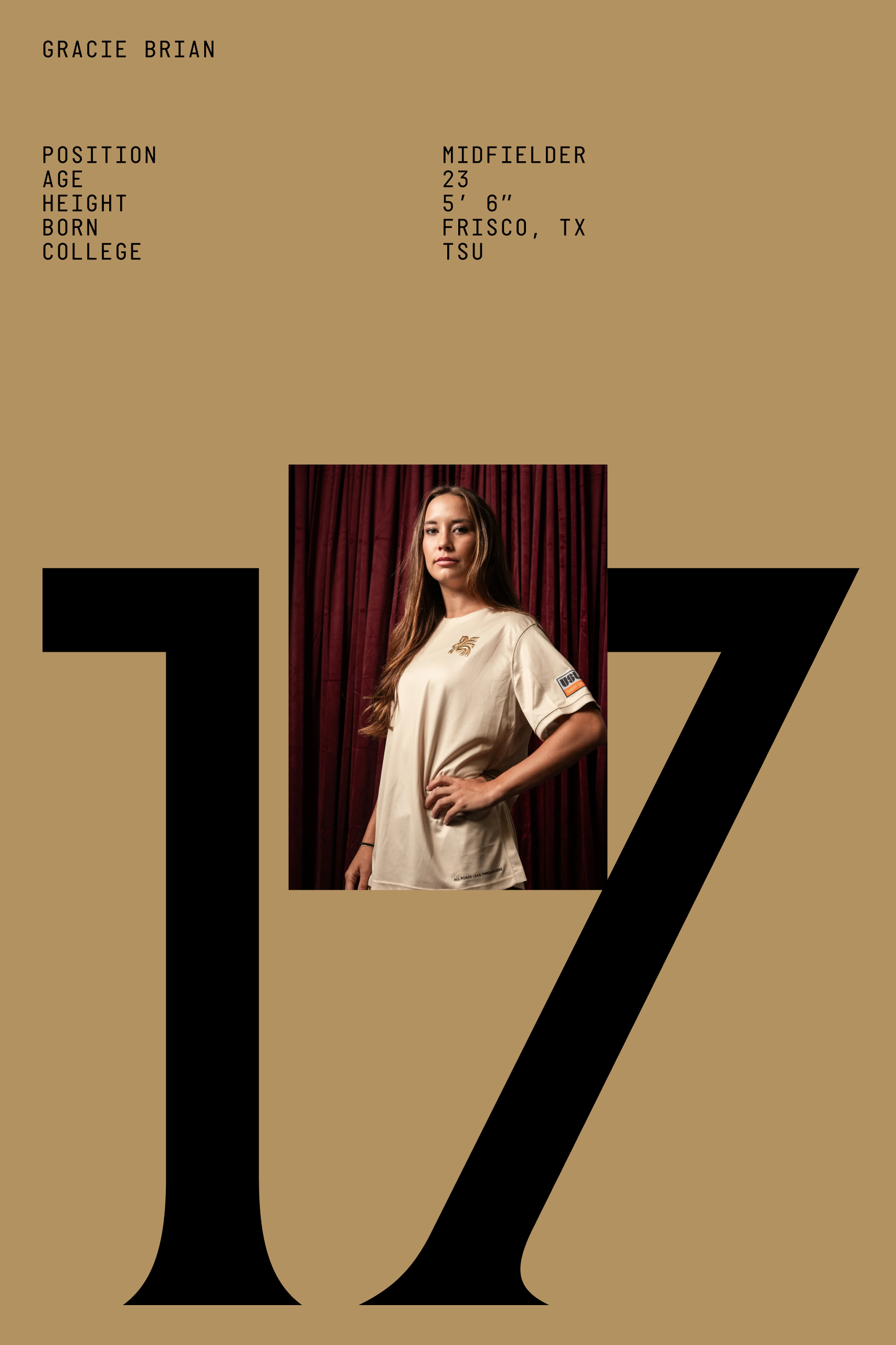
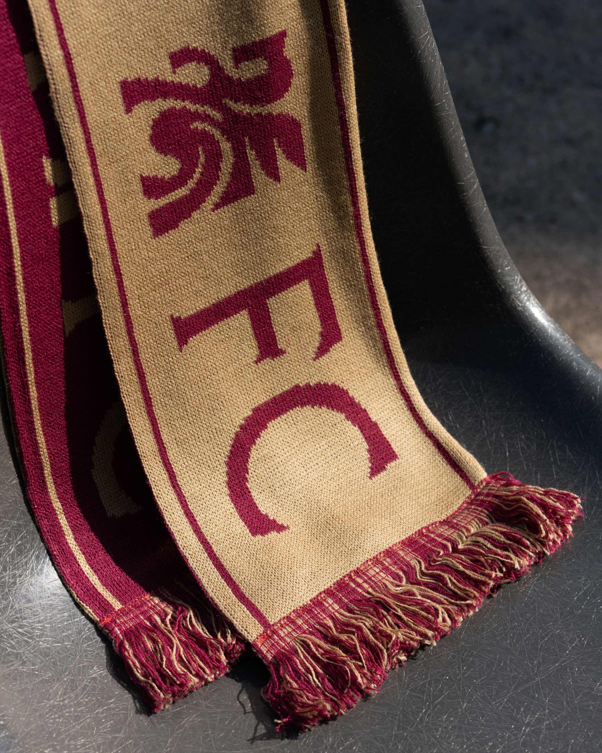
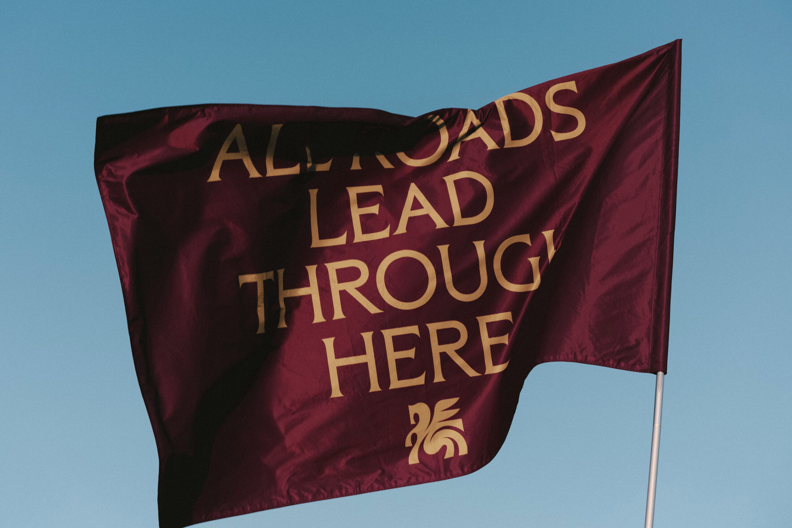
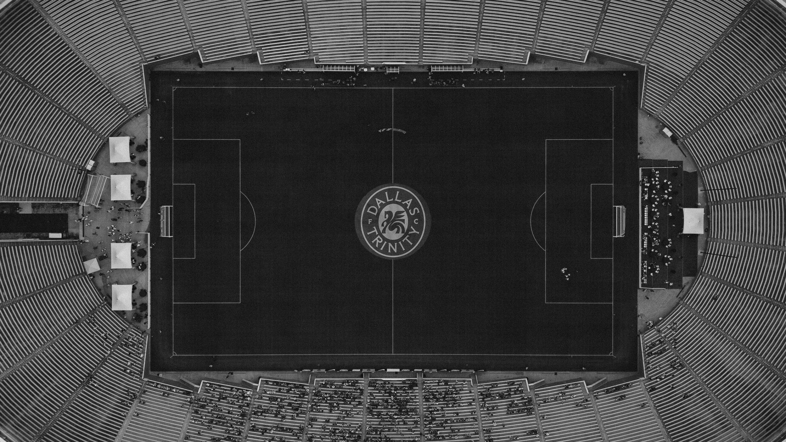
To bring the visual identity to life, we drew inspiration from the team’s inaugural home: the historic Cotton Bowl. Located in Fair Park just east of downtown, the stadium is surrounded by one of the world’s finest collections of art deco architecture. Custom typefaces were designed to echo the bold, timeless forms of the words and letters etched into stone across Fair Park’s iconic buildings.

Dallas Trinity FC represents more than just a team—it’s a testament to the collective determination of a city committed to building a new future for professional women’s sports. It’s a promise to act, to create, and to achieve—not through lofty ambitions but through relentless effort.

Women’s soccer is on the rise, but it’s not America’s Sport until Dallas has a team.


In a city where a different kind of football takes center stage, we partnered with ModestWorks to craft the identity for Dallas's first professional women’s soccer team. The team would be part of the groundbreaking USL Super League, embodying the spirit of Dallas—a city defined by its diversity, ambition, and unwavering passion.

Our brand strategy and story drew inspiration from the people, landmarks, and narratives that have shaped Dallas into what it is today.

The most defining characteristic of Dallas is its approach to potential. This city doesn’t dwell on limitations or indulge in empty promises—it takes action and delivers results. That same relentless attitude would define the team’s presence on the field and guide our creation of its brand identity.

For the team’s name, we sought something deeply rooted in Dallas’s heritage—something that resonated with the city’s history and the rich interplay of its diverse cultures. We found our answer in the Trinity River that winds from the northwest to the southeast through town, serving as a unifying thread in Dallas’s story since its founding in 1841. While the river might lack the glamour often associated with the city, its quiet resilience reflects the resourceful, can-do spirit of Dallas’s people.

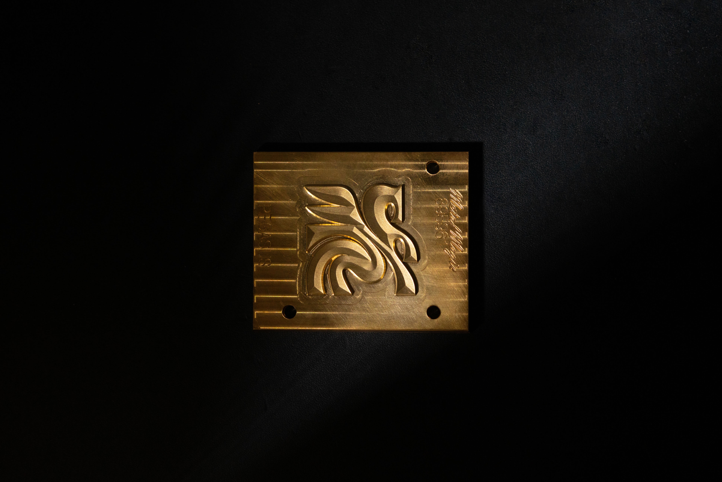
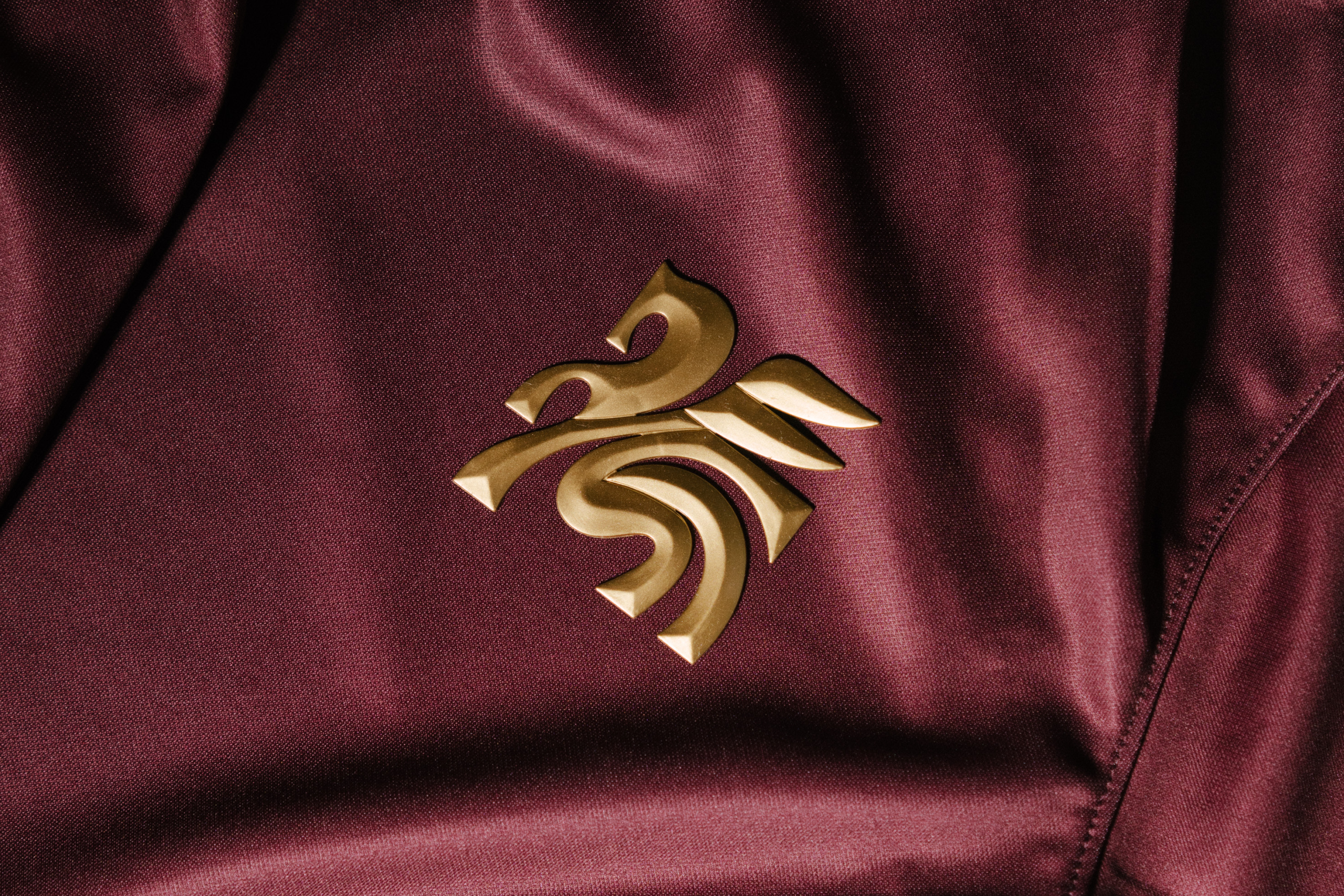
Since the 1930s, a red neon Pegasus has illuminated downtown Dallas from atop the 29-story Magnolia Petroleum Building, standing as a steadfast symbol of the city’s progress, pride, and persistence. We reimagined this iconic figure from Greek mythology in our crest, tying the team’s identity to the rich history of Dallas. This enduring symbol embodies the city’s unyielding spirit—whether you call it grit, entrepreneurial drive, or plain stubbornness, there’s simply no quit in Dallas.

To bring the visual identity to life, we drew inspiration from the team’s inaugural home: the historic Cotton Bowl. Located in Fair Park just east of downtown, the stadium is surrounded by one of the world’s finest collections of art deco architecture. Custom typefaces were designed to echo the bold, timeless forms of the words and letters etched into stone across Fair Park’s iconic buildings.

Dallas Trinity FC represents more than just a team—it’s a testament to the collective determination of a city committed to building a new future for professional women’s sports. It’s a promise to act, to create, and to achieve—not through lofty ambitions but through relentless effort.
Moniker_Trinity_Stack_01
Moniker_Trinity_Pegasus_02_b
Moniker_Trinity_Pegasus_01
Moniker_Trinity_Game_201
Moniker_Trinity_Launch_02
Moniker_Trinity_Launch_01
Moniker_Trinity_Launch_03
Moniker_Trinity_Launch_08
Moniker_Trinity_Launch_05
Moniker_Trinity_Game_202
Moniker_Trinity_Game_01
Moniker_Trinity_Merch_201
Moniker_Trinity_Flag_02
DSC01654-web
Moniker_Trinity_Flag_01
Moniker_Trinity_Game_05
Campaign Photography: Molly Dickson
Team Photography: Sean Berry
Away Photography: Adam Keelan

Contact Overlay

Moniker, Inc.

2169 Folsom Street, M101

San Francisco, CA 94110

JavaScript