Founded in 2007, One Medical set out to create a totally new kind of doctor’s office and primary care experience — one designed with people at the center. As the company grew, expanding into new cities and increasing their services, the visual identity became complex, difficult to use, and failed to reflect the premium experience of the brand.
Moniker worked collaboratively with the internal design team to rebuild One Medical's identity system from the ground up. We began with an extensive brand audit and competitive analysis, identifying key equities in the existing identity and opportunities for expansion. Each element of the identity was then aligned with the company’s focus of delivering people-centered care.
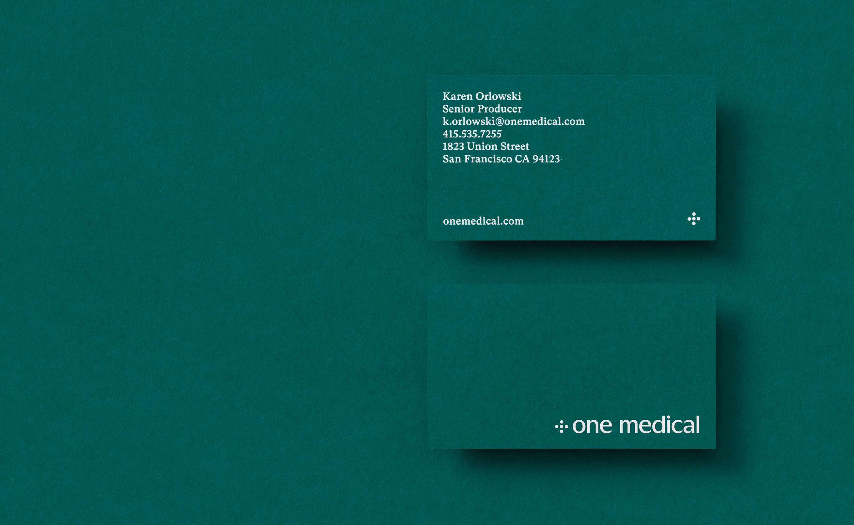
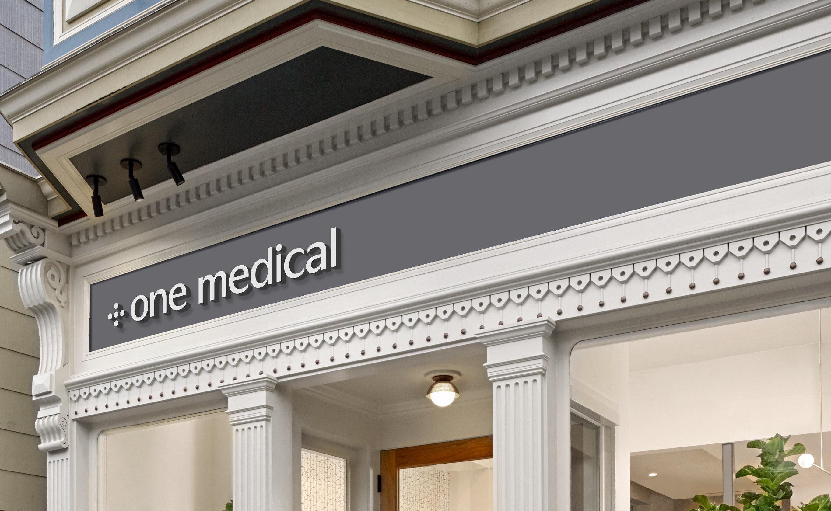
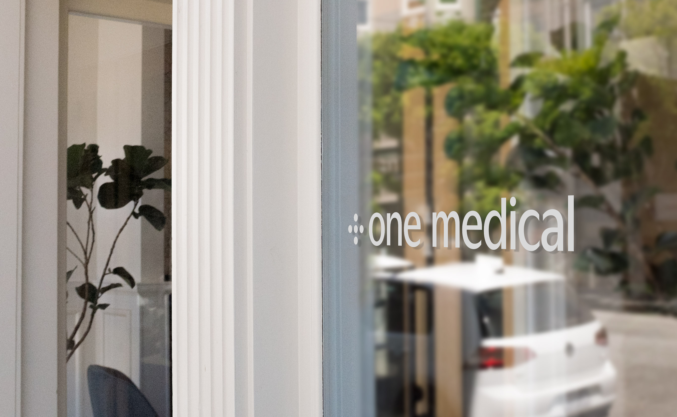
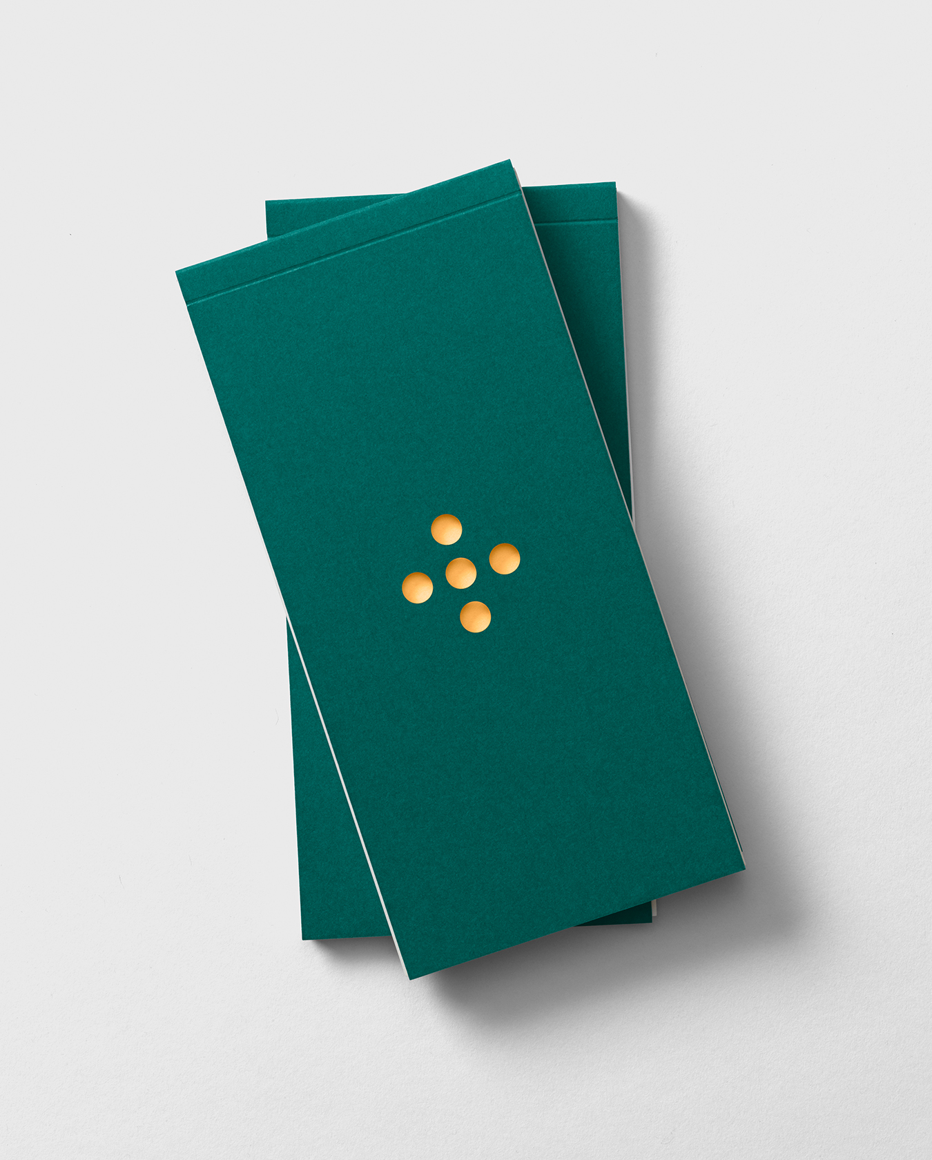
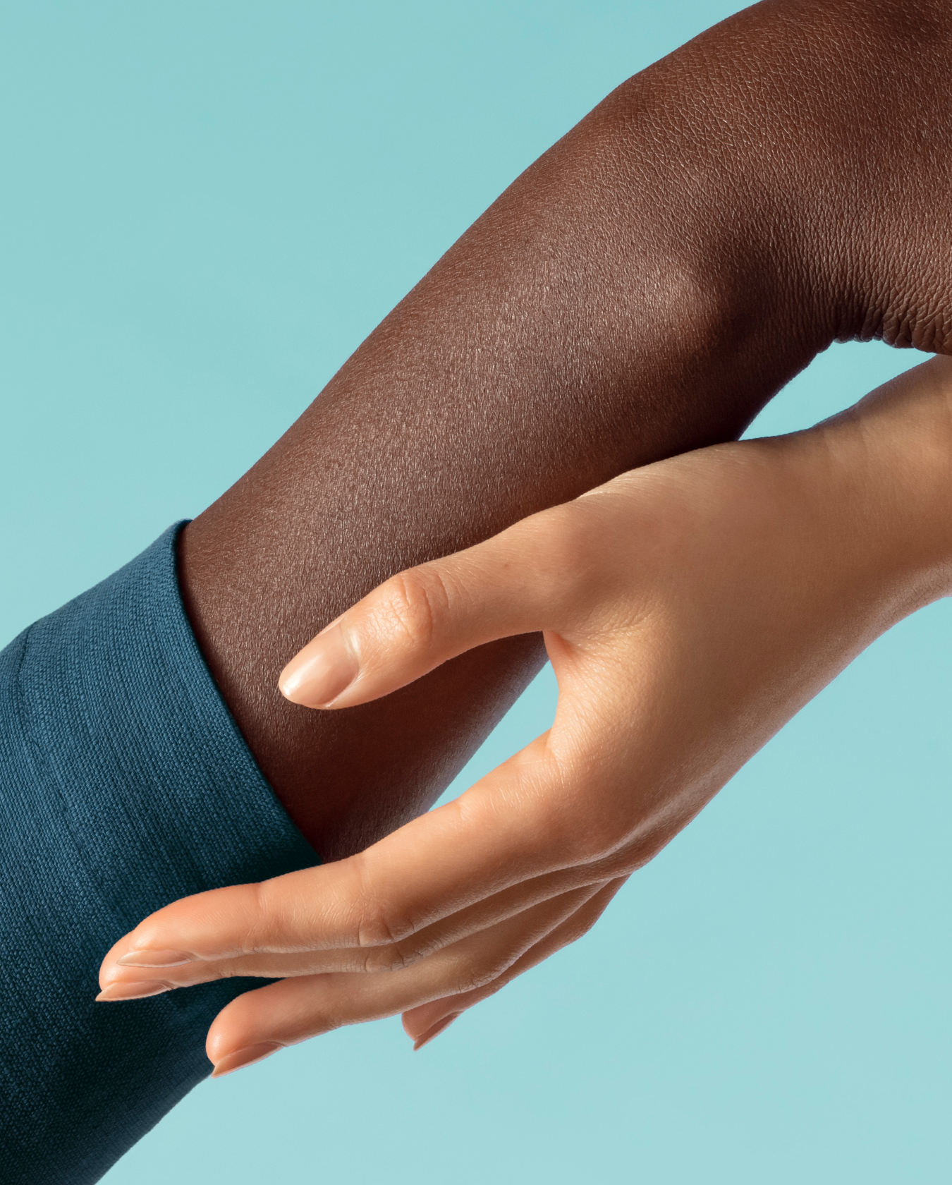
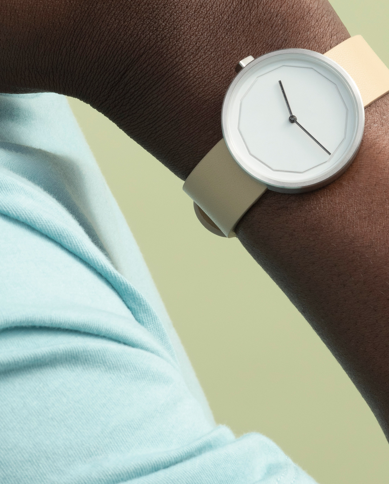
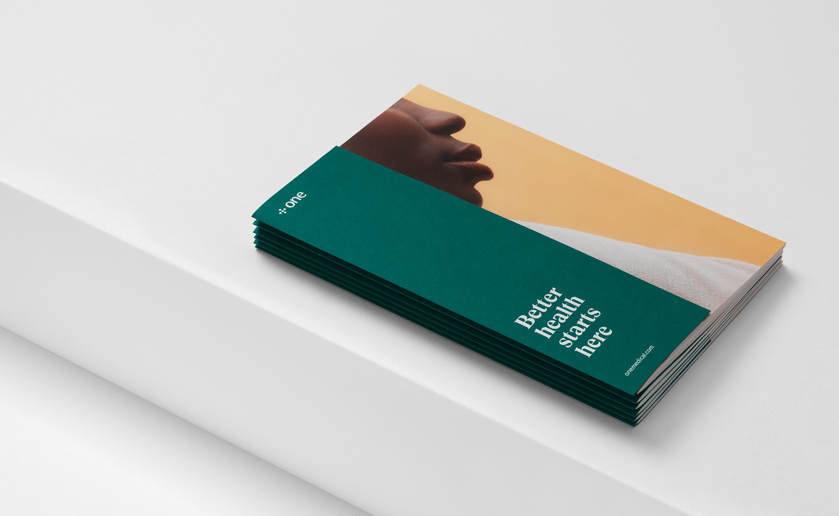
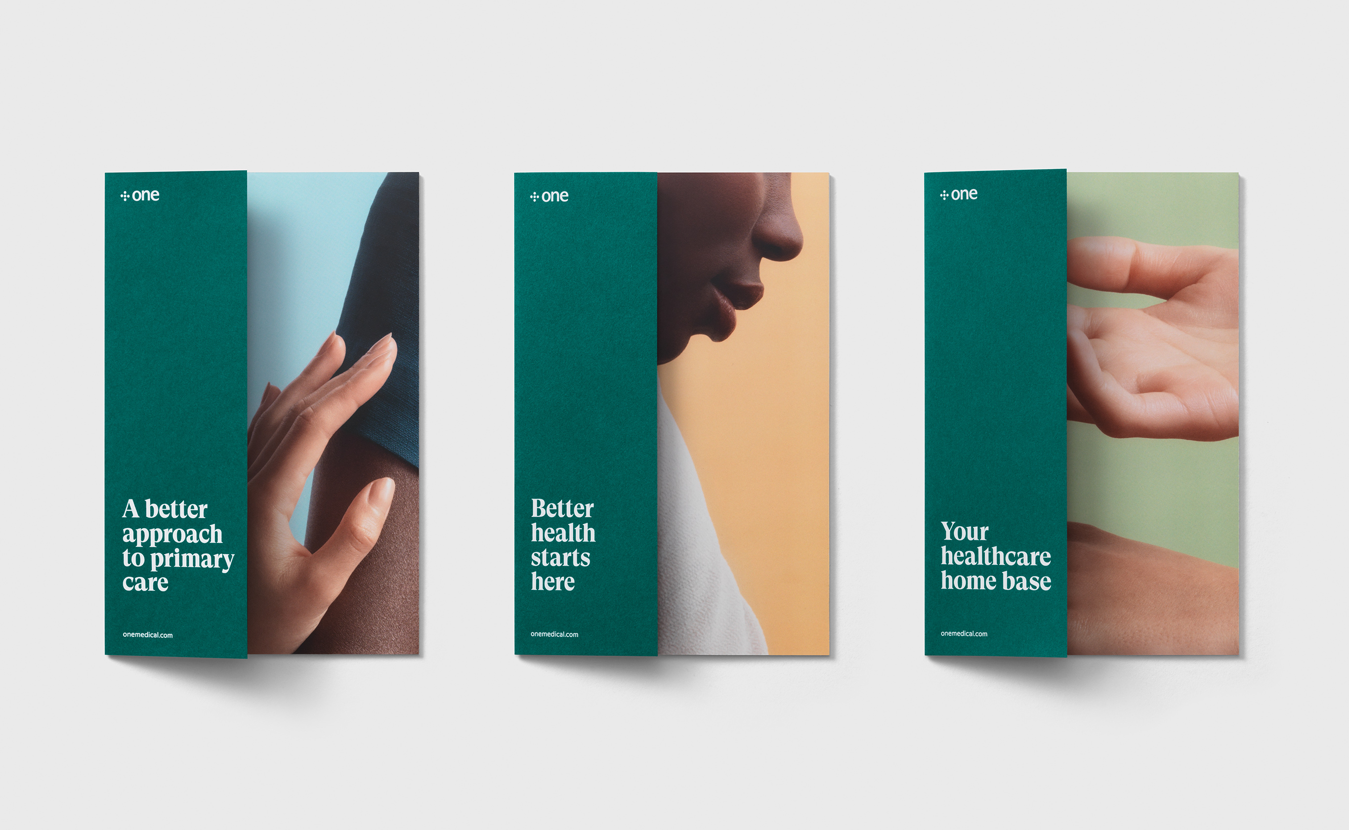
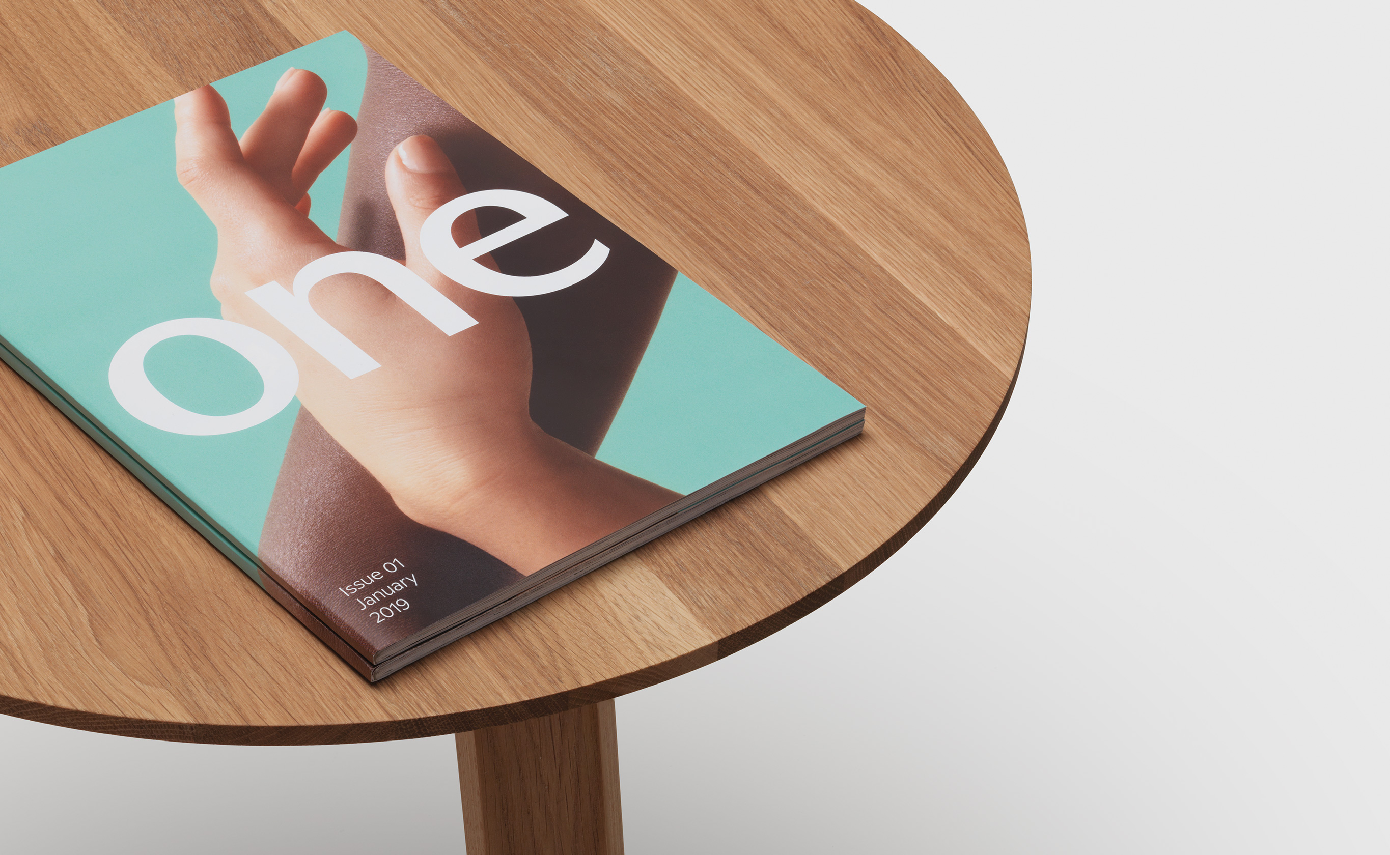
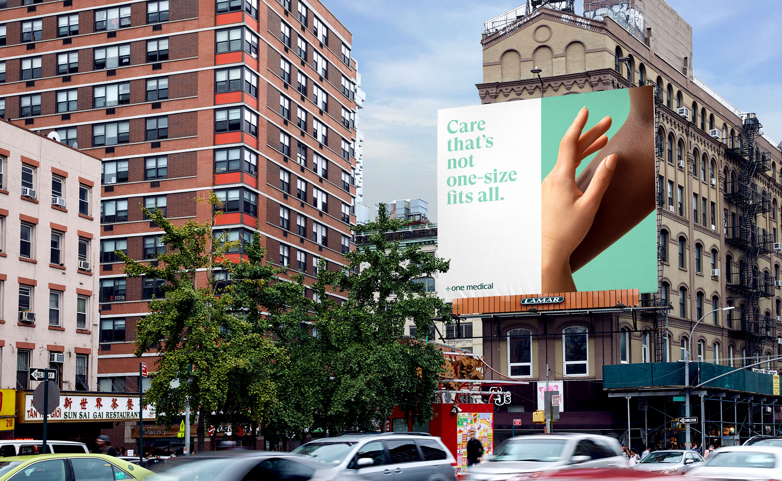
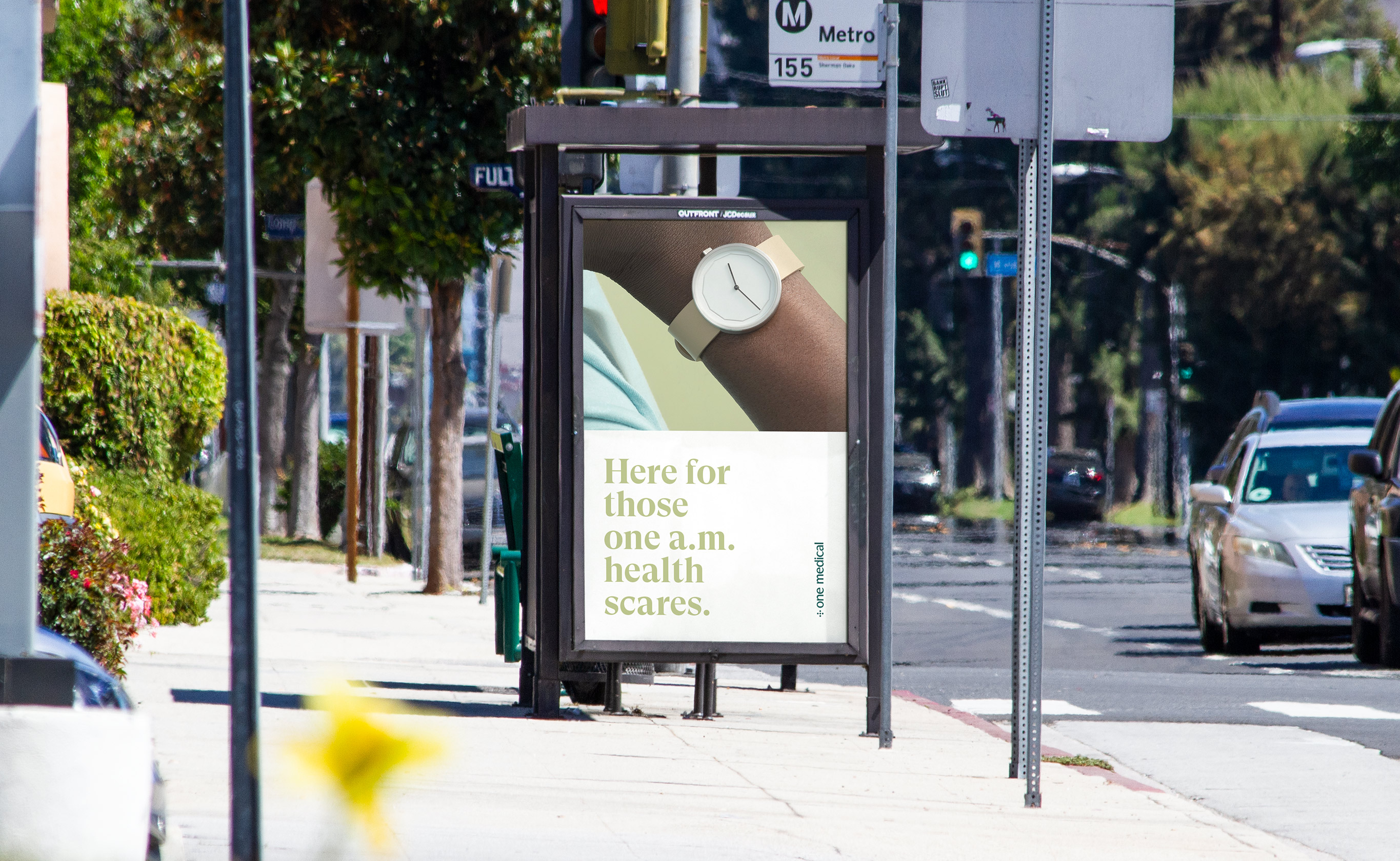
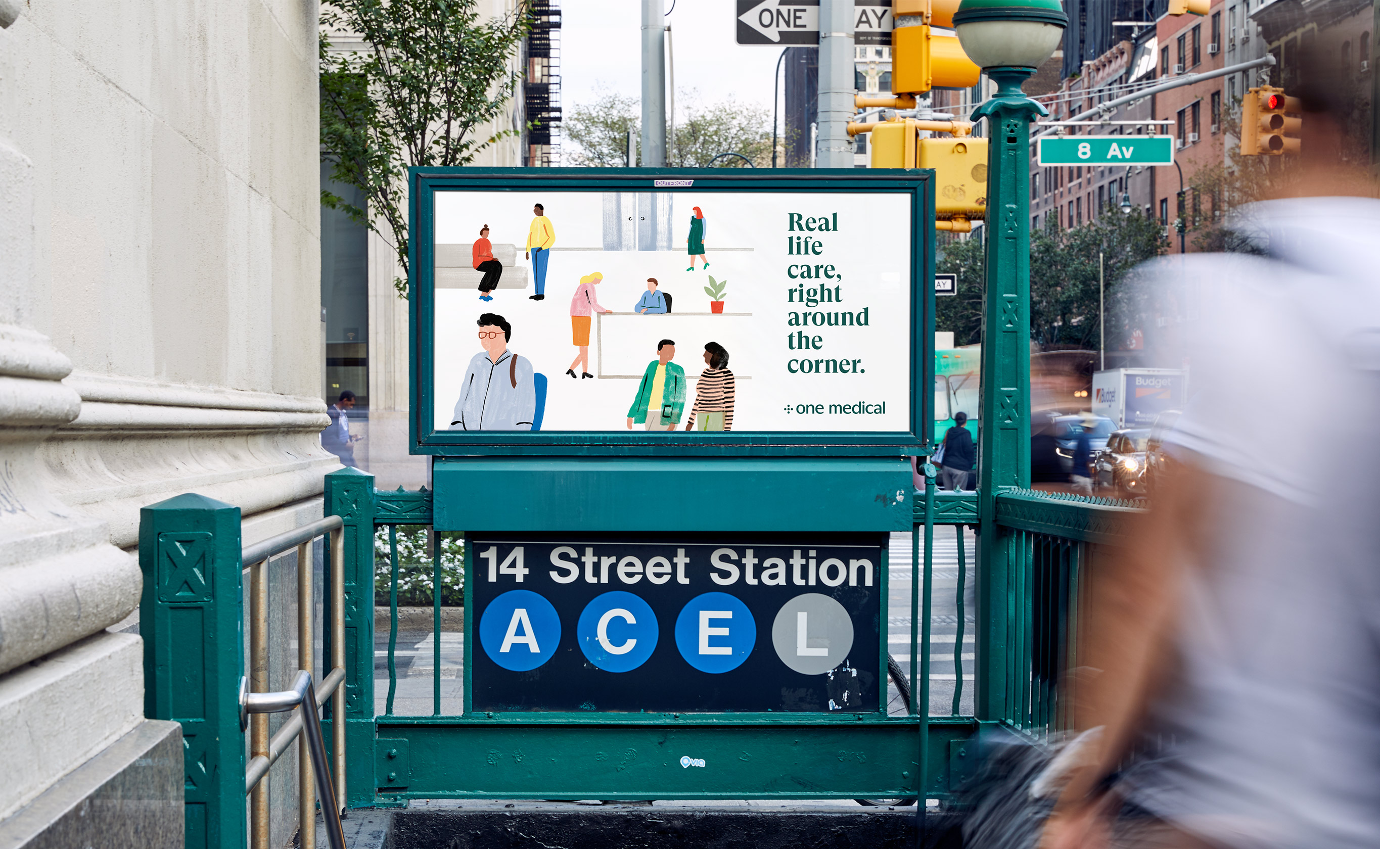
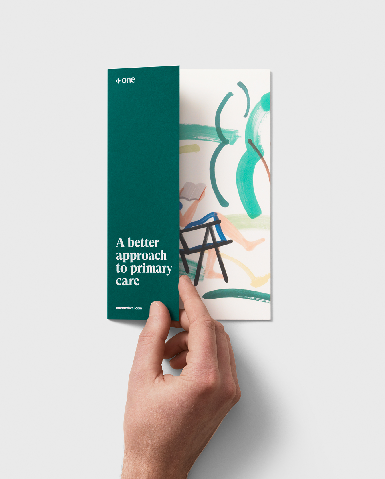
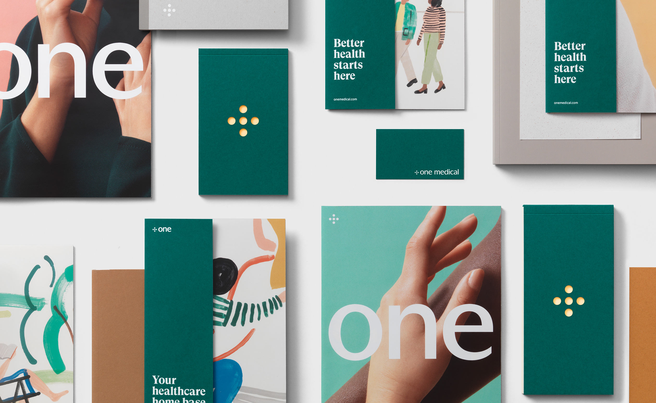
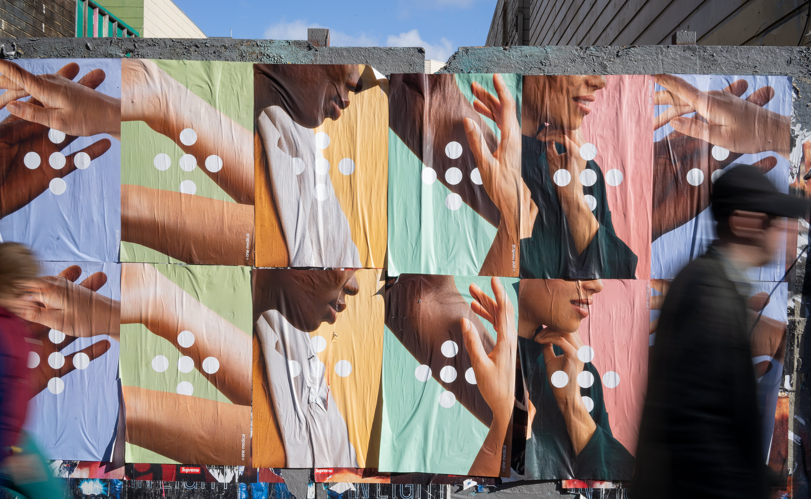
The result is a sophisticated brand that is equally premium and human. A refined logotype, simplified color palette, and expressive typographic system laid the foundation of the brand, while intimate photography of real people and hand-drawn illustrations brought a personal touch to expand the visual system. A comprehensive set of guidelines provided a flexible foundation for the brand to evolve with the company as they expand into new markets and services.
Founded in 2007, One Medical set out to create a totally new kind of doctor’s office and primary care experience — one designed with people at the center. As the company grew, expanding into new cities and increasing their services, the visual identity became complex, difficult to use, and failed to reflect the premium experience of the brand.
Moniker worked collaboratively with the internal design team to rebuild One Medical's identity system from the ground up. We began with an extensive brand audit and competitive analysis, identifying key equities in the existing identity and opportunities for expansion. Each element of the identity was then aligned with the company’s focus of delivering people-centered care.
The result is a sophisticated brand that is equally premium and human. A refined logotype, simplified color palette, and expressive typographic system laid the foundation of the brand, while intimate photography of real people and hand-drawn illustrations brought a personal touch to expand the visual system. A comprehensive set of guidelines provided a flexible foundation for the brand to evolve with the company as they expand into new markets and services.


Credits
Moniker: Visual Identity System, Art Direction, Brand Guidelines
Dinamo: Logotype
Grilli Type: Custom GT Super Typeface
Michael O'Neal: Photography
Charlotte Trounce: Illustration
Credits
Moniker: Visual Identity System, Art Direction, Brand Guidelines
Dinamo: Logotype
Grilli Type: Custom GT Super Typeface
Michael O'Neal: Photography
Charlotte Trounce: Illustration
Contact Overlay
JavaScript