Atlético Dallas

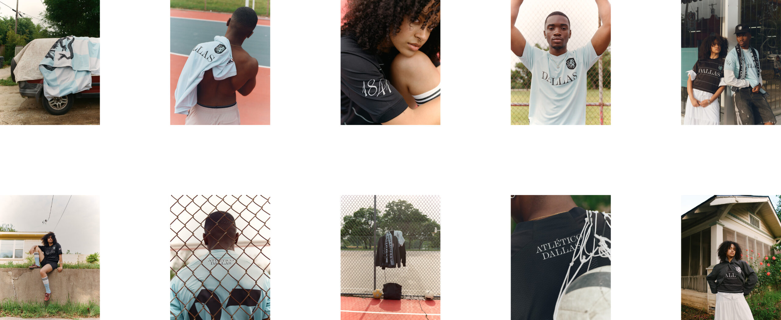
Launching in 2027, Atlético Dallas will join the USL Championship—a league reshaping professional soccer in the United States. Developed by Moniker in partnership with ModestWorks, the club was built to capture the heart of Dallas: diverse, ambitious, and united by a love for the game.

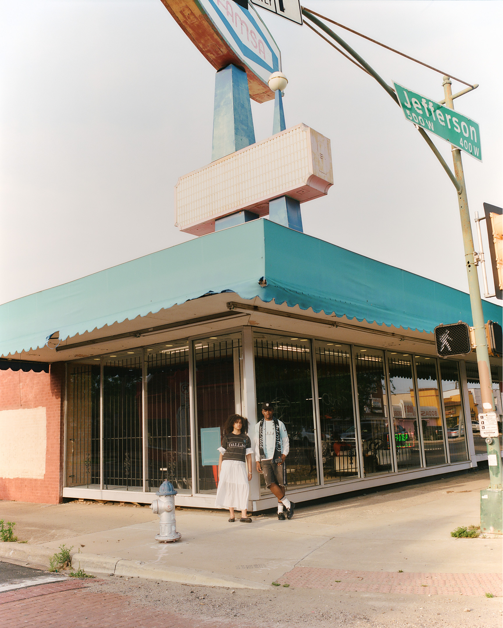
Dallas is already defined by its mix of cultures and constant motion. The challenge was to create a club that felt like it had always been part of the city. A club with an identity that belongs to Dallas, but could stand confidently alongside the greats of world football.

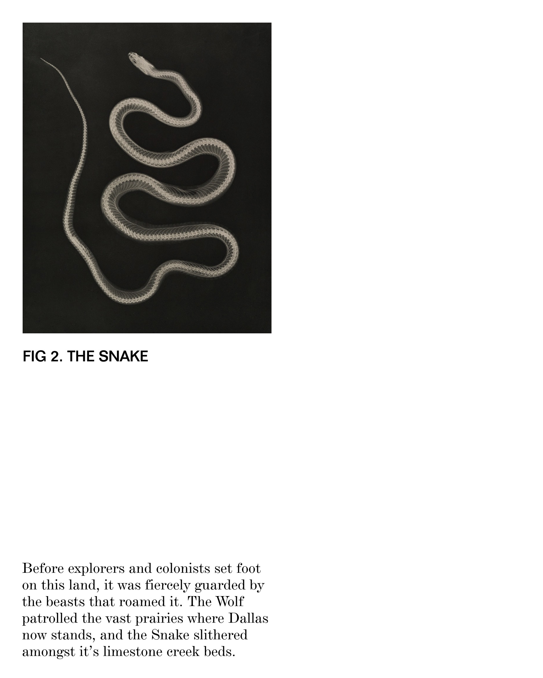
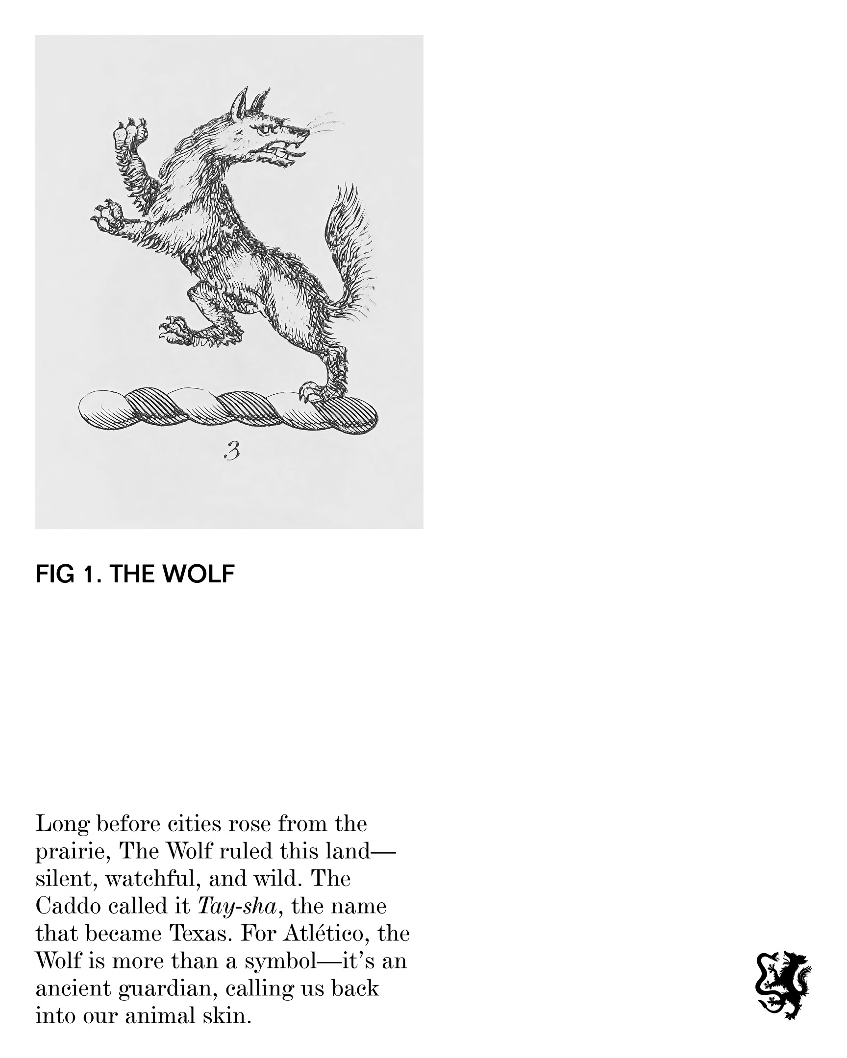
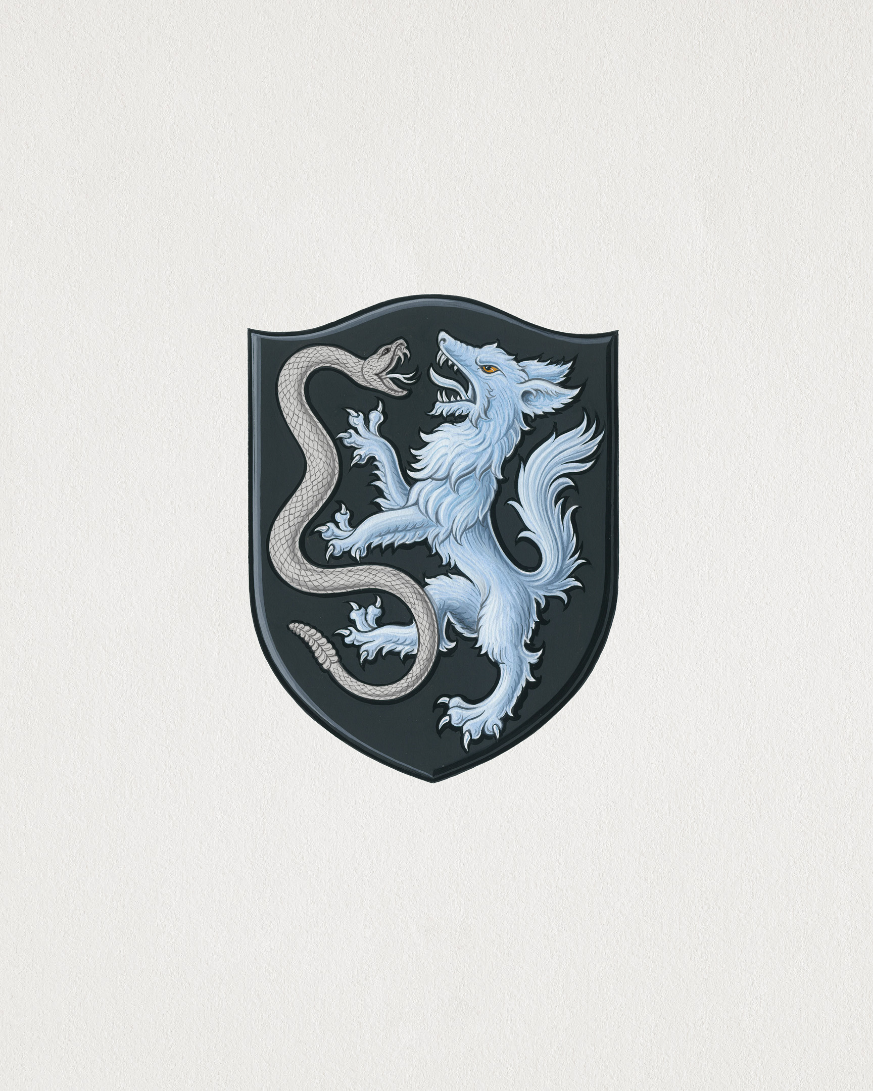
Before design came story. In researching the origins of Dallas, we discovered traces of myth that predated the city itself, tales of wild creatures that ruled the plains before it was mapped and settled. From that landscape came the legend of the Wolf and the Snake. The Wolf, once the apex predator of North Texas, represented courage and command. The Rattlesnake, quiet but deadly, represented patience and precision. Their rivalry was as much about domination as it was about respect.

That story became the foundation of the brand. Two forces, equal and opposite, locked in perpetual battle. The legend gave Atlético Dallas something few modern clubs have: a myth that connects the past to present, city to symbol.

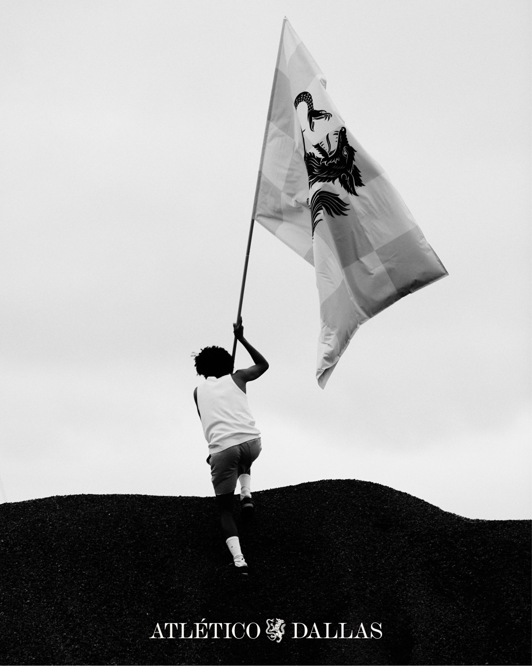
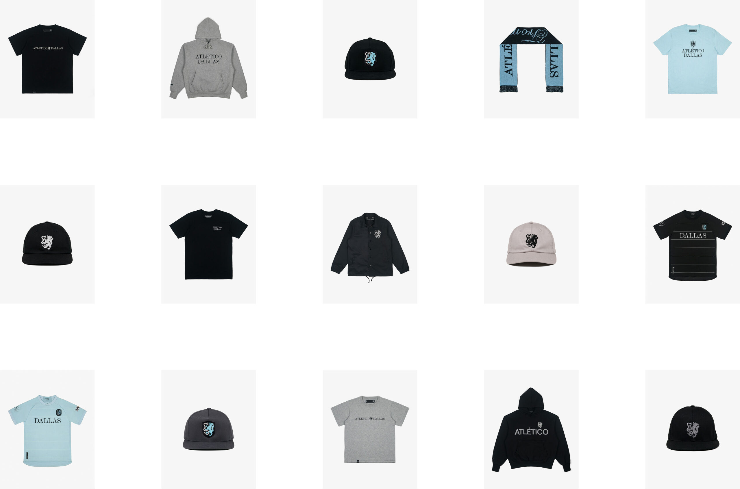
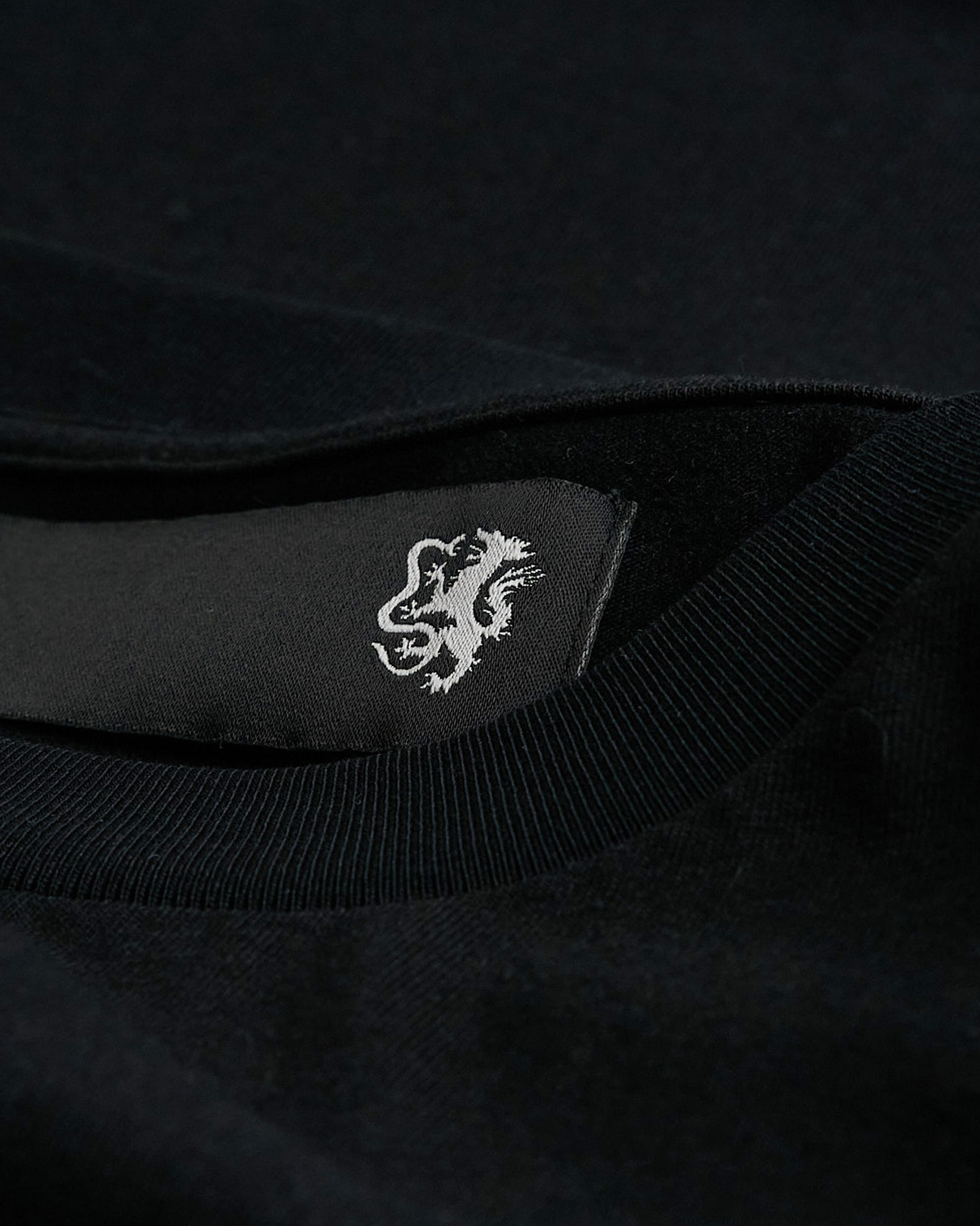
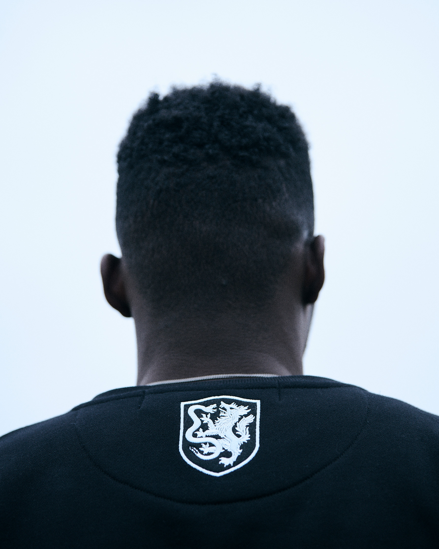
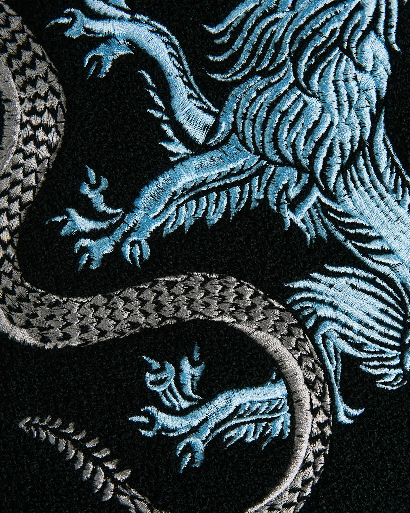
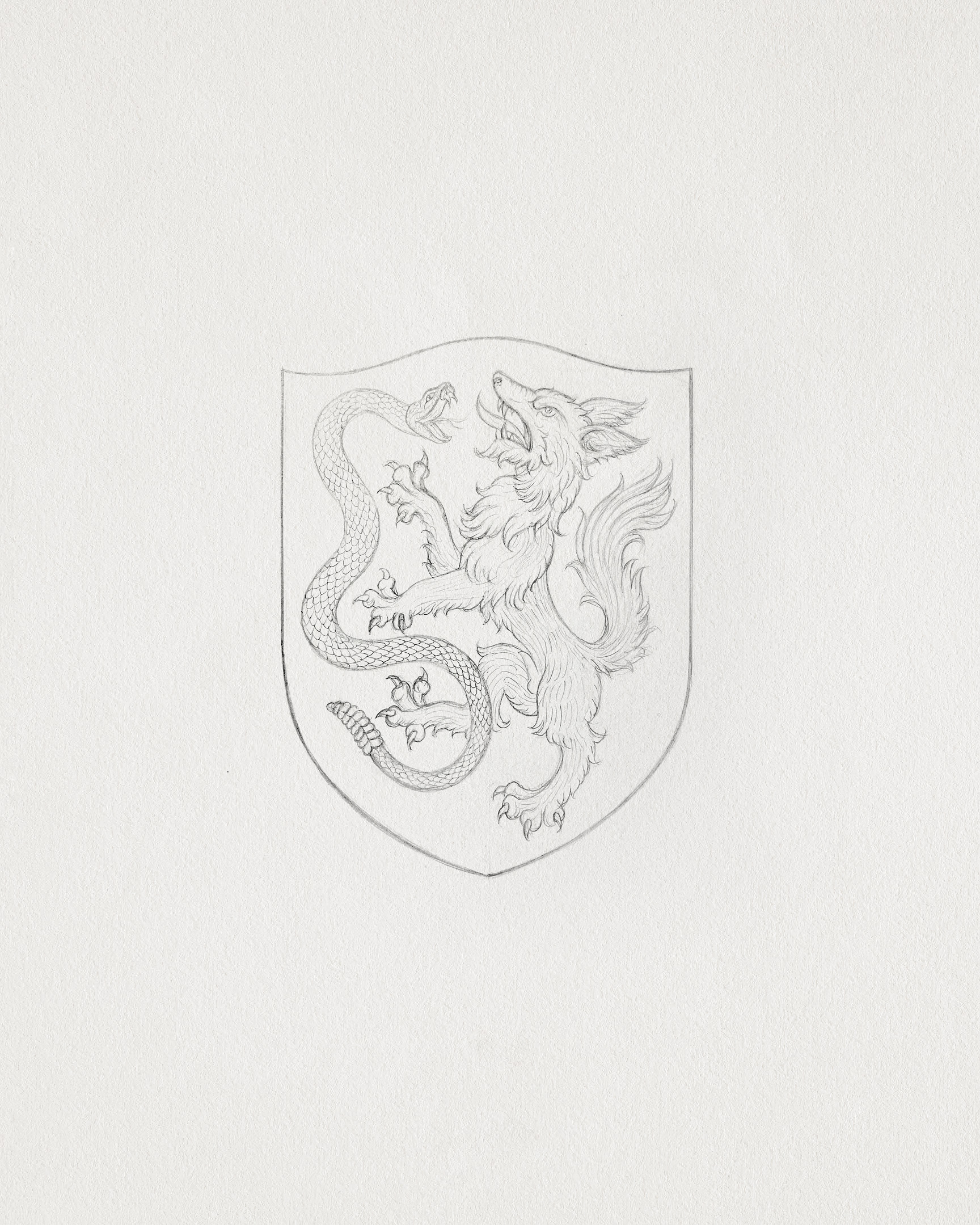
At the center of the identity is the crest, a hand-painted depiction of the Wolf and Snake created through an iterative process in collaboration with artist Tom Meek. The illustration takes cues from historical heraldry, where animals are symbolic expressions of pride and lineage. The mark rejects the sterile, digital perfection of modern sports logos in favor of something textured and human. It feels timeless, as if it’s always existed.

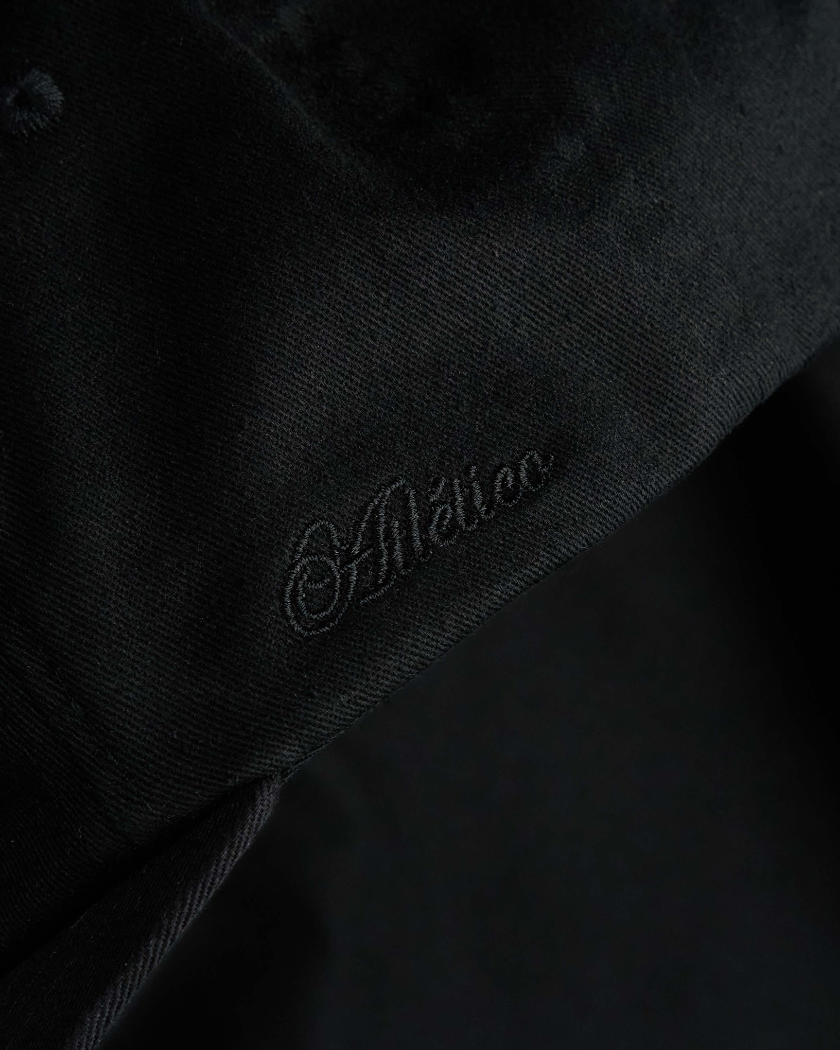
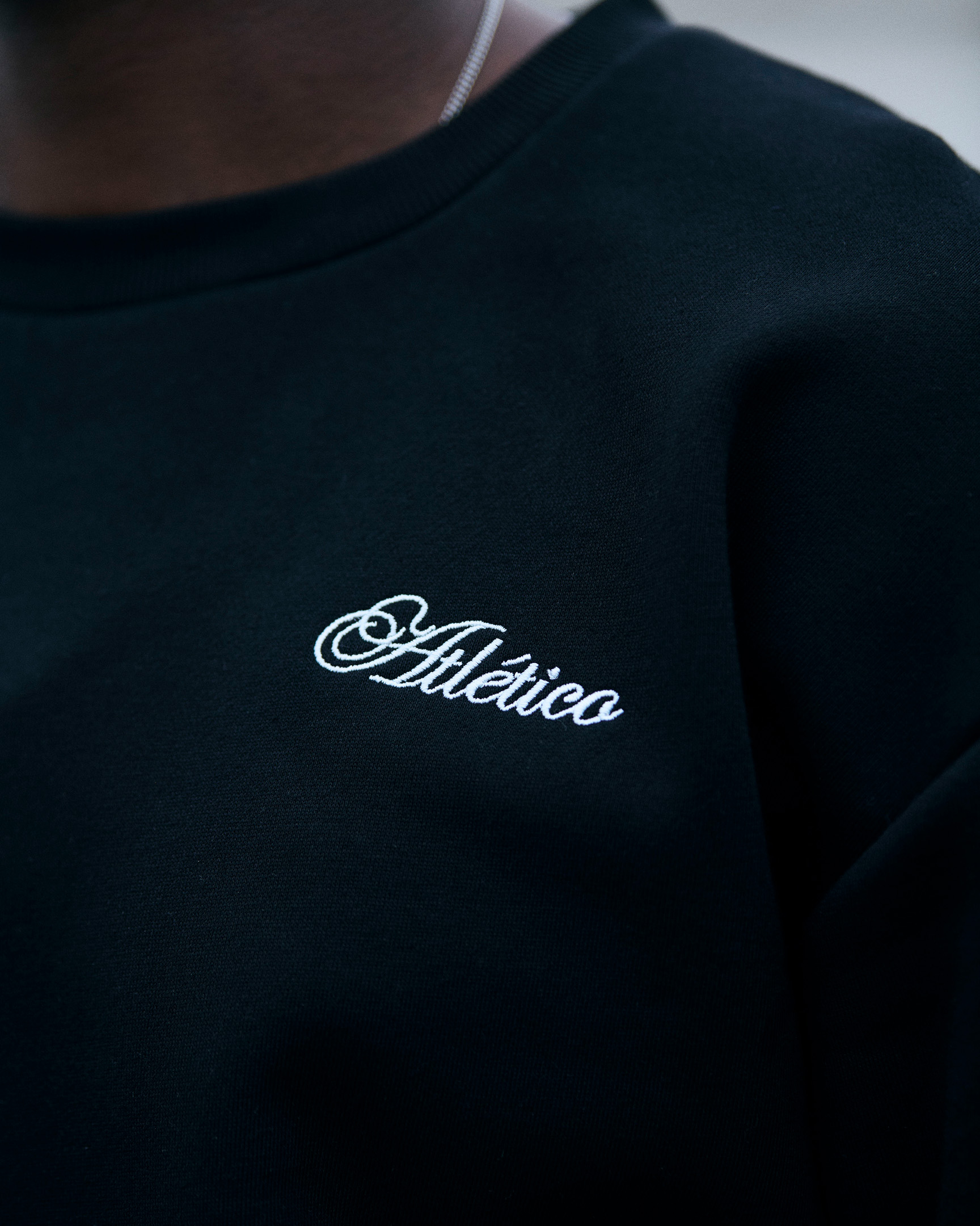
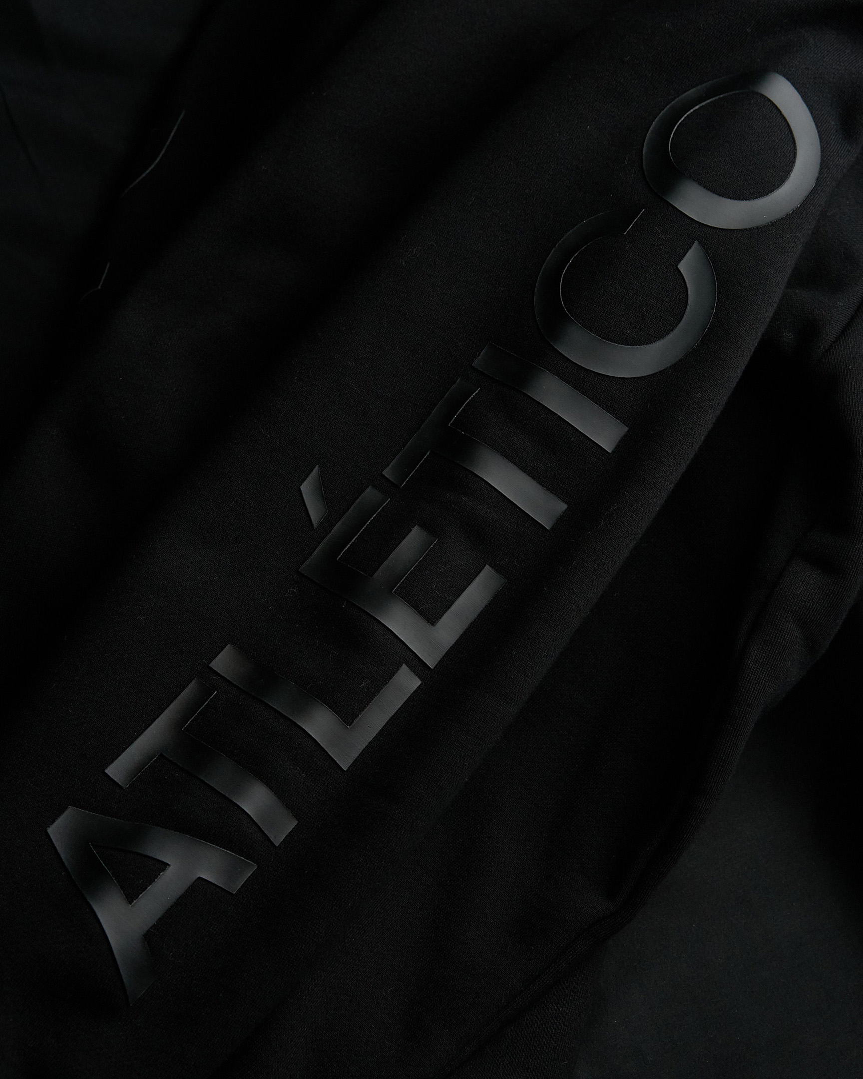
Even the name carries meaning. “Atlético” is a word recognized across the world of football. It speaks to movement, energy, and collective strength. In Dallas, it takes on a second layer of significance—honoring the city’s deep connection to Latin culture and the global language of the game.

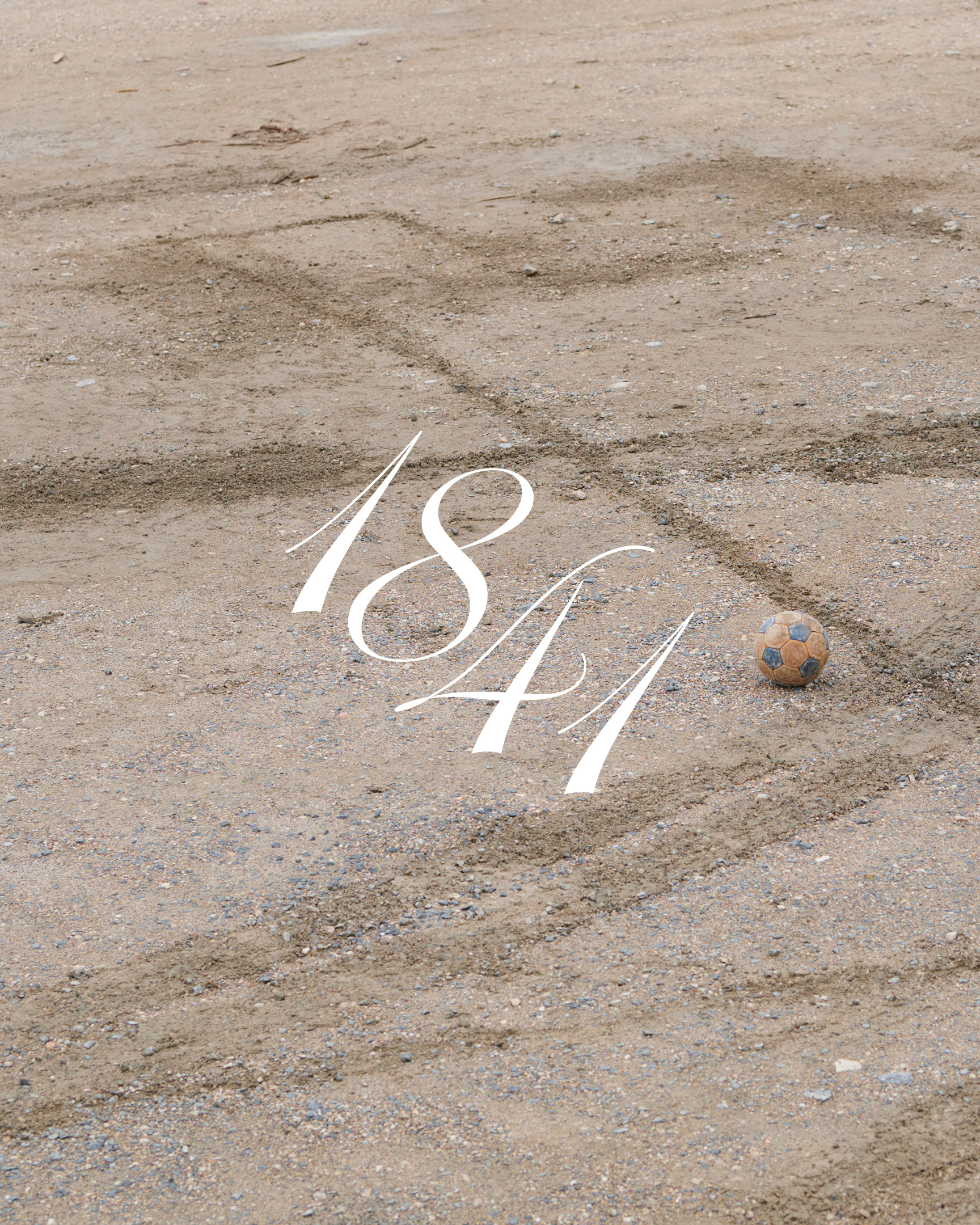
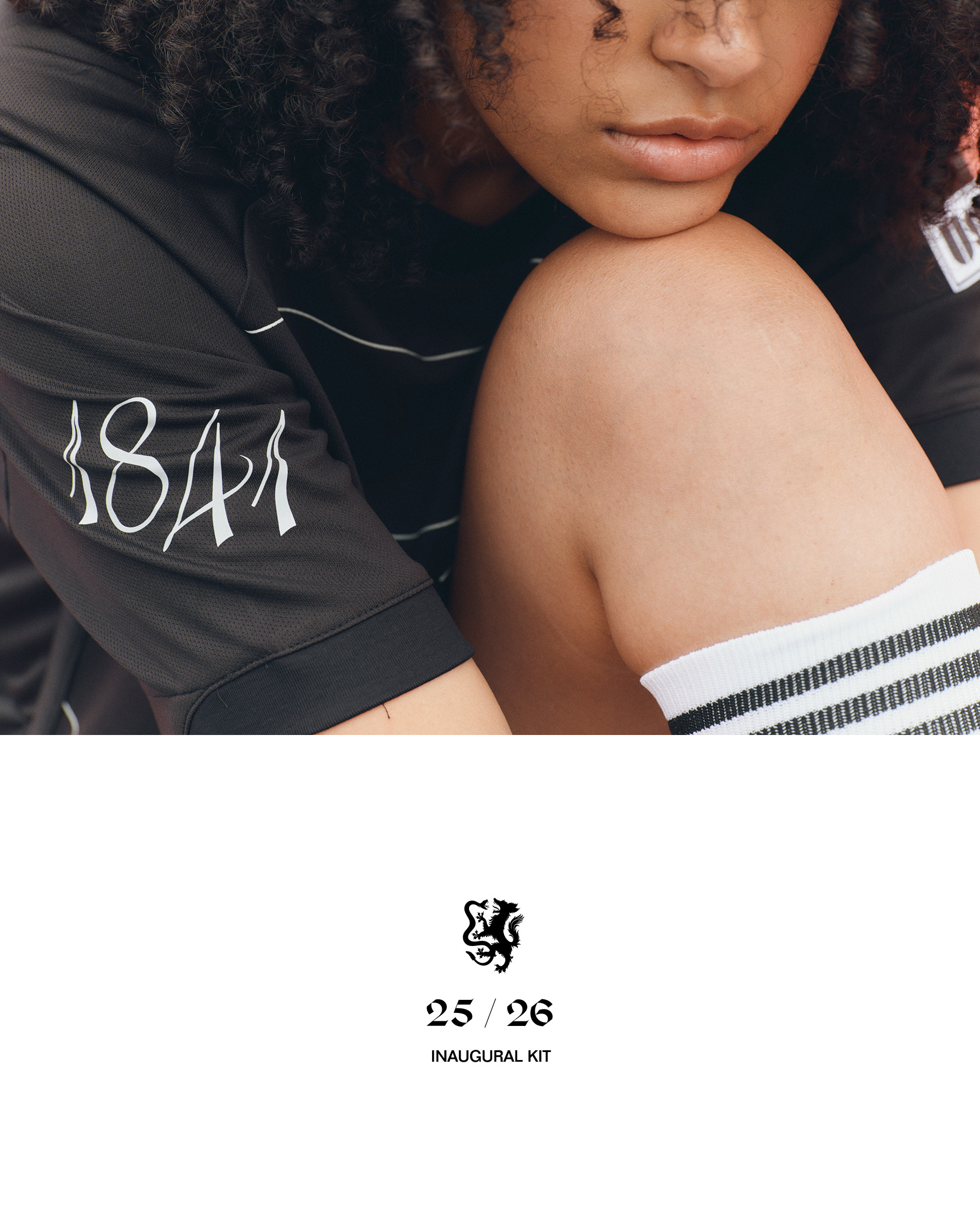
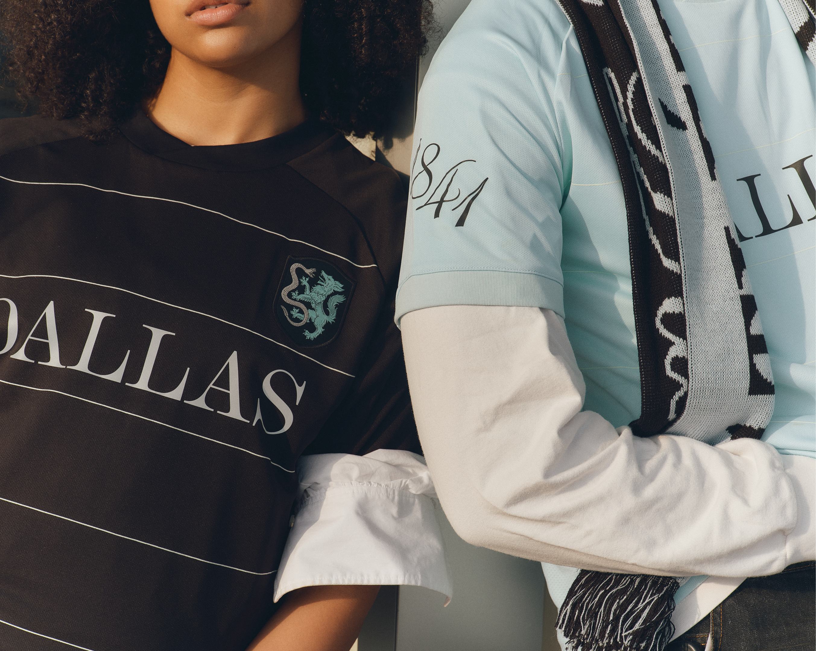
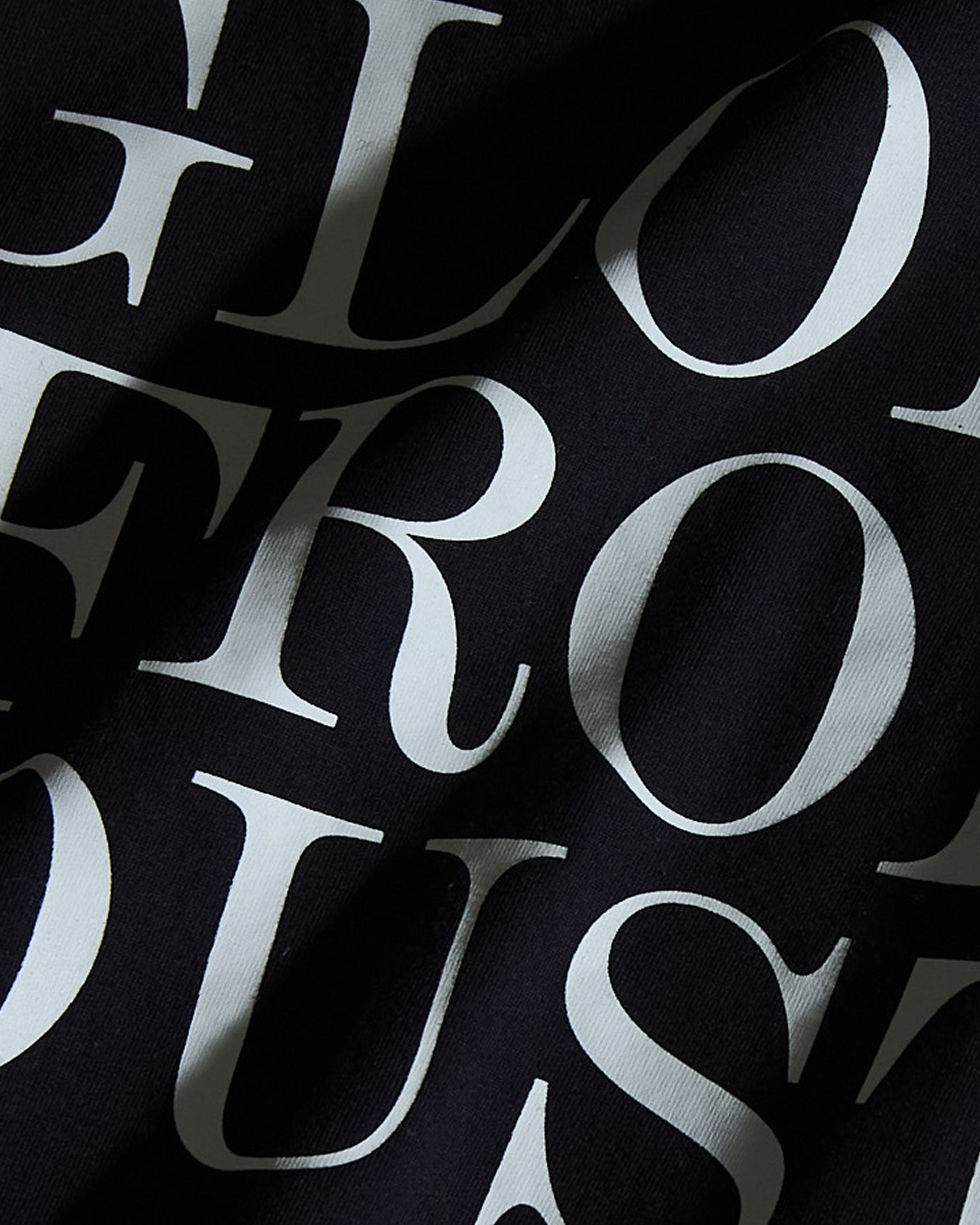
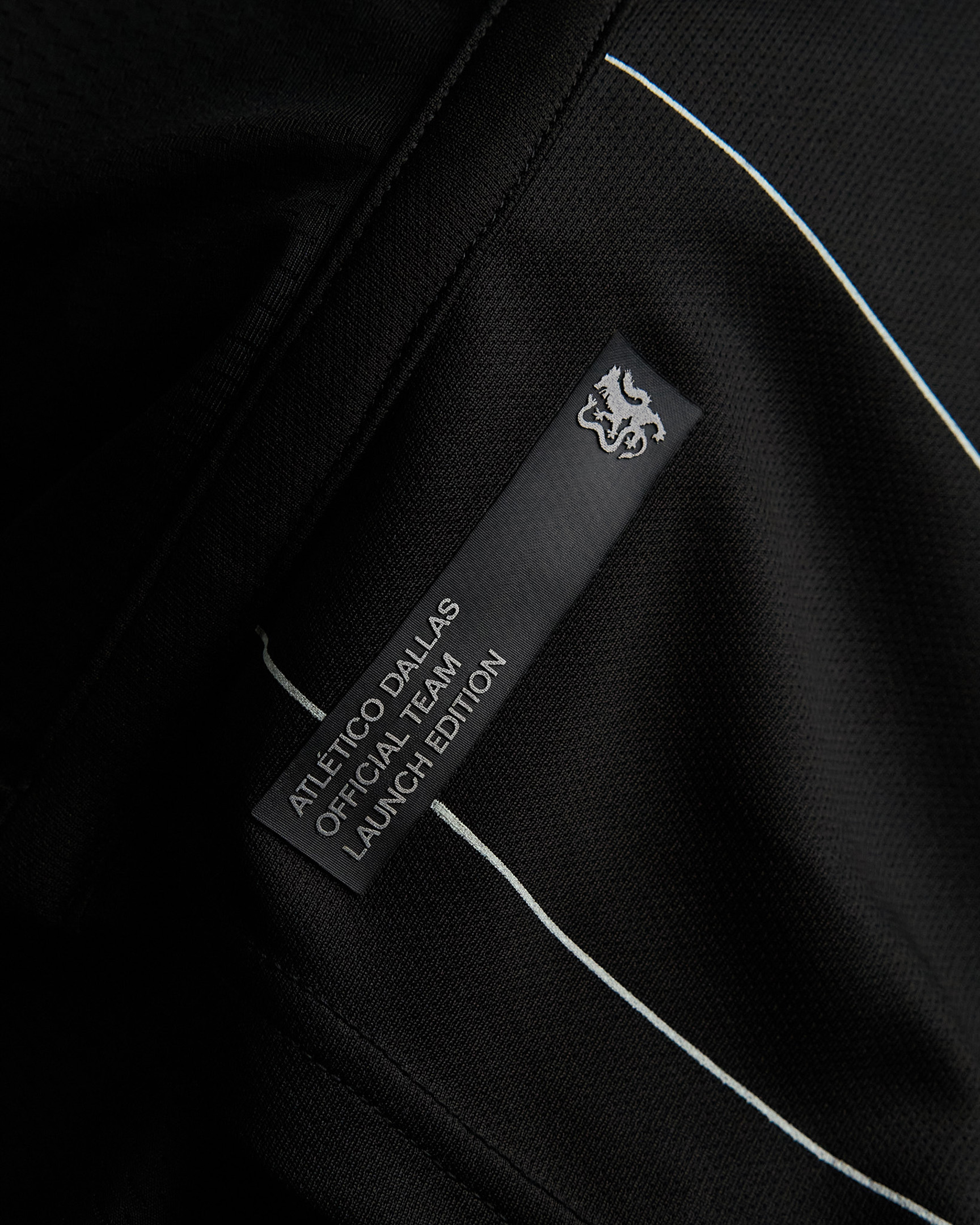
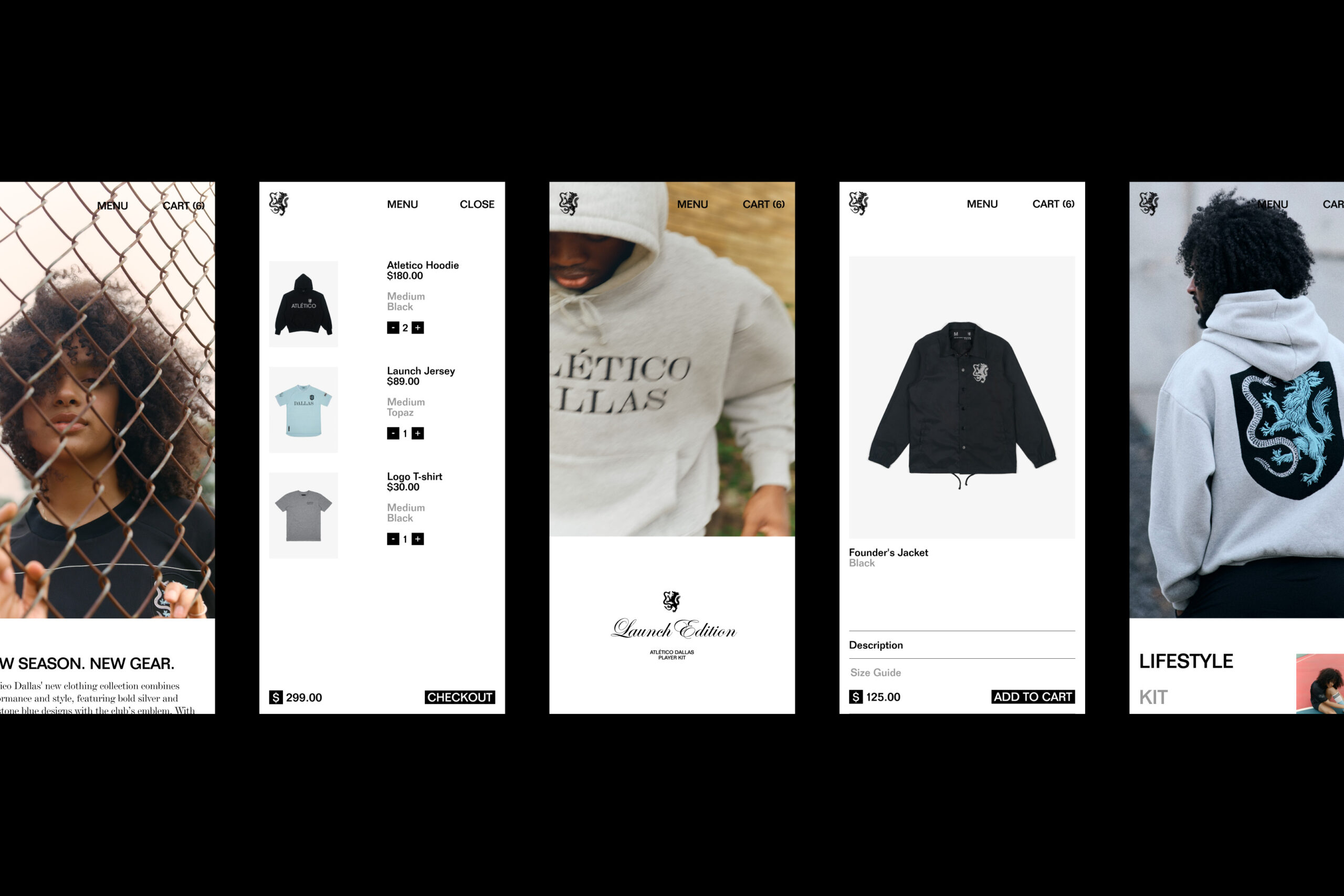
The visual system pulls from the Texas landscape itself. Blues drawn from topaz, blacks from the rich prairie soil, silvers from the minerals that shaped early settlements. The typography mixes multiple styles of sans and serif with a custom set of blackletter numerals, giving the brand a tension that feels lived-in and distinctly regional.

Atlético Dallas isn’t just a soccer club. It’s a reflection of the city that built it, ambitious, hard-working, and unafraid to start from nothing.
 

Atletico_01A
Atletico_04
Atletico_05
Atletico_Lifestyle_02
Atletico_Lifestyle_01
Atletico_Grid_02
Atletico_Lifestyle_03
Atletico_Lifestyle_05
Atletico_Lifestyle_04
Atletico_12
Atletico_Lifestyle_07
Atletico_Lifestyle_06
Atletico_Grid_01
Atletico_Web_01
Atletico_Web_02
Atletico_Web_Mobile
Atletico_Lifestyle_08
Credits
Photography: Max Kütz, Blair Getz Mezibov
Heraldic Artist: Tom Meek 
Numerals: Bobby Tannam
Website Development: Logan Sparlin

Credits
Photography: Max Kütz, Blair Getz Mezibov
Heraldic Artist: Tom Meek 
Numerals: Bobby Tannam
Website Development: Logan Sparlin

Contact Overlay

Moniker, Inc.

2169 Folsom Street, M101

San Francisco, CA 94110

JavaScript